- Home
- /
- Programming
- /
- ODS Reports
- /
- Mean with SE bars over time: i am stuck.. Need help
- RSS Feed
- Mark Topic as New
- Mark Topic as Read
- Float this Topic for Current User
- Bookmark
- Subscribe
- Mute
- Printer Friendly Page
- Mark as New
- Bookmark
- Subscribe
- Mute
- RSS Feed
- Permalink
- Report Inappropriate Content
I am on SAS studio,
trying to create a mean with SE bars over time ( hand hygiene compliance over time, 2 groups of wards ('0' composed of 6 wards with low bed occupancy rates and '1' composed of wards with high occupancy rates).
I referred to
Sample 42542: Plot means with standard error bars from calculated data with PROC SGPLOT
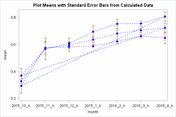
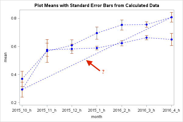
Supposed to get 2 pairs of dots & 2 lines with error bars. Didn't happen:
Where did it go wrong?
my codes:
proc means data=WORK.HANDHYGIENE3 mean stderr;
class grouphh month;
var findings;
output out=out1hh mean = mean stderr=stderr;
run;
data reshape(drop=stderr);
set out1hh;
lower=mean - stderr;
upper=mean + stderr;
run;
ods listing close;
ods graphics / reset width=600px height=400px imagefmt=gif;
proc sgplot data=reshape noautolegend;
scatter x=month y=mean / yerrorlower=lower
yerrorupper=upper
markerattrs=(color=blue symbol=CircleFilled);
series x=month y=mean / lineattrs=(color=blue pattern=2);
title1 'Plot Means with Standard Error Bars from Calculated Data';
run;
Accepted Solutions
- Mark as New
- Bookmark
- Subscribe
- Mute
- RSS Feed
- Permalink
- Report Inappropriate Content
Maybe you need to group the series by grouphh:
series x=month y=mean / lineattrs=(color=blue pattern=2) group=grouphh;That worked for me.
Regards,
- Jan.
- Mark as New
- Bookmark
- Subscribe
- Mute
- RSS Feed
- Permalink
- Report Inappropriate Content
the data file
- Mark as New
- Bookmark
- Subscribe
- Mute
- RSS Feed
- Permalink
- Report Inappropriate Content
Proc means will calculate stats for all permutations of the classification variables. Add the NWAY option to only keep the grouphh*month interactions. That will take care of the erratic lines in your plot.
proc means data=WORK.HANDHYGIENE3 mean stderr nway;Hope this helps,
- Jan,
- Mark as New
- Bookmark
- Subscribe
- Mute
- RSS Feed
- Permalink
- Report Inappropriate Content
- Mark as New
- Bookmark
- Subscribe
- Mute
- RSS Feed
- Permalink
- Report Inappropriate Content
Maybe you need to group the series by grouphh:
series x=month y=mean / lineattrs=(color=blue pattern=2) group=grouphh;That worked for me.
Regards,
- Jan.
Ready to join fellow brilliant minds for the SAS Hackathon?
Build your skills. Make connections. Enjoy creative freedom. Maybe change the world. Registration is now open through August 30th. Visit the SAS Hackathon homepage.
Register today!Learn how use the CAT functions in SAS to join values from multiple variables into a single value.
Find more tutorials on the SAS Users YouTube channel.
 Click image to register for webinar
Classroom Training Available!
Select SAS Training centers are offering in-person courses. View upcoming courses for:


