- Mark as New
- Bookmark
- Subscribe
- Mute
- RSS Feed
- Permalink
- Report Inappropriate Content
I am on SAS studio,
trying to create a mean with SE bars over time ( hand hygiene compliance over time, 2 groups of wards ('0' composed of 6 wards with low bed occupancy rates and '1' composed of wards with high occupancy rates).
I referred to
Sample 42542: Plot means with standard error bars from calculated data with PROC SGPLOT
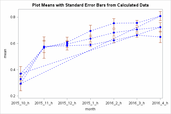
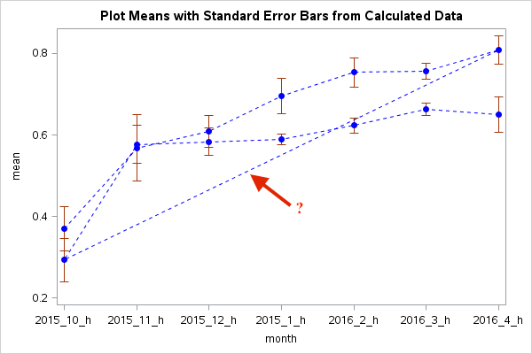
Supposed to get 2 pairs of dots & 2 lines with error bars. Didn't happen:
Where did it go wrong?
my codes:
proc means data=WORK.HANDHYGIENE3 mean stderr;
class grouphh month;
var findings;
output out=out1hh mean = mean stderr=stderr;
run;
data reshape(drop=stderr);
set out1hh;
lower=mean - stderr;
upper=mean + stderr;
run;
ods listing close;
ods graphics / reset width=600px height=400px imagefmt=gif;
proc sgplot data=reshape noautolegend;
scatter x=month y=mean / yerrorlower=lower
yerrorupper=upper
markerattrs=(color=blue symbol=CircleFilled);
series x=month y=mean / lineattrs=(color=blue pattern=2);
title1 'Plot Means with Standard Error Bars from Calculated Data';
run;
Accepted Solutions
- Mark as New
- Bookmark
- Subscribe
- Mute
- RSS Feed
- Permalink
- Report Inappropriate Content
Maybe you need to group the series by grouphh:
series x=month y=mean / lineattrs=(color=blue pattern=2) group=grouphh;That worked for me.
Regards,
- Jan.
- Mark as New
- Bookmark
- Subscribe
- Mute
- RSS Feed
- Permalink
- Report Inappropriate Content
the data file
- Mark as New
- Bookmark
- Subscribe
- Mute
- RSS Feed
- Permalink
- Report Inappropriate Content
Proc means will calculate stats for all permutations of the classification variables. Add the NWAY option to only keep the grouphh*month interactions. That will take care of the erratic lines in your plot.
proc means data=WORK.HANDHYGIENE3 mean stderr nway;Hope this helps,
- Jan,
- Mark as New
- Bookmark
- Subscribe
- Mute
- RSS Feed
- Permalink
- Report Inappropriate Content
- Mark as New
- Bookmark
- Subscribe
- Mute
- RSS Feed
- Permalink
- Report Inappropriate Content
Maybe you need to group the series by grouphh:
series x=month y=mean / lineattrs=(color=blue pattern=2) group=grouphh;That worked for me.
Regards,
- Jan.


