- Home
- /
- Programming
- /
- ODS Reports
- /
- Re: Conditionally formatting needles or bands?
- RSS Feed
- Mark Topic as New
- Mark Topic as Read
- Float this Topic for Current User
- Bookmark
- Subscribe
- Mute
- Printer Friendly Page

- Mark as New
- Bookmark
- Subscribe
- Mute
- RSS Feed
- Permalink
- Report Inappropriate Content
I have data which is recorded over time. I've been using NEEDLE charts, I wasn't sure about BAND but it now looks like I could possibly use that instead. I need the needle or band to be a different color for each shift, so that it is visually possible to differentiate the shift the data is f
The dataset has a SHIFT variable, a TIMESTMP variable which has the start time of the interval when the measurement was taken, and the measurement.
I've read about attribute datasets, which seems like what I need for this - but would I need to create an entry for each TIMESTMP and use TIMESTMP as the ATTRID? Can I use SHIFT as the ATTRID instead, even though it's not in the chart?
- Mark as New
- Bookmark
- Subscribe
- Mute
- RSS Feed
- Permalink
- Report Inappropriate Content
I should add that I had "okay" results by splitting the measurement variable into pieces, and setting one of the pieces to the value and the other to missing, then plotting all the variables on the same graph with different color attributes. That worked for NEEDLE but not for BAND which stretched the bands across the intervals with missing values.

- Mark as New
- Bookmark
- Subscribe
- Mute
- RSS Feed
- Permalink
- Report Inappropriate Content
Can you post an image of what this should look like?
- Mark as New
- Bookmark
- Subscribe
- Mute
- RSS Feed
- Permalink
- Report Inappropriate Content
This is it done with the splitting technique and NEEDLE chart... I removed the 4-hour average SERIES to make this look clearer I think it would look better with BAND, maybe
- Mark as New
- Bookmark
- Subscribe
- Mute
- RSS Feed
- Permalink
- Report Inappropriate Content
I get a communications error trying to view the example. By any chance is the lin to an intranet that's restricted?
- Mark as New
- Bookmark
- Subscribe
- Mute
- RSS Feed
- Permalink
- Report Inappropriate Content
I didn't realize that would create a link. Uploading it this time.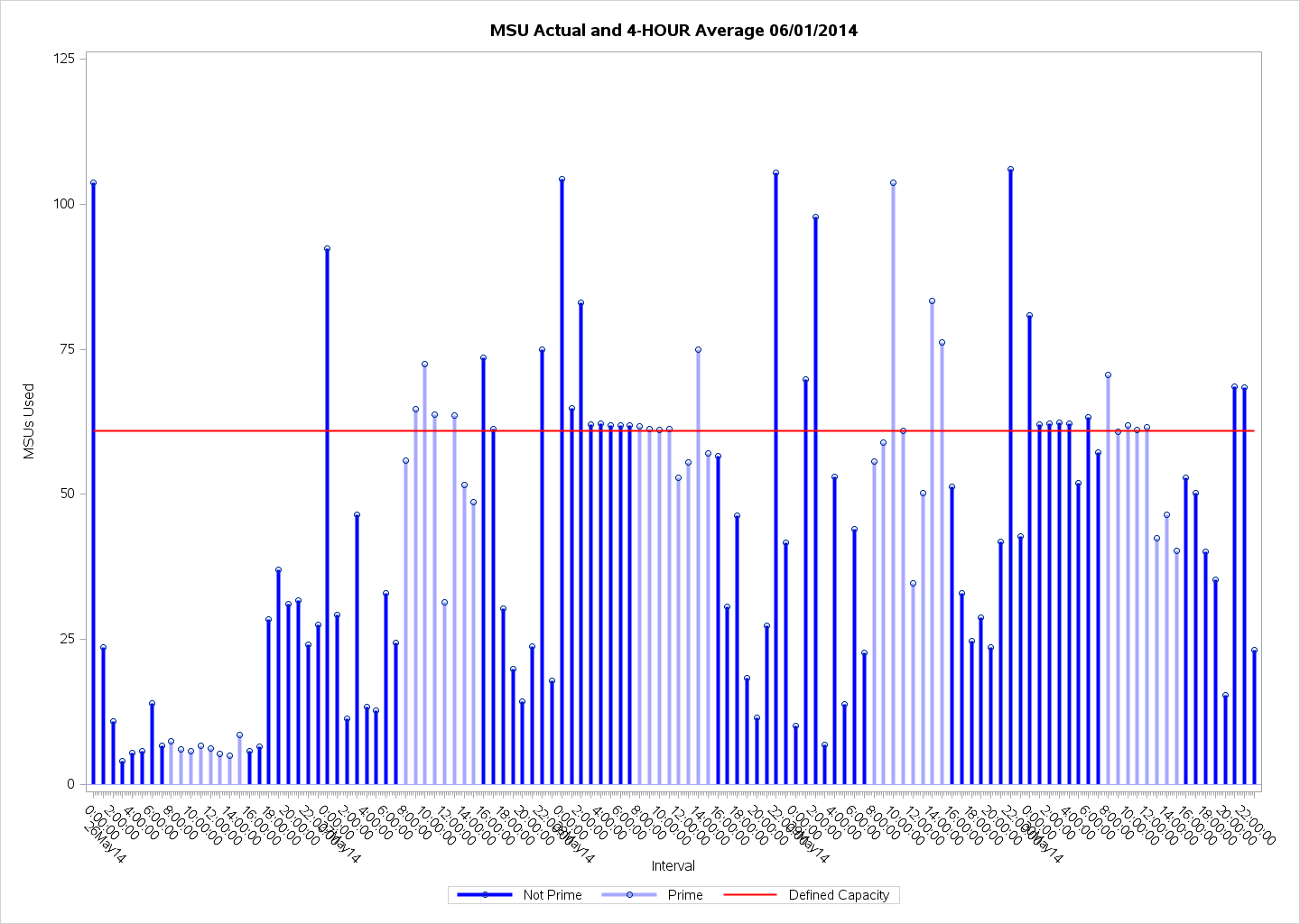
.jpg")
Catch up on SAS Innovate 2026
Nearly 200 sessions are now available on demand with the SAS Innovate Digital Pass.
Explore Now →Learn how use the CAT functions in SAS to join values from multiple variables into a single value.

Find more tutorials on the SAS Users YouTube channel.
SAS Training: Just a Click Away
Ready to level-up your skills? Choose your own adventure.
-
5 replies
-
06-02-2014 10:52 AM
-
2847 views
-
0 likes
-
2 in conversation
-
