BookmarkSubscribeRSS Feed
sarobinson010
Calcite | Level 5

Dear SAS users,


I am using SAS Enterprise Guide to look at the relationship between online patient portal use (continuous; X) and age (continuous; Y), and whether this relationship differs by dichotomous variable region (M; categorical; rural or urban).This patient portal data (X) is not normally distributed, so I am trying to fit a loess curve. I would like to overlay 1 loess curve for rural and one curve for urban on the same graph. My data are set up as such:


PortalUse        Region        Age
3                Rural         45
7                Urban         67
2                Urban         83
etc...

Right now, I have only figured out how to plot separate loess curves (one plot for rural, one for urban) with the following syntax:


ods graphics on;
ods select FitPlot;
proc loess data=LoessData plots=FitPlot;
by region;
model Age = PortalUse / interp=linear degree=1 select=AICC(presearch); run;

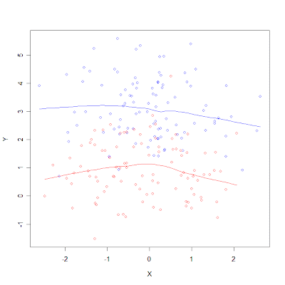
 Is there a way to graph these two loess curves on the same plot? ideally, it would look  something like this (with obvious differences in the x and y axes labels):


Image result for multiple lines one loess graph


Thank you in advance for your expertise and time.


Stephanie

3 REPLIES 3
PaigeMiller
Diamond | Level 26

Easily done via PROC SGPLOT.


Use two LOESS commands in your PROC SGPLOT.

--
Paige Miller
PGStats
Opal | Level 21

Use BY processing and SGPLOT. Example:


proc sort data=sashelp.heart out=heart; by sex height; run;

proc loess data=heart plots=none;
by sex;
model weight = height / interp=linear degree=1;
output out=smooth predicted=smWeight;
run;

proc sgplot data=smooth;
where ageAtStart between 60 and 65;
scatter x=height y=weight / group=sex markerattrs=(symbol=circle);
series x=height y=smWeight / group=sex lineattrs=(pattern=solid);
run;

SGPlot3.png


PG
PaigeMiller
Diamond | Level 26

Yes, @PGStats, that fits better than my answer above.

--
Paige Miller