- Home
- /
- Programming
- /
- Graphics
- /
- Re: xaxistable
- RSS Feed
- Mark Topic as New
- Mark Topic as Read
- Float this Topic for Current User
- Bookmark
- Subscribe
- Mute
- Printer Friendly Page
- Mark as New
- Bookmark
- Subscribe
- Mute
- RSS Feed
- Permalink
- Report Inappropriate Content
Hello all,
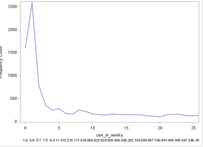
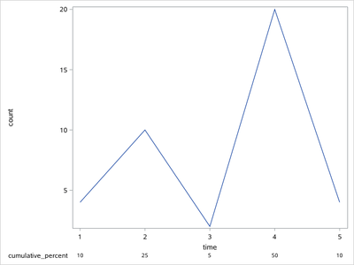
i am creating a really simple sgplot, where i want to use an xaxistable. My problem is, that the xaxistable is not aligned with the x-axis. It shows too many observations.
How can i get the values to align with the values on the x-axis?
example data:
data have;
input time count cumulative_percent;
datalines;
1 4 10
2 10 25
3 2 5
4 20 50
5 4 10
;
run;
proc sgplot data = abc;
series x=time y = count;
taxis values = 0 to 52 by 5);
xaxistable cumulative_percent;run;
Accepted Solutions
- Mark as New
- Bookmark
- Subscribe
- Mute
- RSS Feed
- Permalink
- Report Inappropriate Content
You might need to create a temporary dataset where those unwanted values are set to missing.
Example:
/* Create sample data for demonstration */

data have;
do time=0 to 52;
  count=round(pdf('chisq',time,3)*1e4+108.9);
  cumulative_percent+count/150;
  output;
end;
label time='use_in_weeks';
run;

/* Restrict values for x-axis table to tick marks */

data want;
set have;
if mod(time,5) then cumulative_percent=.;
format cumulative_percent 5.1;
run;

/* Create the plot with blanks between the x-axis table items */

options missing=' ';
proc sgplot data = want;
series x=time y = count;
xaxis values = (0 to 52 by 5);
xaxistable cumulative_percent / label='cumul. %';
run;- Mark as New
- Bookmark
- Subscribe
- Mute
- RSS Feed
- Permalink
- Report Inappropriate Content
data have;
input time count cumulative_percent;
datalines;
1 4 10
2 10 25
3 2 5
4 20 50
5 4 10
;
run;

proc sgplot data = have;
series x=time y = count;
*xaxis values =( 0 to 52 by 5);
xaxistable cumulative_percent/x=time;
run;
- Mark as New
- Bookmark
- Subscribe
- Mute
- RSS Feed
- Permalink
- Report Inappropriate Content
Thank you for your answer,
When i add the / x=time to my code, i still have way to many datapoints at my graph.
I have calculated the cumulative percent for each observation, but on my x-axis i have chosen only to show by 5. Can i get the xaxistable to only show by 5 as well?
- Mark as New
- Bookmark
- Subscribe
- Mute
- RSS Feed
- Permalink
- Report Inappropriate Content
You might need to create a temporary dataset where those unwanted values are set to missing.
Example:
/* Create sample data for demonstration */

data have;
do time=0 to 52;
  count=round(pdf('chisq',time,3)*1e4+108.9);
  cumulative_percent+count/150;
  output;
end;
label time='use_in_weeks';
run;

/* Restrict values for x-axis table to tick marks */

data want;
set have;
if mod(time,5) then cumulative_percent=.;
format cumulative_percent 5.1;
run;

/* Create the plot with blanks between the x-axis table items */

options missing=' ';
proc sgplot data = want;
series x=time y = count;
xaxis values = (0 to 52 by 5);
xaxistable cumulative_percent / label='cumul. %';
run;Catch up on SAS Innovate 2026
Dive into keynotes, announcements and breakthroughs on demand.
Explore Now →Learn how use the CAT functions in SAS to join values from multiple variables into a single value.
Find more tutorials on the SAS Users YouTube channel.
SAS Training: Just a Click Away
Ready to level-up your skills? Choose your own adventure.


