- Home
- /
- Programming
- /
- Graphics
- /
- Re: special symbol in gplot labels
- RSS Feed
- Mark Topic as New
- Mark Topic as Read
- Float this Topic for Current User
- Bookmark
- Subscribe
- Mute
- Printer Friendly Page

- Mark as New
- Bookmark
- Subscribe
- Mute
- RSS Feed
- Permalink
- Report Inappropriate Content
Hi everyone.
Just a quick question. How can we use label statement in gplot to put special symbols in axis label?
For example, how to put a 'um' (mu m) there? I tried to copy that 'mu' symbol from "system map" (ms windows), but it just did not work.
Any suggestion? or any other method to do so? thanks.
- Mark as New
- Bookmark
- Subscribe
- Mute
- RSS Feed
- Permalink
- Report Inappropriate Content
I found a way to do this, by using the following code:
label=(f=arial h=3 c=black justify=c a=90 "Length (%sysfunc(byte(181),$1.)m)" )
The "%sysfunc(byte(181),$1.)" should show as the the 'mu' sign in the gplot. The number "181" came from the following unicode chart: (link)
We can see that "mu" can be located from "181" (Latin-1 Supplement chart). If we want other symbols, we can just simply replace the "181" with other numbers.
Then here comes the second question:
The method above works and only works for Latin-1 Supplement chart. How if we want to throw in other special symbols?

- Mark as New
- Bookmark
- Subscribe
- Mute
- RSS Feed
- Permalink
- Report Inappropriate Content
Maybe go more old school and avoid the unicode by using one of the SAS GREEK fonts?

- Mark as New
- Bookmark
- Subscribe
- Mute
- RSS Feed
- Permalink
- Report Inappropriate Content
For GPLOT, you can do it this way:
axis1 label=(font="Arial/unicode" "03bc"x "006d"x);
proc gplot data=sashelp.class;
plot weight*height / haxis=axis1;
run;
quit;
Assuming you have SAS 9.2 or greater, you can do this in SGPLOT using ODS escapement syntax:
proc sgplot data=sashelp.class;
xaxis label="(*ESC*){unicode mu}m";
scatter x=weight y=height;
run;
Hope this helps!
Dan
- Mark as New
- Bookmark
- Subscribe
- Mute
- RSS Feed
- Permalink
- Report Inappropriate Content
@DanH, Thanks for the quick reply. I tried you code, the code worked. The problem is, the "mu" and the "m" overlap each other. How can I set them one after another in the label? Thanks again!
- Mark as New
- Bookmark
- Subscribe
- Mute
- RSS Feed
- Permalink
- Report Inappropriate Content
What I tired was the GPLOT code, have not tried the Sgplot yet, but I will ![]()
- Mark as New
- Bookmark
- Subscribe
- Mute
- RSS Feed
- Permalink
- Report Inappropriate Content
Interesting...I don't see this overlap problem in my GPLOT output. What version of SAS do you have?
- Mark as New
- Bookmark
- Subscribe
- Mute
- RSS Feed
- Permalink
- Report Inappropriate Content
I just ran the GPLOT example in 9.2 and 9.3, and the output in neither version showed the overlap. Could you have some settings active that could affect your graph rendering? Maybe start a fresh session and see if it still happens.
- Mark as New
- Bookmark
- Subscribe
- Mute
- RSS Feed
- Permalink
- Report Inappropriate Content
@DanH. I had the SAS 9.2, I tried to restart my SAS, but still keep having this "overlap" style label. I thought I might mess up the goption settings, but after doing a goption reset=all, I still got the following graph.
- Mark as New
- Bookmark
- Subscribe
- Mute
- RSS Feed
- Permalink
- Report Inappropriate Content
Ah, I was putting the label on the X axis instead of the Y axis, which would explain why I was not getting the overlap. Since you are running 9.2, and I know what type of plot you're generating, would this work for you?
proc sgplot data=sashelp.class;
yaxis label="This label contains a (*ESC*){unicode mu}m";
vbox height / category=age;
run;
- Mark as New
- Bookmark
- Subscribe
- Mute
- RSS Feed
- Permalink
- Report Inappropriate Content

- Mark as New
- Bookmark
- Subscribe
- Mute
- RSS Feed
- Permalink
- Report Inappropriate Content
Could you show the exact axis statement you're using when you see the overlap?
Is the axis label text horizontal, or angled?
One possible work-around is to insert some extra spaces between the two characters:
axis1 label=(font="albany amt" 'Here is a mu character:'
font="albany amt/unicode" '03bc'x font="albany amt" ' ' font="albany amt/unicode" '006d'x);
proc gplot data=sashelp.class;
plot height*weight / haxis=axis1;
run;
- Mark as New
- Bookmark
- Subscribe
- Mute
- RSS Feed
- Permalink
- Report Inappropriate Content
, Thanks for the advice. I tried your code but still had the sample overlap looking result.
In my Label statement, I used:
axis2 order= 0 to 800 by 100
value=(f=arial c=black h=2.5)
label=( h=3 c=black a=90 font="Arial/unicode" "03bc"x font="albany amt" ' ' font="albany amt/unicode" '006d'x )
minor=none;
I also tested DanH's code:
axis2 order= 0 to 800 by 100
value=(f=arial c=black h=2.5)
label=( h=3 c=black a=90 font="Arial/unicode" "03bc"x "006d"x )
minor=none;
- Mark as New
- Bookmark
- Subscribe
- Mute
- RSS Feed
- Permalink
- Report Inappropriate Content
Are you using Proc Boxplot, or Proc Gplot (or other)?
Which output are you using? (dev=png, dev=actximg, dev=javaimg, other?)
- Mark as New
- Bookmark
- Subscribe
- Mute
- RSS Feed
- Permalink
- Report Inappropriate Content
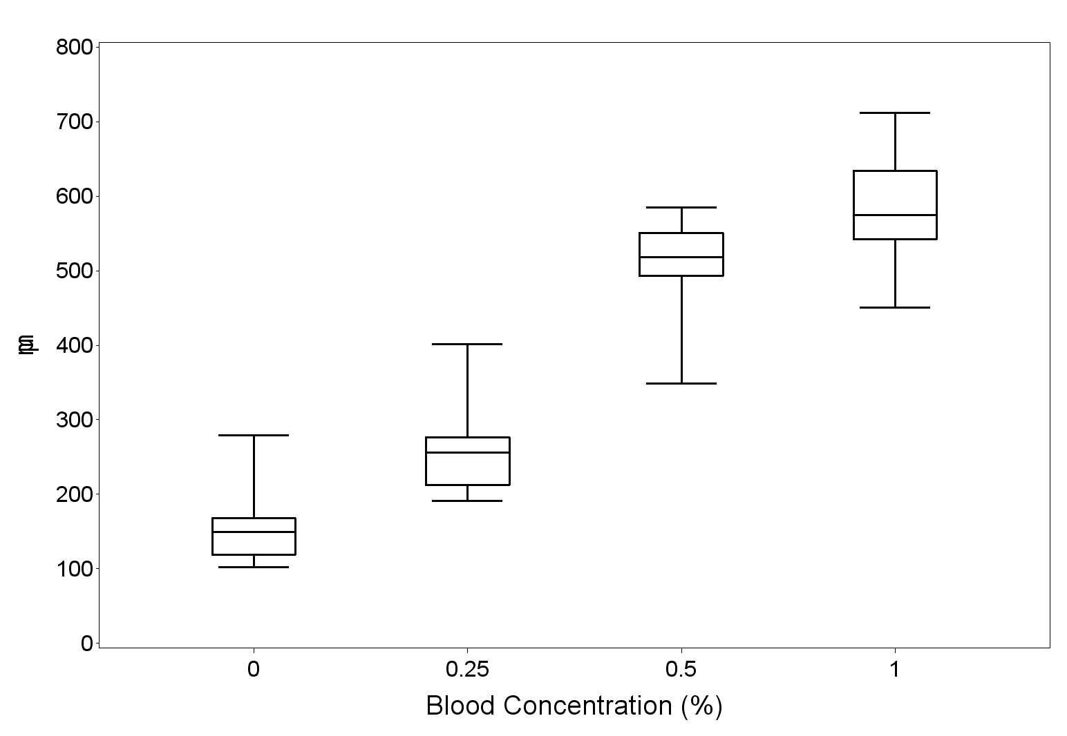
no, I used gplot + %annotate to do those boxplots. Did not use any dev options.
I think it should be my SAS version problem.
.jpg")
Catch up on SAS Innovate 2026
Nearly 200 sessions are now available on demand in the Innovate Hub.
Watch Now →Learn how use the CAT functions in SAS to join values from multiple variables into a single value.

Find more tutorials on the SAS Users YouTube channel.
SAS Training: Just a Click Away
Ready to level-up your skills? Choose your own adventure.
-
20 replies
-
11-15-2012 05:12 PM
-
12272 views
-
4 likes
-
4 in conversation
-
