- Home
- /
- Programming
- /
- Graphics
- /
- Re: sgplot: change group colour and line style
- RSS Feed
- Mark Topic as New
- Mark Topic as Read
- Float this Topic for Current User
- Bookmark
- Subscribe
- Mute
- Printer Friendly Page
- Mark as New
- Bookmark
- Subscribe
- Mute
- RSS Feed
- Permalink
- Report Inappropriate Content
Hello all,
I am doing a survival curve using proc sgplot and the group statement. I have a total of 8 groups. I need some of the groups to have dotted lines and some of them to have full lines and specify every groups colour.
How to put it into the following code?
proc sgplot data=abc2;
series x=weeks y=SURVIVAL1 /group = exp_event;
run;
Accepted Solutions
- Mark as New
- Bookmark
- Subscribe
- Mute
- RSS Feed
- Permalink
- Report Inappropriate Content
For full control of the attributes try a Discrete Attribute Map .
- Mark as New
- Bookmark
- Subscribe
- Mute
- RSS Feed
- Permalink
- Report Inappropriate Content
For full control of the attributes try a Discrete Attribute Map .
- Mark as New
- Bookmark
- Subscribe
- Mute
- RSS Feed
- Permalink
- Report Inappropriate Content
Thank you for your answer 🙂
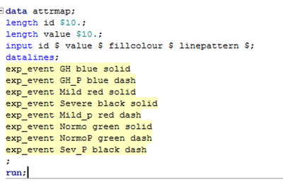
I have tried to make the attribute map (please see attatched photo), but the colours are not at all corresponding. Do i miss something in the code?
- Mark as New
- Bookmark
- Subscribe
- Mute
- RSS Feed
- Permalink
- Report Inappropriate Content
The column names in an attributes map are reserved keywords, so they must be spelled as they are expected. In your screenshot, you have spelled the expected "fillcolor" with the alternate "fillcolour" spelling. Also, for a series plot, you should be using "linecolor" instead of "fillcolor".
- Mark as New
- Bookmark
- Subscribe
- Mute
- RSS Feed
- Permalink
- Report Inappropriate Content
You can use the STYLEATTRS command in PROC SGPLOT
Example
styleattrs datacontrastcolors=(orange cyan CXFF0000)
    datalinepatterns=(dot solid longdash 26);
Experiment to find what works for you.
Paige Miller
- Mark as New
- Bookmark
- Subscribe
- Mute
- RSS Feed
- Permalink
- Report Inappropriate Content
@PeterClemmensen is correct. You' will want to use an attributes map. Here is a simple example using a SERIES plot below:
data attrmap;
retain ID "myid" nocase "true";
input value $ linecolor $ linepattern $;
cards;
F   pink   solid
M   blue   dash
;
run;

proc sgplot data=sashelp.class dattrmap=attrmap;
series x=name y=weight / group=sex attrid=myid;
run;Learn how use the CAT functions in SAS to join values from multiple variables into a single value.
Find more tutorials on the SAS Users YouTube channel.
SAS Training: Just a Click Away
Ready to level-up your skills? Choose your own adventure.


