- Home
- /
- Programming
- /
- Graphics
- /
- sgpanel formatting issues
- RSS Feed
- Mark Topic as New
- Mark Topic as Read
- Float this Topic for Current User
- Bookmark
- Subscribe
- Mute
- Printer Friendly Page
- Mark as New
- Bookmark
- Subscribe
- Mute
- RSS Feed
- Permalink
- Report Inappropriate Content
Hello, I have a dataset which looks like the below
gcode seccode WT1 WT2 REG SSEC
AU ENGY 10 20 APAC RES
CA HCARE 15 25 NA NCYC
HK IND 3 10 APAC NCYC
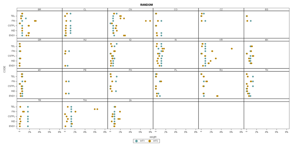
I am using sgpanel to plot the values for T1 and T2 by gcode and seccode
gcode is the columns and seccode is the rows.
The issues I am facing
1) I dont see all the available tick values for the columns; also the y axis does not show 0% but ** for some reason
2) How do I increase the size of the x axis and y axis values and the title
3) How do I show my sgpanel chart sorted according to SSEC for the rows and the REG for the columns as given above..
So in this example the panel on the columns will be sorted CA HK AU and the rows will be sorted as HCARE, IND and ENGY
4) This would be good to have if I can color the titles of each panel "AU", "CA" by the REG specified
5) Any other suggestions to improve the visual..
I have attached an example of what I have so far . Many Thanks for your help!
l
ods graphics on/width = 20in height = 10in border = off;
%let myYvalues = ("ENGY", "BMAT", "IND", "CDISC", "CSTPL", "HCARE", "FIN", "TECH", "TEL", "UTIL");
proc sgpanel data=mygroup;
format WT1 percent4.1;
format WT2 percent4.1;
title "RANDOM";
panelby gcode / novarname spacing = 0 columns=6 rows = 4;
rowaxis label = "CODE" ;
scatter x = WT1 y = seccode /markerattrs = (symbol = circlefilled color = cadetblue size = 15 ) legendlabel = 'T1';
scatter x = WT2 y =seccode/ markerattrs = (symbol = circlefilled color = darkgoldenrod size = 15 ) legendlabel = 'T2';
run
Attached is some data as well..Thanks!

- Mark as New
- Bookmark
- Subscribe
- Mute
- RSS Feed
- Permalink
- Report Inappropriate Content
1) I dont see all the available tick values for the columns;
Fitpolicy option on the rowaxis may help. The default is THIN which removes values unless there is lots of space. Fitpolicy=Rotate will angle text and may allow more text to display or Fitpolicy=Stagger which will shift some values away from the axis to provide more space for text. Last option may be to try, or modify a style, that uses smaller fonts for the axis labels.
also the y axis does not show 0% but ** for some reason
The format you assigned wants more space than available is most likely, I'd try a percent3.0
2) How do I increase the size of the x axis and y axis values and the title
Bigger text conflicts with your desire to show more values, at least on the y axis. Default size is controlled by style elements.
3) How do I show my sgpanel chart sorted according to SSEC for the rows and the REG for the columns as given above
Rowaxis or colaxis statement with a discreteorder option. Choices are basically Data, the order they appear in the dataset, formatted or unformatted. The default is unformatted and character values appear character sort order. If you can sort your data into the order you want then the option data should work.
4) This would be good to have if I can color the titles of each panel "AU", "CA" by the REG specified
5) Any other suggestions to improve the visual..
If you need more control, which appears likely, then you probably need to investigate GTL and proc sgrender.
Catch up on SAS Innovate 2026
Dive into keynotes, announcements and breakthroughs on demand.
Explore Now →Learn how use the CAT functions in SAS to join values from multiple variables into a single value.
Find more tutorials on the SAS Users YouTube channel.
SAS Training: Just a Click Away
Ready to level-up your skills? Choose your own adventure.


