- Home
- /
- Programming
- /
- Graphics
- /
- running Turnip chart demo code
- RSS Feed
- Mark Topic as New
- Mark Topic as Read
- Float this Topic for Current User
- Bookmark
- Subscribe
- Mute
- Printer Friendly Page
- Mark as New
- Bookmark
- Subscribe
- Mute
- RSS Feed
- Permalink
- Report Inappropriate Content
SAS UniversityEdition
This is the log file when I run the Turnip Chart demo: Can SAS UniversityEdition runn this code and how?
1 OPTIONS NONOTES NOSTIMER NOSOURCE NOSYNTAXCHECK;
NOTE: GOPTIONS statements in the SAS Studio environment may disable some output features.
NOTE: ODS statements in the SAS Studio environment may disable some output features.
57
58 %let name=turnip;
59 filename odsout '.';
60
61 /* Get your data into a sas data set.
62 If you use these exact same variable names, you can re-use
63 this exact same sas code. If this code is converted into
64 a generalized macro, the variable names could be parameters
65 that are passed in.
66 */
67 data mydata;
68 format percent percentn9.2;
69 format cum_percent percentn9.2;
70 input mpg freq percent cum_percent;
71 percent=percent/100;
72 cum_percent=cum_percent/100;
73 datalines;
NOTE: The data set WORK.MYDATA has 11 observations and 4 variables.
NOTE: DATA statement used (Total process time):
real time 0.00 seconds
cpu time 0.01 seconds
85 ;
86 run;
87
88 /* Create one plot marker for each 'freq', and position it symmetrically
89 around x=0. Note that these are centered differently for odd-versus-even
90 numbers of markers. */
91 data plotdata; set mydata;
92 /* Even number of markers */
93 if (freq/2) eq int(freq/2) then do;
94 do lcv=1 to (freq/2);
95 x=lcv-.5; output;
96 x=-1*(lcv-.5); output;
97 end;
98 end;
99 /* Odd number of markers */
100 else do;
101 do lcv=1 to ((freq+1)/2);
102 x=lcv-1; output;
103 x=-1*(lcv-1); output;
104 end;
105 end;
106 run;
NOTE: There were 11 observations read from the data set WORK.MYDATA.
NOTE: The data set WORK.PLOTDATA has 78 observations and 6 variables.
NOTE: DATA statement used (Total process time):
real time 0.00 seconds
cpu time 0.01 seconds
107
108 goptions device=png;
108 goptions device=png;
________
180
ERROR 180-322: Statement is not valid or it is used out of proper order.
109 goptions noborder;
109 goptions noborder;
________
180
ERROR 180-322: Statement is not valid or it is used out of proper order.
110
111 ODS LISTING CLOSE;
112 ODS HTML path=odsout body="&name..htm" (title="Custom SAS/Graph Turnip Chart") style=htmlblue;
NOTE: Writing HTML Body file: turnip.htm
ERROR: Insufficient authorization to access /opt/sasinside/SASConfig/Lev1/SASApp/turnip.htm.
ERROR: No body file. HTML output will not be created.
113
114 goptions gunit=pct htitle=5 ftitle="albany amt/bold" htext=3 ftext="albany amt";
114 goptions gunit=pct htitle=5 ftitle="albany amt/bold" htext=3 ftext="albany amt";
________
180
ERROR 180-322: Statement is not valid or it is used out of proper order.
115
116 symbol1 value=circle height=4 interpol=none color=black;
116 symbol1 value=circle height=4 interpol=none color=black;
_______
180
ERROR 180-322: Statement is not valid or it is used out of proper order.
117
118 axis1 label=(angle=90) order=(9 to 45 by 36) minor=none offset=(5,5) reflabel=("20");
118 axis1 label=(angle=90) order=(9 to 45 by 36) minor=none offset=(5,5) reflabel=("20");
_____
180
ERROR 180-322: Statement is not valid or it is used out of proper order.
119
120 axis2 label=none order=(-16 to 16 by 32) minor=(number=1) offset=(5,5);
120 axis2 label=none order=(-16 to 16 by 32) minor=(number=1) offset=(5,5);
_____
180
ERROR 180-322: Statement is not valid or it is used out of proper order.
121
122 title1 ls=1.5 link="turnip_info.htm" "Turnip Chart";
123
124 proc gplot data=plotdata;
ERROR: Procedure GPLOT not found.
125 plot mpg*x=1 / noframe
126 vaxis=axis1 haxis=axis2
127 vref=20 cvref=gray
128 des='' name="&name" ;
129 run;
NOTE: The SAS System stopped processing this step because of errors.
NOTE: PROCEDURE GPLOT used (Total process time):
real time 0.00 seconds
cpu time 0.00 seconds
130
131 proc print data=mydata noobs;
132 var mpg freq percent cum_percent;
133 run;
NOTE: There were 11 observations read from the data set WORK.MYDATA.
NOTE: PROCEDURE PRINT used (Total process time):
real time 0.03 seconds
cpu time 0.04 seconds
134
135 quit;
136 ODS HTML CLOSE;
137 ODS LISTING;
138
139 OPTIONS NONOTES NOSTIMER NOSOURCE NOSYNTAXCHECK;
151
User: sasdemo
Accepted Solutions
- Mark as New
- Bookmark
- Subscribe
- Mute
- RSS Feed
- Permalink
- Report Inappropriate Content
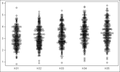
Here is a graph with program. You could restructure your data by category (each of the "Kxx" columns for easier processing. Anyway, I kept your data structure, and just added some columns with the last 3 characters of each response variable as the category, such as "K01", "K02", etc, and used them with the corresponding response variable.
%let gpath='.';
%let dpi=150;
ods html close;
ods listing image_dpi=&dpi gpath=&gpath;

/*--Read datra from Excel--*/
proc import datafile="C:\qry_hip.xlsx"
     dbms=xlsx out=Hip_Replacement replace;
run;

/*--Add some categories--*/
data hip;
  set hip_replacement;
  K01='K01'; K02='K02'; K03='K03'; K04='K04'; K05='K05';
run;

/*--Plot Graph--*/
ods graphics / reset width=5in height=3in imagename='Turnip_Hip';
proc sgplot data=hip nocycleattrs noautolegend;
 scatter x=k01 y=HipReplacementper1K01 / jitter;
 scatter x=k02 y=HipReplacementper1K02 / jitter;
 scatter x=k03 y=HipReplacementper1K03 / jitter;
 scatter x=k04 y=HipReplacementper1K04 / jitter;
 scatter x=k05 y=HipReplacementper1K05 / jitter;
 xaxis display=(noticks nolabel);
 yaxis display=(nolabel);
run;
(Editor's note: Full example of a scalable Turnip graph is available on this blog post.)
- Mark as New
- Bookmark
- Subscribe
- Mute
- RSS Feed
- Permalink
- Report Inappropriate Content
GOPTIONS is related to settings for the traditional device based graphics found in SAS/GRAPH which is not part of University edition.
Look at the ODS GRAPHICS statement to set options such as IMAGEFM. But PNG will generally be the default for graphics so you may not need to worry.
- Mark as New
- Bookmark
- Subscribe
- Mute
- RSS Feed
- Permalink
- Report Inappropriate Content
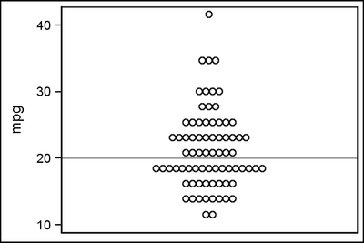
As noted by "ballardW", SAS/GRAPH is not included with SAS University Edition. But Base Graphics procedures are included such as SGPLOT. Reviewing Robert's example, it looks like a "Jittered" scatter plot. Should be doable using SGPLOT.
- Mark as New
- Bookmark
- Subscribe
- Mute
- RSS Feed
- Permalink
- Report Inappropriate Content
%let gpath='.';
%let dpi=200;

data mydata;
  format percent percentn9.2;
  format cum_percent percentn9.2;
  input mpg freq percent cum_percent;
  percent=percent/100;
  cum_percent=cum_percent/100;
  Cat='A';
  datalines;
11.57101  2  2.70   2.70
13.88521  8 10.81  13.51
16.19941  8 10.81  24.32
18.51361 17 22.97  47.30
20.82781  8 10.81  58.11
23.14201 12 16.22  74.32
25.45621  8 10.81  85.14
27.77042  3  4.05  89.19
30.08462  4  5.41  94.59
34.71302  3  4.05  98.65
41.65562  1  1.35 100.00
;
run;

/*--Expand the data--*/
data expand;
  set mydata;
  do i=1 to freq;
   output;
  end;
run;

/*--Draw Graph--*/
title;
ods html close;
ods listing gpath=&gpath image_dpi=&dpi;
ods graphics / reset width=3in height=2in imagename='Turnip';
proc sgplot data=expand;
  scatter x=cat y=mpg / jitter;
  refline 20;
  xaxis display=(noticks novalues nolabel);
run;
- Mark as New
- Bookmark
- Subscribe
- Mute
- RSS Feed
- Permalink
- Report Inappropriate Content
How do I adapt demo code to use my sas data set and variables
Can you suggest how I can produce turnip charts of variables in qry_hipReplacement1992to2013.xlsx
Greatly appreciative,
jemohr22
- Tags:
- Turnip Chart
- Mark as New
- Bookmark
- Subscribe
- Mute
- RSS Feed
- Permalink
- Report Inappropriate Content
- Mark as New
- Bookmark
- Subscribe
- Mute
- RSS Feed
- Permalink
- Report Inappropriate Content
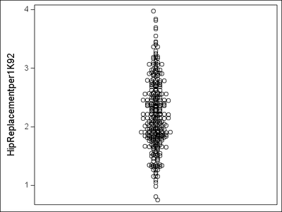
Which variable from this data do you want to plot? This is one of them.
- Mark as New
- Bookmark
- Subscribe
- Mute
- RSS Feed
- Permalink
- Report Inappropriate Content
The hipreplacement variable you chose is good. What does the sas code look like?
My professor asked me to produce a series of turnip graphs
Thank you
- Mark as New
- Bookmark
- Subscribe
- Mute
- RSS Feed
- Permalink
- Report Inappropriate Content
I need to produce a series of Turnip Charts for all variables in this data set. It appears that you were able to successfully produce a Turnip Chart for one of the variables. Could you share the code? I assume that with the code I will be able to simply change the variable name
In an ideal world I would be able to display a Turnip Chart Graphic for multiple variables in the same output. See attached pdf file
- Mark as New
- Bookmark
- Subscribe
- Mute
- RSS Feed
- Permalink
- Report Inappropriate Content
Here is a graph with program. You could restructure your data by category (each of the "Kxx" columns for easier processing. Anyway, I kept your data structure, and just added some columns with the last 3 characters of each response variable as the category, such as "K01", "K02", etc, and used them with the corresponding response variable.
%let gpath='.';
%let dpi=150;
ods html close;
ods listing image_dpi=&dpi gpath=&gpath;

/*--Read datra from Excel--*/
proc import datafile="C:\qry_hip.xlsx"
     dbms=xlsx out=Hip_Replacement replace;
run;

/*--Add some categories--*/
data hip;
  set hip_replacement;
  K01='K01'; K02='K02'; K03='K03'; K04='K04'; K05='K05';
run;

/*--Plot Graph--*/
ods graphics / reset width=5in height=3in imagename='Turnip_Hip';
proc sgplot data=hip nocycleattrs noautolegend;
 scatter x=k01 y=HipReplacementper1K01 / jitter;
 scatter x=k02 y=HipReplacementper1K02 / jitter;
 scatter x=k03 y=HipReplacementper1K03 / jitter;
 scatter x=k04 y=HipReplacementper1K04 / jitter;
 scatter x=k05 y=HipReplacementper1K05 / jitter;
 xaxis display=(noticks nolabel);
 yaxis display=(nolabel);
run;
(Editor's note: Full example of a scalable Turnip graph is available on this blog post.)
- Mark as New
- Bookmark
- Subscribe
- Mute
- RSS Feed
- Permalink
- Report Inappropriate Content
Here is the code I ran. The excel file was located at C:\qry_hip.xlsx
%let dpi=150;
ods html close;
ods listing image_dpi=&dpi gpath=&gpath;
proc import datafile="C:\qry_hip.xlsx"
dbms=xlsx out=Hip_Replacement replace;
run;
data hip;
set hip_replacement;
K01='K01'; K02='K02'; K03='K03'; K04='K04'; K05='K05';
run;
ods graphics / reset width=5in height=3in imagename='Turnip_Hip';
proc sgplot data=hip nocycleattrs noautolegend;
scatter x=k01 y=HipReplacementper1K01 / jitter;
scatter x=k02 y=HipReplacementper1K02 / jitter;
scatter x=k03 y=HipReplacementper1K03 / jitter;
scatter x=k04 y=HipReplacementper1K04 / jitter;
scatter x=k05 y=HipReplacementper1K05 / jitter;
xaxis display=(noticks nolabel);
yaxis display=(nolabel);
run;
- Mark as New
- Bookmark
- Subscribe
- Mute
- RSS Feed
- Permalink
- Report Inappropriate Content
It appears that some of the code in the first demo code example is missing from the code you sent along with the Turnip Chart depicting multiple years.
Instead of importing the qry_hips.xlsx could I reference a SAS data set created by importing the qry_hips.xlsx to create a SAS dataset WORK.QRY_HIPS92TO13
I have tried running the code you sent, but I get multiple error messages including that the physical file qry_hips.xlsx can not be found or does not exist
Could you please forward a copy of all code used to produce the multi year Turnip Chart. I should be able to produce similar charts using the SAS University Edition by changing a few variable names
I am facing a publication deadline
Thanks again for your help
- Mark as New
- Bookmark
- Subscribe
- Mute
- RSS Feed
- Permalink
- Report Inappropriate Content
"qry_hips.xlsx" is the same as your original xlsx file. I used proc IMPORT to read the Excel data. I don't know if UA has PROC IMPORT? I attached the data set I imported in a zip file. You can try using that.
- Mark as New
- Bookmark
- Subscribe
- Mute
- RSS Feed
- Permalink
- Report Inappropriate Content
I appreciate the value of your time and would be grateful if you could guide me to the point of having a SAS program that produces a turnip chart for my HLTHDATA.HIPS9213 SAS dat set.
I imported qry_hips.xlsx into a SAS data set into a library, HLTHDATA.HIPS9213. The attached pdf file is the output of proc contents on HLTHDATA.HIPS9213. It lists the variable names I will need to use. I should be able to access this SAS data set using the data step:
data WORK.HIPREP;
set HLTHDATA.HIPS9213;
run;
What follows this data step? Where is the code that functions as the following sections of the original demo code?
format percent percentn9.2;
format cum_percent percentn9.2;
input mpg freq percent cum_percent;
percent=percent/100;
cum_percent=cum_percent/100;
Cat='A';
datalines;
11.57101 2 2.70 2.70
13.88521 8 10.81 13.51
16.19941 8 10.81 24.32
18.51361 17 22.97 47.30
20.82781 8 10.81 58.11
23.14201 12 16.22 74.32
25.45621 8 10.81 85.14
27.77042 3 4.05 89.19
30.08462 4 5.41 94.59
34.71302 3 4.05 98.65
41.65562 1 1.35 100.00
;
run;
data expand;
set mydata;
do i=1 to freq;
output;
end;
run;
title;
ods html close;
ods listing gpath=&gpath image_dpi=&dpi;
ods graphics / reset width=7in height=7in imagename='Turnip';
proc sgplot data=expand;
scatter x=cat y=mpg / jitter;
refline 20;
xaxis display=(noticks novalues nolabel);
run;
- Mark as New
- Bookmark
- Subscribe
- Mute
- RSS Feed
- Permalink
- Report Inappropriate Content
Thank you so very much!
I was able to make it work.
Now I will tweak refinements to the display
Catch up on SAS Innovate 2026
Dive into keynotes, announcements and breakthroughs on demand.
Explore Now →Learn how use the CAT functions in SAS to join values from multiple variables into a single value.
Find more tutorials on the SAS Users YouTube channel.
SAS Training: Just a Click Away
Ready to level-up your skills? Choose your own adventure.


