- Home
- /
- Programming
- /
- Graphics
- /
- proc sgplot top/bottom graphs using common x-axis
- RSS Feed
- Mark Topic as New
- Mark Topic as Read
- Float this Topic for Current User
- Bookmark
- Subscribe
- Mute
- Printer Friendly Page
- Mark as New
- Bookmark
- Subscribe
- Mute
- RSS Feed
- Permalink
- Report Inappropriate Content
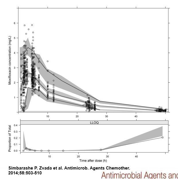
I'm using proc sgplot (v9.4) to create box/scatter plots and wish to create a separate companion bar (or line) graph below using the same x-axis but using frequencies along the y-axis to produce a single figure. I'm inserting an example of what I want to do. Can someone suggest a way to do this? Thanks.
- Mark as New
- Bookmark
- Subscribe
- Mute
- RSS Feed
- Permalink
- Report Inappropriate Content
The best way to do this is using GTL. See this paper to get started.
http://support.sas.com/rnd/datavisualization/papers/sgf2014/096-Matange_final.pdf
See "Multi-Cell layouts" starting page 9.
- Mark as New
- Bookmark
- Subscribe
- Mute
- RSS Feed
- Permalink
- Report Inappropriate Content
ok, thank you Sanjay
- Mark as New
- Bookmark
- Subscribe
- Mute
- RSS Feed
- Permalink
- Report Inappropriate Content
GTL and PROC template can do this.
See page 9 here, it’s not the exact same but it shows you the idea.
http://support.sas.com/resources/papers/proceedings14/2342-2014.pdf
@wcw wrote:
I'm using proc sgplot (v9.4) to create box/scatter plots and wish to create a separate companion bar (or line) graph below using the same x-axis but using frequencies along the y-axis to produce a single figure. I'm inserting an example of what I want to do. Can someone suggest a way to do this? Thanks.
- Mark as New
- Bookmark
- Subscribe
- Mute
- RSS Feed
- Permalink
- Report Inappropriate Content
great, thank you Reeza
Catch up on SAS Innovate 2026
Dive into keynotes, announcements and breakthroughs on demand.
Explore Now →Learn how use the CAT functions in SAS to join values from multiple variables into a single value.
Find more tutorials on the SAS Users YouTube channel.
SAS Training: Just a Click Away
Ready to level-up your skills? Choose your own adventure.


