- Home
- /
- Programming
- /
- Graphics
- /
- Re: proc gbarline legends and labels
- RSS Feed
- Mark Topic as New
- Mark Topic as Read
- Float this Topic for Current User
- Bookmark
- Subscribe
- Mute
- Printer Friendly Page
- Mark as New
- Bookmark
- Subscribe
- Mute
- RSS Feed
- Permalink
- Report Inappropriate Content
Hello all,
Never used the proc gbarline procedure before! Love the utility of it, but finding the labeling and legend defining very confusing.
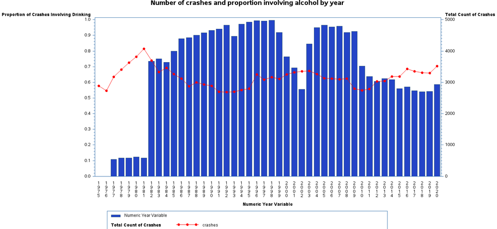
Question 1: Why isn't my legend defining the bar chart appropriately? Would like it to read, "Proportion of crashes that involved drinking".
Question 2: Again for the bar chart, I would like to custom define the bottom axis label from the variable label "Numeric Year Label" to simply say "Year". I have tried using every one of the axis statements (haxis, maxis, etc.) none seem to work
My code:
proc gbarline data=y_cd;
	TITLE 'Number of crashes and proportion involving alcohol by year';
	symbol1 c=red value=dot;
	axis1 label=("Proportion of Crashes Involving Drinking");
	axis2 label=("Total Count of Crashes");
	axis3 label=("Year");
	/* Bar plot legend */
	legend1 position=(bottom)
    label=("Proportion of Crashes Involving Drinking");
	/* Line plot legend */
	legend2 position=(bottom)
    label=(position=(left) j=l  "Total Count of Crashes") ;
	bar year_n / discrete sumvar=prop_drinking raxis=axis1 legend=legend1;
	plot / sumvar=crashes axis=axis2 legend=legend2;
	pattern1 value=s color=CX2444c7 value=s;
	legend1 across=4 frame label=none position=(bottom) shape=bar(2,.5);
run;
Resulting Image:
Accepted Solutions
- Mark as New
- Bookmark
- Subscribe
- Mute
- RSS Feed
- Permalink
- Report Inappropriate Content
I would recommend using the SGPLOT procedure to generate this output. Try the example below, substituting your data and variables in the statement. Let me know if you have any questions.
proc sgplot data=sashelp.class;
label weight="Proportion of Crashes Involving Drinking";
label height="Total Count of Crashes";
label age="Year";
yaxis offsetmin=0;
y2axis offsetmin=0 min=0;
vbar age / response=weight fillattrs=(color=cx2444c7);
vline age / response=height markers y2axis
            markerattrs=(color=red symbol=circlefilled);
run;- Mark as New
- Bookmark
- Subscribe
- Mute
- RSS Feed
- Permalink
- Report Inappropriate Content
yup, proc sgplot for the win yet again!
- Mark as New
- Bookmark
- Subscribe
- Mute
- RSS Feed
- Permalink
- Report Inappropriate Content
https://documentation.sas.com/doc/en/pgmsascdc/9.4_3.5/grstatproc/n1mp0swy0atvzun1oeqlkrg8d89o.htm
SAS Graphics might be older than you are 🙂
- Mark as New
- Bookmark
- Subscribe
- Mute
- RSS Feed
- Permalink
- Report Inappropriate Content
- Mark as New
- Bookmark
- Subscribe
- Mute
- RSS Feed
- Permalink
- Report Inappropriate Content
Typically the easiest way to label an AXIS for a horizontal axis main variable is to use a LABEL statement.
You don't show any attempt to use AXIS3 and I doubt the code you show created the picture because the appearance of the right-side response axis is your Axis2 definition or Raxis=Axis2, not Axis=Axis2.
One of the somewhat obnoxious bits of using the old device based graphics procs like Gbarline with the Global definition statements is the persistence of those definitions and appearance as defaults sometimes when you don't expect them. Since you don't provide any data it is hard to make an actual diagnosis. Note that AXIS=, since that should affect both the BAR and PLOT statements are not a good idea to use different values in both statements as you create conflicts.
Here is an example from GBARLINE documentation translated into Proc Sgplot. There are many more options in SGPLOT and that is where any development is going. Plus you do not need a license for SAS/Graph for the SG procedures.
data nyse;
   format Day date7.;
   format High Low Close comma12.;
   format Volume comma12.;
   input Day date7. High Low Close Volume;
datalines;
01AUG07 10478.76 10346.24 10426.91 1908809
02AUG07 11042.92 10298.44 10274.65 1807543
05AUG07 10498.22 10400.31 10456.43 1500656
06AUG07 10694.47 10636.32 10762.98 1498403
07AUG07 10801.12 10695.13 10759.48 1695602
run;
proc gbarline data=nyse;
bar day / discrete sumvar=volume space=4;
plot / sumvar=close;
label day='Day of test';
run;
quit;


proc sgplot data=nyse;
   vbarbasic day /response=volume;
   series x=day y=close/y2axis;
   y2axis values=(0 to 11000 by 1000) ;
run;
The Axis, Symbol, Pattern and Legend statements are not used. Instead each plot addresses axis with Xaxis, X2axis (top), Yaxis and Y2Axis(right) controls for axis. ODS Style definitions start the values for Symbol and Pattern equivalent or are overwritten in the Proc statement for style options or each plot. Legend is replaced by a Keylegend statement.
I was never particularly a fan of GBARLINE as it seemed to combine some of the worst features of Gchart without all of the functionality of Gplot for the lines.
Learn how use the CAT functions in SAS to join values from multiple variables into a single value.
Find more tutorials on the SAS Users YouTube channel.
SAS Training: Just a Click Away
Ready to level-up your skills? Choose your own adventure.


