- Home
- /
- Programming
- /
- Graphics
- /
- Re: polar plot with bias
- RSS Feed
- Mark Topic as New
- Mark Topic as Read
- Float this Topic for Current User
- Bookmark
- Subscribe
- Mute
- Printer Friendly Page
- Mark as New
- Bookmark
- Subscribe
- Mute
- RSS Feed
- Permalink
- Report Inappropriate Content
Hello,
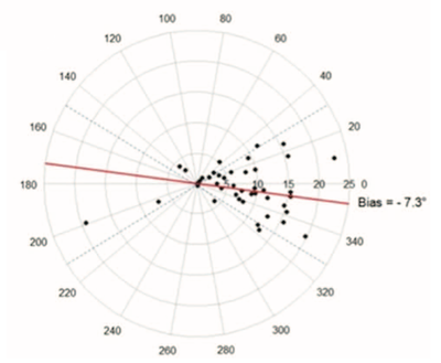
I am looking to graph a Polar plot for Δ between 2/3 methods. I read a lot of things but I am not sure of the great method to use and fear to do mistakes.
My aim is to represent the same polar plot that the pict.
I need to :
- plot points (mean of Δ for each individue);
- plot one line to represents the bias;
- other to ±30° lines;
- get the angular bias
Best
- Mark as New
- Bookmark
- Subscribe
- Mute
- RSS Feed
- Permalink
- Report Inappropriate Content
A discussion of polar plots is available at this blog post from 2012. It uses the Graph Template Language (GTL). Since then, a lot of additions have been made to PROC SGPLOT, so you can read a newer article about how to create similar polar plots with PROC SGPLOT.
- Mark as New
- Bookmark
- Subscribe
- Mute
- RSS Feed
- Permalink
- Report Inappropriate Content
- Mark as New
- Bookmark
- Subscribe
- Mute
- RSS Feed
- Permalink
- Report Inappropriate Content
In general, the more information you provide, the more the community can help. Post your data and what you have attempted so far.
- Mark as New
- Bookmark
- Subscribe
- Mute
- RSS Feed
- Permalink
- Report Inappropriate Content
@Mic35 wrote:
Hello,
I am looking to graph a Polar plot for Δ between 2/3 methods. I read a lot of things but I am not sure of the great method to use and fear to do mistakes.
My aim is to represent the same polar plot that the pict.
I need to :
- plot points (mean of Δ for each individue);
- plot one line to represents the bias;
- other to ±30° lines;
- get the angular biasBest
Do you already know the value of the line you need or are you expecting the plot procedure to estimate the bias? I doubt that a general plotting procedure will do that sort of fitting but may be wrong. Otherwise you may need to provide example data and the process for estimating the bias line.
I will admit that I am not familiar with this concept at all. But I really doubt that any plotting procedure can "get the angular bias". Likely that will have to be done separately.
- Mark as New
- Bookmark
- Subscribe
- Mute
- RSS Feed
- Permalink
- Report Inappropriate Content
The polar plot arrive after Bland-Altman step and four-quadrant
Process sometimes use in anesthesia - cardiology studies
Catch up on SAS Innovate 2026
Nearly 200 sessions are now available on demand with the SAS Innovate Digital Pass.
Explore Now →Learn how use the CAT functions in SAS to join values from multiple variables into a single value.
Find more tutorials on the SAS Users YouTube channel.
SAS Training: Just a Click Away
Ready to level-up your skills? Choose your own adventure.


