Hello,
I have a two fold question:
1. I Would like to replace Y axis values with legend is it possible to do this SAS GTL or any other SAS procedure? Alternatively how to place circle filled next to the y axis values. As an example, please see below for the graph, I would like to place blue filled circle next to Philip, and red filled circle next to Ronald.
2. How to manually specify the colors for the filled circle ?
Please SAS code for reproduciblity.
Many Thanks
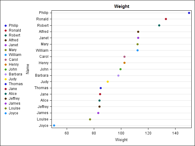
proc template;
define statgraph dotplot;
begingraph;
entrytitle "Weight";
layout overlay/yaxisopts = (type=discrete griddisplay=on reverse=true);
scatterplot x = weight y=name/markerattrs=(symbol=circlefilled) name='dot' group = name
legendlabel = 'Weight';
discretelegend 'dot'/halign = left ORDER=rowmajor across=1 BORDER = FALSE pad=(top=5 bottom=5);
endlayout;
endgraph;
end;
run;
proc sort data = sashelp.class out = class;
by descending weight;
run;
proc sgrender data = class template = dotplot;
run;


.jpg")

