- Home
- /
- Programming
- /
- Graphics
- /
- interrupted time series
- RSS Feed
- Mark Topic as New
- Mark Topic as Read
- Float this Topic for Current User
- Bookmark
- Subscribe
- Mute
- Printer Friendly Page
- Mark as New
- Bookmark
- Subscribe
- Mute
- RSS Feed
- Permalink
- Report Inappropriate Content
hi!
I have  a data ( number of  crashes ). I used interrupted time series to show the effect of speed camera that introduced at time=49
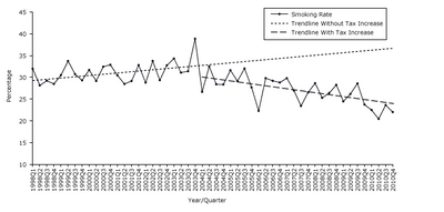
I want to plot in one graph as in the Figure1a in the link http://www.cdc.gov/pcd/issues/2013/12_0268.htm

30 1
26 2
39 3
44 4
35 5
20 6
27 7
67 8
25 9
39 10
69 11
74 12
45 13
41 14
50 15
67 16
55 17
77 18
41 19
38 20
38 21
46 22
45 23
62 24
60 25
62 26
49 27
60 28
78 29
69 30
64 31
86 32
68 33
53 34
59 35
56 36
68 37
57 38
59 39
101 40
63 41
90 42
92 43
64 44
77 45
69 46
82 47
70 48
63 49
66 50
78 51
94 52
88 53
62 54
77 55
92 56
76 57
55 58
70 59
54 60
76 61
58 62
58 63
79 64
77 65
79 66
;
Accepted Solutions
- Mark as New
- Bookmark
- Subscribe
- Mute
- RSS Feed
- Permalink
- Report Inappropriate Content
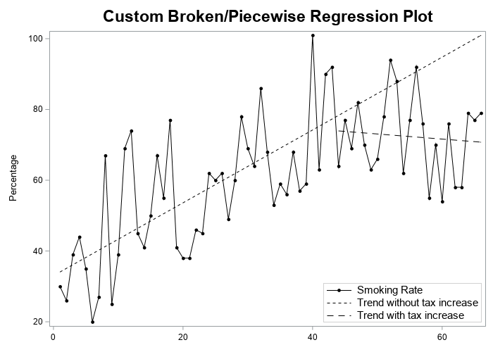
Here's one "brute force" way to do it (somebody might come up with a more elegant way to do it). It produces the following plot:
data my_data;
format time comma8.0 value comma8.0;
input value time;
if time <=43 then series1=value;
else series2=value;
datalines;
30 1
26 2
39 3
44 4
35 5
20 6
27 7
67 8
25 9
39 10
69 11
74 12
45 13
41 14
50 15
67 16
55 17
77 18
41 19
38 20
38 21
46 22
45 23
62 24
60 25
62 26
49 27
60 28
78 29
69 30
64 31
86 32
68 33
53 34
59 35
56 36
68 37
57 38
59 39
101 40
63 41
90 42
92 43
64 44
77 45
69 46
82 47
70 48
63 49
66 50
78 51
94 52
88 53
62 54
77 55
92 56
76 57
55 58
70 59
54 60
76 61
58 62
58 63
79 64
77 65
79 66
;
run;
proc reg data=my_data plots=none noprint;
model series1 = time;
output out=my_data p=series1_predicted;
run;
proc reg data=my_data plots=none noprint;
model series2 = time;
output out=my_data p=series2_predicted;
run;
data my_data; set my_data;
if time<=43 then series2_predicted=.;
run;
title1 height=16pt "Custom Broken/Piecewise Regression Plot";
proc sgplot data=my_data;
label value='Smoking Rate';
label series1_predicted='Trend without tax increase';
label series2_predicted='Trend with tax increase';
series x=time y=value / lineattrs=(color=black)
markers markerattrs=(size=6px color=black symbol=circlefilled);
series x=time y=series1_predicted / lineattrs=(color=black pattern=shortdash);
series x=time y=series2_predicted / lineattrs=(color=black pattern=dash);
yaxis label="Percentage";
xaxis display=(nolabel);
keylegend / across=1 position=bottomright location=inside
linelength=35px border valueattrs=(size=11pt);
run;
- Mark as New
- Bookmark
- Subscribe
- Mute
- RSS Feed
- Permalink
- Report Inappropriate Content
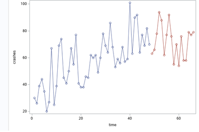
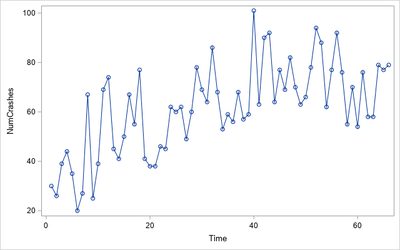
I am not sure what question you are asking. You can use PROC SGPLOT to create the plot of NumCrashes vs Time:
proc sgplot data=Have;
  series y=NumCrashes x=Time / markers;
run;
- Mark as New
- Bookmark
- Subscribe
- Mute
- RSS Feed
- Permalink
- Report Inappropriate Content
thank you
I used intervention analysis. so, i need to plot a graph similar to the picture below.
- Mark as New
- Bookmark
- Subscribe
- Mute
- RSS Feed
- Permalink
- Report Inappropriate Content
OK, so add the two fit lines to the data set that has the data. Use a binary indicator variable to specify which predicted values are for the pre/post model. Then add another SERIES statement, like this
series x=Time y=Predicted / group=PrePost;
For example:
proc sort data=Sashelp.Class out=Have;
by Height;
run;

data Pred;
input PrePost Height Predicted;
datalines;
1 51  56
1 72 150
2 64 110
2 72 100
;

data All;
set Have Pred;
run;

proc sgplot data=All;
series x=Height y=Weight;
series x=Height y=Predicted / group=PrePost;
run;- Mark as New
- Bookmark
- Subscribe
- Mute
- RSS Feed
- Permalink
- Report Inappropriate Content
ok, I need the regression lines in the graph!
- Mark as New
- Bookmark
- Subscribe
- Mute
- RSS Feed
- Permalink
- Report Inappropriate Content
Do you have the regression lines or not? In your original post you said "I used interrupted time series to show the effect of ...," which sounds like you already have the regression line.
If you want OLS lines for each segment, you can use
REG x=Time y=NumCrashes / group=PrePost;
Be aware, however, that those are least squares regression lines. If you want something more sophisticated, fit a model to the data and use the OUTPUT statement to output the predicted values to a SAS data set, then use my earlier method.
- Mark as New
- Bookmark
- Subscribe
- Mute
- RSS Feed
- Permalink
- Report Inappropriate Content
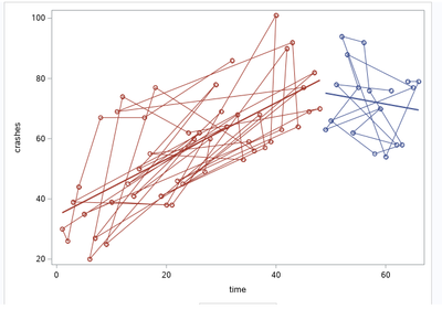
i used this code
proc sgplot data=FitOut;
scatter x=time y=crashes / group=group;
series x=time y=crashes/ group=group;
reg x=time y=crashes/ group=group;
run;
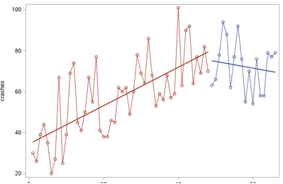
and the result as show below. I used linear regression and I have the equation of the regression but I want to show the regression lines in the graph in two period ( before and after )
- Mark as New
- Bookmark
- Subscribe
- Mute
- RSS Feed
- Permalink
- Report Inappropriate Content
Notice the PROC SORT at the top of my example. Try this:
proc sort data=FitOut;
by group time;
run;

proc sgplot data=FitOut;
series x=time y=crashes/ group=group markers;
reg x=time y=crashes/ group=group nomarkers;
run;
- Mark as New
- Bookmark
- Subscribe
- Mute
- RSS Feed
- Permalink
- Report Inappropriate Content
Thank you, this what i asked for
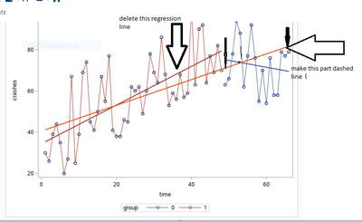
if possible, I want to delete the regression line for the first period and make it for all period (1-66) .how?
- Mark as New
- Bookmark
- Subscribe
- Mute
- RSS Feed
- Permalink
- Report Inappropriate Content
- Mark as New
- Bookmark
- Subscribe
- Mute
- RSS Feed
- Permalink
- Report Inappropriate Content
Here's one "brute force" way to do it (somebody might come up with a more elegant way to do it). It produces the following plot:
data my_data;
format time comma8.0 value comma8.0;
input value time;
if time <=43 then series1=value;
else series2=value;
datalines;
30 1
26 2
39 3
44 4
35 5
20 6
27 7
67 8
25 9
39 10
69 11
74 12
45 13
41 14
50 15
67 16
55 17
77 18
41 19
38 20
38 21
46 22
45 23
62 24
60 25
62 26
49 27
60 28
78 29
69 30
64 31
86 32
68 33
53 34
59 35
56 36
68 37
57 38
59 39
101 40
63 41
90 42
92 43
64 44
77 45
69 46
82 47
70 48
63 49
66 50
78 51
94 52
88 53
62 54
77 55
92 56
76 57
55 58
70 59
54 60
76 61
58 62
58 63
79 64
77 65
79 66
;
run;
proc reg data=my_data plots=none noprint;
model series1 = time;
output out=my_data p=series1_predicted;
run;
proc reg data=my_data plots=none noprint;
model series2 = time;
output out=my_data p=series2_predicted;
run;
data my_data; set my_data;
if time<=43 then series2_predicted=.;
run;
title1 height=16pt "Custom Broken/Piecewise Regression Plot";
proc sgplot data=my_data;
label value='Smoking Rate';
label series1_predicted='Trend without tax increase';
label series2_predicted='Trend with tax increase';
series x=time y=value / lineattrs=(color=black)
markers markerattrs=(size=6px color=black symbol=circlefilled);
series x=time y=series1_predicted / lineattrs=(color=black pattern=shortdash);
series x=time y=series2_predicted / lineattrs=(color=black pattern=dash);
yaxis label="Percentage";
xaxis display=(nolabel);
keylegend / across=1 position=bottomright location=inside
linelength=35px border valueattrs=(size=11pt);
run;
- Mark as New
- Bookmark
- Subscribe
- Mute
- RSS Feed
- Permalink
- Report Inappropriate Content
@GraphGuy thank you, you are right, this is a Piecewise Regression
but how can get the coefficients (regression equation ) for the Piecewise Regression and R square by sas ?
- Mark as New
- Bookmark
- Subscribe
- Mute
- RSS Feed
- Permalink
- Report Inappropriate Content
I believe we have answered your questions about how to create a graph. If you want to learn more about regression in SAS, you might want to open a separate thread in the Statistical Procedures Community.
All of your questions can be answered by a Google search or by reading the SAS documentation (especially the Getting Started examples) for PROC GLM. There are many blog posts about regression models that change at a cutpoint.
There are also papers about piecewise linear models.Keywords are
+SAS piecewise linear regression model
Good luck with your project.
- Mark as New
- Bookmark
- Subscribe
- Mute
- RSS Feed
- Permalink
- Report Inappropriate Content
useful links.I got what I want
thank you
Catch up on SAS Innovate 2026
Dive into keynotes, announcements and breakthroughs on demand.
Explore Now →Learn how use the CAT functions in SAS to join values from multiple variables into a single value.
Find more tutorials on the SAS Users YouTube channel.
SAS Training: Just a Click Away
Ready to level-up your skills? Choose your own adventure.

