- Home
- /
- Programming
- /
- Graphics
- /
- how to create multiple lines plot
- RSS Feed
- Mark Topic as New
- Mark Topic as Read
- Float this Topic for Current User
- Bookmark
- Subscribe
- Mute
- Printer Friendly Page
- Mark as New
- Bookmark
- Subscribe
- Mute
- RSS Feed
- Permalink
- Report Inappropriate Content
| pool | count | average | upper | lower |
| 1 | 2068 | 0.0953 | 0.1059 | 0.0846 |
| 2 | 6120 | 0.2408 | 0.2498 | 0.2319 |
| 3 | 6215 | 0.3390 | 0.3489 | 0.3291 |
| 4 | 4625 | 0.4244 | 0.4364 | 0.4125 |
| 5 | 1695 | 0.5268 | 0.5468 | 0.5069 |
Hello everyone, know someone how to easily get multiple lines plot from these data?
Upper and lower are confidence interval, average is mean. Count is not relevant and pool is some group.
I'll be glad for any help.
Accepted Solutions
- Mark as New
- Bookmark
- Subscribe
- Mute
- RSS Feed
- Permalink
- Report Inappropriate Content
UNTESTED CODE
proc sgplot data=have;
    series x=pool y=average;
    series x=pool y=upper;
    series x=pool y=lower;
run;
If you want tested code (and this is always a good idea anyway, @matus2711 ) provide the data as SAS data step code (instructions) and not as a screen capture, something you should just do automatically, every time you ask a question; and from now on we will expect data in this form and not as screen captures.
Paige Miller
- Mark as New
- Bookmark
- Subscribe
- Mute
- RSS Feed
- Permalink
- Report Inappropriate Content
Usually, when someone wants a line plot there is an X (indep) and a Y variable (response). What variable do you want to use as X?
For these data, you can create a set of lines that show the average and CI for each group. This kind of plot is sometimes called a "forest plot." It can be used to compare means of groups or to show odds ratios.
data Have;
input pool	count	average	upper	lower;
datalines;
1	2068	0.0953	0.1059	0.0846
2	6120	0.2408	0.2498	0.2319
3	6215	0.3390	0.3489	0.3291
4	4625	0.4244	0.4364	0.4125
5	1695	0.5268	0.5468	0.5069
;

proc sgplot data=Have;
   scatter x=pool y=average / yerrorlower=lower yerrorupper=upper;
run;
If you want a different plot, please specify or draw it on paper and upload a picture.
- Mark as New
- Bookmark
- Subscribe
- Mute
- RSS Feed
- Permalink
- Report Inappropriate Content
Since the answer from @Rick_SAS is a better answer than mine, would you please mark his answer as correct? Thanks!
Paige Miller
- Mark as New
- Bookmark
- Subscribe
- Mute
- RSS Feed
- Permalink
- Report Inappropriate Content
To expand on Paige's gracious response, some graphical experts discourage connecting groups with line segments. There is no "Group=1.5" or "Group=2.8", so some folks argue that it is misleading to plot line segments.
- Mark as New
- Bookmark
- Subscribe
- Mute
- RSS Feed
- Permalink
- Report Inappropriate Content
@Rick_SAS wrote:
To expand on Paige's gracious response, some graphical experts discourage connecting groups with line segments. There is no "Group=1.5" or "Group=2.8", so some folks argue that it is misleading to plot line segments.
A good point from @Rick_SAS , it is a very common thing for people to treat groups as continuous in their plots, and (ideally) is should be a much less common situation.
Paige Miller
- Mark as New
- Bookmark
- Subscribe
- Mute
- RSS Feed
- Permalink
- Report Inappropriate Content
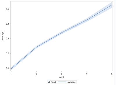
proc sgplot data=have;
    band x=pool upper=upper lower=lower/transpancy=0.5;
	series x=pool y=average;
run;
Catch up on SAS Innovate 2026
Dive into keynotes, announcements and breakthroughs on demand.
Explore Now →Learn how use the CAT functions in SAS to join values from multiple variables into a single value.
Find more tutorials on the SAS Users YouTube channel.
SAS Training: Just a Click Away
Ready to level-up your skills? Choose your own adventure.


