- Home
- /
- Programming
- /
- Graphics
- /
- data driven coloring in sgplot
- RSS Feed
- Mark Topic as New
- Mark Topic as Read
- Float this Topic for Current User
- Bookmark
- Subscribe
- Mute
- Printer Friendly Page

- Mark as New
- Bookmark
- Subscribe
- Mute
- RSS Feed
- Permalink
- Report Inappropriate Content
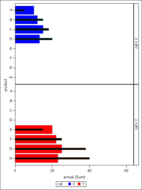
Hello, I need to create a bullet graph by category. I have actual sales and predicted sales for individual products and the are grouped by category. I would like to use different colors for each category and in the legend show only actual and predicted sales. When I used ssgpanel, the p[roblem I'm facing is that the products in one category is also appearing in other category. Please see below for a reproducible example. I'm using SAS 9.3.
My question is: how can I create a bullet graph by data driven color schemes ?
data sales;
input cat $ product $ actual predict;
datalines;
X A 10 5
X B 12 15
X C 15 18
X D 13 20
Y E 20 15
Y F 22 25
Y G 25 38
Y H 23 40
;
run;
data attrs;
input id $ value $ fillcolor $;
datalines;
my_id X blue
my_id Y red
;
run;
proc sgpanel data = sales dattrmap=attrs;
PANELBY cat/LAYOUT= rowlattice;
hbar product/response = actual group = cat attrid=my_id ;
hbar product/response = predict group = cat BARWIDTH =0.2 FILLATTRS = (color = black) ;
run;
Products E,F,G and H appear in cat x even though cat x does not have these products vice versa.
Accepted Solutions

- Mark as New
- Bookmark
- Subscribe
- Mute
- RSS Feed
- Permalink
- Report Inappropriate Content
Add UNISCALE=COLUMN to the PANELBY statement, and you should get what you want.
- Mark as New
- Bookmark
- Subscribe
- Mute
- RSS Feed
- Permalink
- Report Inappropriate Content
Add UNISCALE=COLUMN to the PANELBY statement, and you should get what you want.
- Mark as New
- Bookmark
- Subscribe
- Mute
- RSS Feed
- Permalink
- Report Inappropriate Content
Thank you this worked perfectly.
.jpg")
Catch up on SAS Innovate 2026
Nearly 200 sessions are now available on demand in the Innovate Hub.
Watch Now →Learn how use the CAT functions in SAS to join values from multiple variables into a single value.

Find more tutorials on the SAS Users YouTube channel.
SAS Training: Just a Click Away
Ready to level-up your skills? Choose your own adventure.
-
2 replies
-
03-09-2015 09:49 AM
-
2399 views
-
0 likes
-
2 in conversation
-
