- Home
- /
- Programming
- /
- Graphics
- /
- create 3d clustered bar chart 2 variables side by side using SAS 9.4
- RSS Feed
- Mark Topic as New
- Mark Topic as Read
- Float this Topic for Current User
- Bookmark
- Subscribe
- Mute
- Printer Friendly Page
- Mark as New
- Bookmark
- Subscribe
- Mute
- RSS Feed
- Permalink
- Report Inappropriate Content
I have a data set that consists of 11 provinces, semi annual time periods, a indicator, actual value and target value. I'm trying to create a 3d bar chart with axises province X timePeriod X value and then for each province and time period show 2 bars one for actual and one for target.
My dataset looks like this:
PROVINCE    PERIOD  VAR VALUE
Bandundu    2013S1  OUT_BUD_ODE 250000
Bandundu    2013S1  TAR_BUD_ODE 545000
Bandundu    2013S2  OUT_BUD_ODE 283000
Bandundu    2013S2  TAR_BUD_ODE 545000
Bandundu    2014S1  OUT_BUD_ODE 800000
Bandundu    2014S1  TAR_BUD_ODE 645000
Bandundu    2014S2  OUT_BUD_ODE 700000
Bandundu    2014S2  TAR_BUD_ODE 645000
Bandundu    2015S1  OUT_BUD_ODE 369363
Bandundu    2015S1  TAR_BUD_ODE 945288
Bandundu    2015S2  OUT_BUD_ODE 1217449
Bandundu    2015S2  TAR_BUD_ODE 958417
Bandundu    2016S1  OUT_BUD_ODE 96618
Bandundu    2016S1  TAR_BUD_ODE 787740
Bandundu    2016S2  OUT_BUD_ODE 1358568
Bandundu    2016S2  TAR_BUD_ODE 787740
Bandundu    2017S1  OUT_BUD_ODE 1312900
Bandundu    2017S1  TAR_BUD_ODE 311729
Bandundu    2017S2  OUT_BUD_ODE .
Bandundu    2017S2  TAR_BUD_ODE 1299771
Bas-Congo   2013S1  OUT_BUD_ODE 150000
Bas-Congo   2013S1  TAR_BUD_ODE 450000
Bas-Congo   2013S2  OUT_BUD_ODE 145000
Bas-Congo   2013S2  TAR_BUD_ODE 450000
Bas-Congo   2014S1  OUT_BUD_ODE 1000000
Bas-Congo   2014S1  TAR_BUD_ODE 900965
Bas-Congo   2014S2  OUT_BUD_ODE 900000
Bas-Congo   2014S2  TAR_BUD_ODE 900965
Bas-Congo   2015S1  OUT_BUD_ODE 433892
Bas-Congo   2015S1  TAR_BUD_ODE 1115965
Bas-Congo   2015S2  OUT_BUD_ODE 943387
Bas-Congo   2015S2  TAR_BUD_ODE 1115965
Bas-Congo   2016S1  OUT_BUD_ODE 552002
.
.
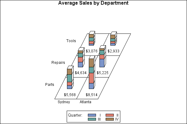
The following code is almost there but it stacks the values instead of placing them side by side:
    /* Generate the block chart */
proc gchart data=totals;
format quarter roman.;
format sales dollar8.;
label site='00'x dept='00'x;
block site / sumvar=sales
             type=mean
             midpoints='Sydney' 'Atlanta'
             group=dept
             subgroup=quarter
             legend=legend1
             noheading
             coutline=black
             caxis=black;
run;
quit;
- Mark as New
- Bookmark
- Subscribe
- Mute
- RSS Feed
- Permalink
- Report Inappropriate Content
Unless a 3D bar chart is a must, you can use the SGPANEL procedure to panel the graph by province, and then display a side-by-side cluster group bar chart of Actual and Target by date. See third graph in this article: https://blogs.sas.com/content/graphicallyspeaking/2012/03/30/cluster-groups/
- Mark as New
- Bookmark
- Subscribe
- Mute
- RSS Feed
- Permalink
- Report Inappropriate Content
Catch up on SAS Innovate 2026
Nearly 200 sessions are now available on demand with the SAS Innovate Digital Pass.
Explore Now →Learn how use the CAT functions in SAS to join values from multiple variables into a single value.
Find more tutorials on the SAS Users YouTube channel.
SAS Training: Just a Click Away
Ready to level-up your skills? Choose your own adventure.


