- Home
- /
- Programming
- /
- Graphics
- /
- bar line plot with line on first axis
- RSS Feed
- Mark Topic as New
- Mark Topic as Read
- Float this Topic for Current User
- Bookmark
- Subscribe
- Mute
- Printer Friendly Page
- Mark as New
- Bookmark
- Subscribe
- Mute
- RSS Feed
- Permalink
- Report Inappropriate Content
dear forumers,
I'm running version 9.2 and need to draw with sgplot a bar-line plot where the line is accounted for by the first axis.
the two plots have very different scales. I don't need actually to have a second axis for the bars as I would add the datalabel above each bar.
I learned through this forum that it is not possible by coding within the sgplot itself but I was wondering if there is any solutions involving GTL.
Even a solution with sgpanel would be probably fine.
any suggestions is greatly appreciated
Accepted Solutions
- Mark as New
- Bookmark
- Subscribe
- Mute
- RSS Feed
- Permalink
- Report Inappropriate Content
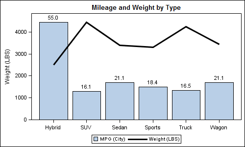
Here I have used mean of mpg_mean for BarChart and wt_mean for SeriesPlot. BarChart is on Y2axis to prevent merging of the axis range. Y2 axis is not displayed and the Bar values are displayed on the bar. You can label the seriesplot instead of bar if you want or rearrange the values around in the legend.
proc means data=sashelp.cars;
class type;
var mpg_city weight;
output out=carmeans mean=mpg_mean wt_mean;
run;
proc print;run;
proc template;
define statgraph cars;
begingraph;
entrytitle 'Mileage and Weight by Type';
layout overlay / y2axisopts=(display=none offsetmin=0 linearopts=(viewmin=0))
yaxisopts=(offsetmin=0 linearopts=(viewmin=0))
xaxisopts=(display=(ticks tickvalues line));
barchart x=type y=mpg_mean / yaxis=y2 barlabel=true name='m' barlabelattrs=(size=9);
seriesplot x=type y=wt_mean / name='w' lineattrs=(thickness=3);
discretelegend 'm' 'w';
endlayout;
endgraph;
end;
run;
ods listing;
ods graphics / reset width=5in height=3in imagename='CarMpgWeight';
proc sgrender data=carmeans template=cars;
format mpg_mean 4.1;
run;

- Mark as New
- Bookmark
- Subscribe
- Mute
- RSS Feed
- Permalink
- Report Inappropriate Content
If you don't find an sgplot or GTL solution, here's how to do it using good-old gplot (using the 'needle' interpolation to simulate a bar)...
data my_data; set sashelp.class;
x_var=_n_;
run;
data my_anno; set my_data;
xsys='2'; ysys='2'; hsys='3'; when='a';
x=x_var; y=weight;
function='label'; position='2'; size=1.5;
text=trim(left(weight));
run;
axis1 label=(j=c 'Height' j=c '(line)') offset=(0,0);
axis2 label=none major=none minor=none value=none offset=(0,0);
axis3 minor=none offset=(3,3);
symbol1 value=dot interpol=join color=blue;
symbol2 value=none interpol=needle width=7 color=green;
proc gplot data=my_data;
plot height*x_var=1 / vzero vaxis=axis1 haxis=axis3;
plot2 weight*x_var=2 / vzero vaxis=axis2 anno=my_anno;
run;
- Mark as New
- Bookmark
- Subscribe
- Mute
- RSS Feed
- Permalink
- Report Inappropriate Content
The simplest solution is:
proc sgplot data=sashelp.cars;
vbar type / response=mpg_city stat=mean;
vline type / response=mpg_highway stat=mean;
run;
The data range for the Y axis will be a union of the two.
SGPLOT VBAR statement does not support Y2AXIS. You can use GTL to do everything you want provided you summarize the data for the SERIESPLOT. I will add an example shortly.
- Mark as New
- Bookmark
- Subscribe
- Mute
- RSS Feed
- Permalink
- Report Inappropriate Content
Here I have used mean of mpg_mean for BarChart and wt_mean for SeriesPlot. BarChart is on Y2axis to prevent merging of the axis range. Y2 axis is not displayed and the Bar values are displayed on the bar. You can label the seriesplot instead of bar if you want or rearrange the values around in the legend.
proc means data=sashelp.cars;
class type;
var mpg_city weight;
output out=carmeans mean=mpg_mean wt_mean;
run;
proc print;run;
proc template;
define statgraph cars;
begingraph;
entrytitle 'Mileage and Weight by Type';
layout overlay / y2axisopts=(display=none offsetmin=0 linearopts=(viewmin=0))
yaxisopts=(offsetmin=0 linearopts=(viewmin=0))
xaxisopts=(display=(ticks tickvalues line));
barchart x=type y=mpg_mean / yaxis=y2 barlabel=true name='m' barlabelattrs=(size=9);
seriesplot x=type y=wt_mean / name='w' lineattrs=(thickness=3);
discretelegend 'm' 'w';
endlayout;
endgraph;
end;
run;
ods listing;
ods graphics / reset width=5in height=3in imagename='CarMpgWeight';
proc sgrender data=carmeans template=cars;
format mpg_mean 4.1;
run;

- Mark as New
- Bookmark
- Subscribe
- Mute
- RSS Feed
- Permalink
- Report Inappropriate Content
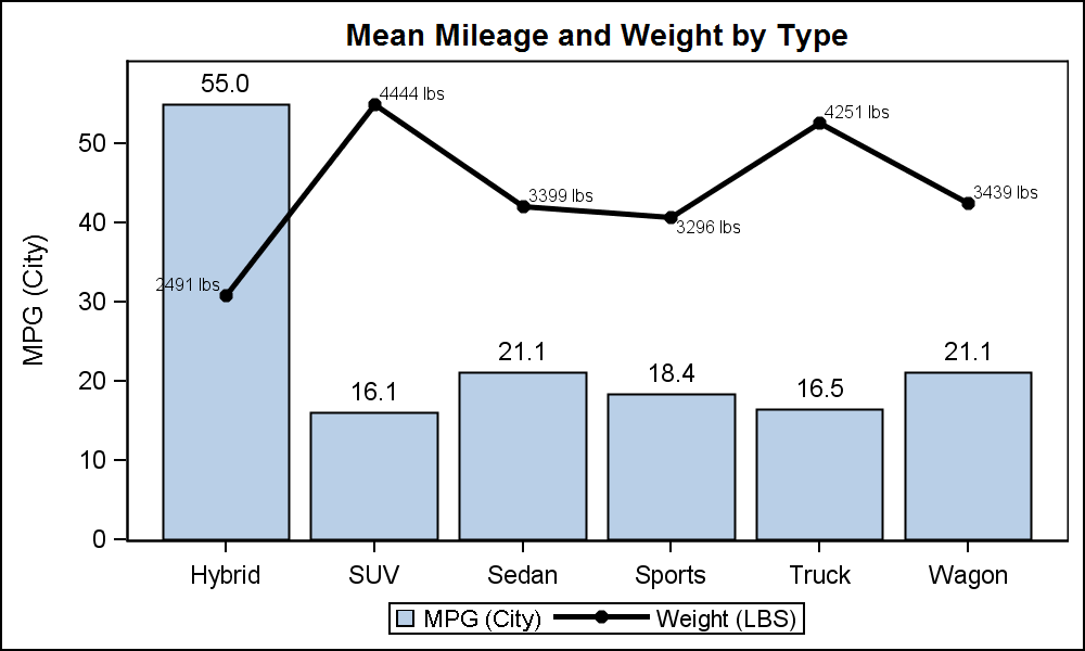
While the above graph looked reasonable right after I made it, when I came back to it, I could not understand why it appeared as if Hybrids had an average weight of over 4000 lbs. The association between the left axis and the bar chart is very strong, that any consumer of this graph may be mislead to think the bar represents weight, even when it is labeled with the Mileage value. If we want only one axis, the following graph with both plots showing data labels may be better:

proc means data=sashelp.cars;
class type;
var mpg_city weight;
output out=carmeans mean=mpg_mean wt_mean;
run;
data cars;
set carmeans;
length wt_label $16;
wt_label=put(wt_mean, 5.0) || ' lbs';
run;
proc print;run;
proc template;
define statgraph cars;
begingraph;
entrytitle 'Mean Mileage and Weight by Type';
layout overlay / y2axisopts=(display=none offsetmin=0 linearopts=(viewmin=0))
yaxisopts=(offsetmin=0 linearopts=(viewmin=0))
xaxisopts=(display=(ticks tickvalues line));
barchart x=type y=mpg_mean / barlabel=true name='m' barlabelattrs=(size=9);
seriesplot x=type y=wt_mean / yaxis=y2 name='w' datalabel=wt_label
lineattrs=(thickness=3) display=(markers) markerattrs=(symbol=circlefilled) ;
discretelegend 'm' 'w';
endlayout;
endgraph;
end;
run;
ods listing gpath='C:\Work\Blogs\Communities\images';
ods graphics / reset width=5in height=3in imagename='CarMpgWeight2';
proc sgrender data=cars template=cars;
format mpg_mean 4.1;
format wt_mean 5.0;
run;
- Mark as New
- Bookmark
- Subscribe
- Mute
- RSS Feed
- Permalink
- Report Inappropriate Content
hi sanjay, thank you very much. It looks exactly what I was looking for.
Catch up on SAS Innovate 2026
Dive into keynotes, announcements and breakthroughs on demand.
Explore Now →Learn how use the CAT functions in SAS to join values from multiple variables into a single value.
Find more tutorials on the SAS Users YouTube channel.
SAS Training: Just a Click Away
Ready to level-up your skills? Choose your own adventure.


