- Home
- /
- Programming
- /
- Graphics
- /
- Why the split option is not working in proc sgplot?
- RSS Feed
- Mark Topic as New
- Mark Topic as Read
- Float this Topic for Current User
- Bookmark
- Subscribe
- Mute
- Printer Friendly Page
- Mark as New
- Bookmark
- Subscribe
- Mute
- RSS Feed
- Permalink
- Report Inappropriate Content
Hi all,
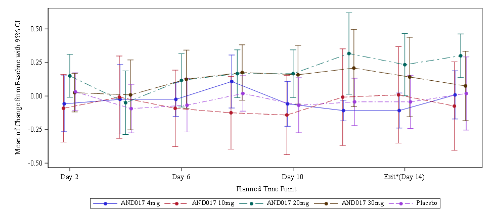
I am trying to split the xasix values in two lines with PROC SGPLOT but it is not working.
Thanks for your idea.
proc sgplot data=trt;
  scatter x=vis y=mean/group=trt01an yerrorlower=lower yerrorupper=upper markerattrs=(symbol=circlefilled) ;
  series x=vis y=mean/group=trt markers markerattrs=(symbol=circlefilled) name='a';
  keylegend 'a'/location=outside position=BOTTOM;
  xaxis values=(1 2 3 4 5 6 7 8) VALUESDISPLAY=("Day 2" "Day 4" "Day 6" "Day 8" "Day 10" "24 hour post*the last dose"
  "Exit*(Day 14)" "Follow up*(Day 17)")  FITPOLICY=SPLIT SPLITCHAR="*"  label='Planned Time Point' offsetmin=0.05 offsetmax=0.05;
  yaxis label='Mean of Change from Baseline with 95% CI';
run;Accepted Solutions
- Mark as New
- Bookmark
- Subscribe
- Mute
- RSS Feed
- Permalink
- Report Inappropriate Content
I believe the reason that you're getting the behavior you're getting is that a FITPOLICY of SPLIT does not work on a LINEAR axis. Try doing the following:
1. Since you're placing your data in equidistant locations, set TYPE=DISCRETE on the XAXIS.
2. It appears that you always want to split on the "*", so use FITPOLICY=SPLITALWAYS instead of SPLIT. The SPLIT policy will happen only if there is a tick value collision while fitting.
3. On the SCATTER and SERIES, set GROUPDISPLAY=CLUSTER. This will cluster each of your groups around each X value. Make sure your "vis" values are only 1-8, as it appears like the X values might be adjusted slightly to get the look in your picture.
Hope this helps!
Dan
- Mark as New
- Bookmark
- Subscribe
- Mute
- RSS Feed
- Permalink
- Report Inappropriate Content
Hi and welcome to the SAS Communities 🙂
What are you trying to achieve? Can you explain a bit further what your desired result looks like?
- Mark as New
- Bookmark
- Subscribe
- Mute
- RSS Feed
- Permalink
- Report Inappropriate Content
I believe the reason that you're getting the behavior you're getting is that a FITPOLICY of SPLIT does not work on a LINEAR axis. Try doing the following:
1. Since you're placing your data in equidistant locations, set TYPE=DISCRETE on the XAXIS.
2. It appears that you always want to split on the "*", so use FITPOLICY=SPLITALWAYS instead of SPLIT. The SPLIT policy will happen only if there is a tick value collision while fitting.
3. On the SCATTER and SERIES, set GROUPDISPLAY=CLUSTER. This will cluster each of your groups around each X value. Make sure your "vis" values are only 1-8, as it appears like the X values might be adjusted slightly to get the look in your picture.
Hope this helps!
Dan
- Mark as New
- Bookmark
- Subscribe
- Mute
- RSS Feed
- Permalink
- Report Inappropriate Content
Amazing! It's working!
Thank you very muck!
You're a Picasso in the SAS figure.
Catch up on SAS Innovate 2026
Nearly 200 sessions are now available on demand with the SAS Innovate Digital Pass.
Explore Now →Learn how use the CAT functions in SAS to join values from multiple variables into a single value.
Find more tutorials on the SAS Users YouTube channel.
SAS Training: Just a Click Away
Ready to level-up your skills? Choose your own adventure.


