- Home
- /
- Programming
- /
- Graphics
- /
- Time Series Plot with reference line
- RSS Feed
- Mark Topic as New
- Mark Topic as Read
- Float this Topic for Current User
- Bookmark
- Subscribe
- Mute
- Printer Friendly Page
- Mark as New
- Bookmark
- Subscribe
- Mute
- RSS Feed
- Permalink
- Report Inappropriate Content
I have the following data.
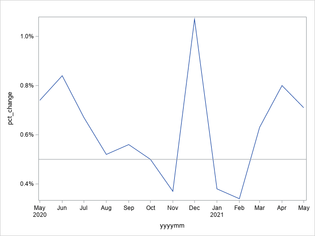
I want to plot the pct_change(on y axis) and yyyymm (on x axis).
Also, is there a way to add 2 reference lines?
%let lower_reference_line=-0.5;
%let upper_reference_line= 0.5;

data temp;
infile datalines missover dsd dlm=" ";
input yyyymm pct_change;
informat yyyymm yymmdd10. pct_change percent10.2;
format yyyymm yymmdd10. pct_change percent10.2;
datalines;
2020-05-01 0.74%
2020-06-01 0.84%
2020-07-01 0.67%
2020-08-01 0.52%
2020-09-01 0.56%
2020-10-01 0.50%
2020-11-01 0.37%
2020-12-01 1.07%
2021-01-01 0.38%
2021-02-01 0.34%
2021-03-01 0.63%
2021-04-01 0.80%
2021-05-01 0.71%
;run;
I tried a couple of things but the layout of X-axis is weird.
Please advise.
Thank You.
Accepted Solutions
- Mark as New
- Bookmark
- Subscribe
- Mute
- RSS Feed
- Permalink
- Report Inappropriate Content
Where do you want the reference lines? Which direction would they run?
When dealing with dates on an axis you may have to sort the data by the date variable to get a better graph. Your example data doesn't show anything weird on the xaxis. SAS will attempt to make "nice" tickmarks based on the range of values if you do not provide an XAXIS statement to set the properties. Your example data covers a period of a year so shows one tick for each month and the year where it changes.
This places a reference line at the .5% line in a graph.
proc sgplot data=temp;
   series x=yyyymm y=pct_change ;
   /* horizontal reference line at .5%*/
   refline  .005 ;
   yaxis values=(0 to .02 by 0.005);
run;
Your values in the macro variables would be WAY out of range for the given percentages you show. 0.5 = 50%.
So a clearer description of where, in relation to the data values you expect these reference lines to appear is needed.
Or did you want to show a some sort of band around the generated series line? That would require adding some variables to your data to indicate the upper/lower bounds at each point. But again, .5 is likely to be right out as an actual offset.
- Mark as New
- Bookmark
- Subscribe
- Mute
- RSS Feed
- Permalink
- Report Inappropriate Content
Hello,
You can try this code. You need to remember to divide the refline by 100 too, hence 0.005 should be used.
proc sgplot data = temp;
  series x = yyyymm y = pct_change;
  refline 0.005 /axis = y;
run;
Thanks
- Mark as New
- Bookmark
- Subscribe
- Mute
- RSS Feed
- Permalink
- Report Inappropriate Content
- Mark as New
- Bookmark
- Subscribe
- Mute
- RSS Feed
- Permalink
- Report Inappropriate Content
Where do you want the reference lines? Which direction would they run?
When dealing with dates on an axis you may have to sort the data by the date variable to get a better graph. Your example data doesn't show anything weird on the xaxis. SAS will attempt to make "nice" tickmarks based on the range of values if you do not provide an XAXIS statement to set the properties. Your example data covers a period of a year so shows one tick for each month and the year where it changes.
This places a reference line at the .5% line in a graph.
proc sgplot data=temp;
   series x=yyyymm y=pct_change ;
   /* horizontal reference line at .5%*/
   refline  .005 ;
   yaxis values=(0 to .02 by 0.005);
run;
Your values in the macro variables would be WAY out of range for the given percentages you show. 0.5 = 50%.
So a clearer description of where, in relation to the data values you expect these reference lines to appear is needed.
Or did you want to show a some sort of band around the generated series line? That would require adding some variables to your data to indicate the upper/lower bounds at each point. But again, .5 is likely to be right out as an actual offset.
- Mark as New
- Bookmark
- Subscribe
- Mute
- RSS Feed
- Permalink
- Report Inappropriate Content
Catch up on SAS Innovate 2026
Dive into keynotes, announcements and breakthroughs on demand.
Explore Now →Learn how use the CAT functions in SAS to join values from multiple variables into a single value.
Find more tutorials on the SAS Users YouTube channel.
SAS Training: Just a Click Away
Ready to level-up your skills? Choose your own adventure.


