- Home
- /
- Programming
- /
- Graphics
- /
- Three variables in a single graph
- RSS Feed
- Mark Topic as New
- Mark Topic as Read
- Float this Topic for Current User
- Bookmark
- Subscribe
- Mute
- Printer Friendly Page
- Mark as New
- Bookmark
- Subscribe
- Mute
- RSS Feed
- Permalink
- Report Inappropriate Content
I want to show the distribution of three variables Preop__Hct,Postop__Hct_Day_1,Postop__Hct_Day_2 in one graph. i'm using the following code.
in the output, the values on x-axis and Y-axis are displayed as the values of these three varaibles are super imposed on one another.
what to do so that i can clearly show the distribution of three variables in one single graph.
title 'Preop,DAY1,DAY2 HCT';
goptions nodisplay;
axis1 order=(0 to 100 by 5) value=(h=2) label=(h=2);
proc univariate data=research noprint;
var Preop__Hct;
histogram Preop__Hct / normal(noprint color=red)
nobars
name='PREOPHCT'
midpoints=20 to 45
vscale=count
vaxis=axis1
height=2;
inset normal(mu sigma) / pos=nw header='PreopHCT' height=2;
run;
quit;
proc univariate data=research noprint;
var Postop__Hct_Day_1;
histogram Postop__Hct_Day_1 / normal(noprint color=blue l=20)
nobars
name='DAY1HCT'
midpoints=20 to 45
vscale=count
vaxis=axis1
height=2;
inset normal(mu sigma) / pos=ne header='DAY1HCT' height=2;
run;
quit;
proc univariate data=research noprint;
var Postop__Hct_Day_2;
histogram Postop__Hct_Day_2 / normal(noprint color=GREEN l=20)
nobars
name='DAY2HCT'
midpoints=20 to 45
vscale=count
vaxis=axis1
height=2;
inset normal(mu sigma) / pos=n header='DAY2HCT' height=2;
run;
quit;
goptions display;
/* Replay the graphs into the same template */
proc greplay igout=work.gseg nofs tc=sashelp.templt template=whole;
treplay 1:PreopHCT 1:DAY1HCT 1:DAY2HCT;
quit;
run;
- Mark as New
- Bookmark
- Subscribe
- Mute
- RSS Feed
- Permalink
- Report Inappropriate Content
hi ... if you want to stick to the above approach, try a different template (though not sure if the graphics will look distorted)
there are four, sas-supplied templates in the sashelp.templt library you can try: v3, v3s, h3, h3s
proc greplay igout=work.gseg nofs tc=sashelp.templt template=v3;
treplay 1:PreopHCT 2:DAY1HCT 3:DAY2HCT;
quit;
- Mark as New
- Bookmark
- Subscribe
- Mute
- RSS Feed
- Permalink
- Report Inappropriate Content
I tried. Can we still plot graphs on one set of x and y axis values?
say for instance x axis will values 20 to 45 and y axis will have values 0 to 100 and we would want to see how the three varaibles are distributed over these x and y axes.
- Mark as New
- Bookmark
- Subscribe
- Mute
- RSS Feed
- Permalink
- Report Inappropriate Content
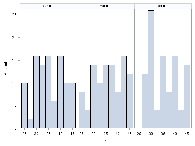
hi ... I have not used the SG procs much, but here's an example that I think does something like you want ...
data test;
do var = 1 to 3;
do j = 1 to 50;
x = ceil(20*ranuni(999)) + 25;
y = ceil(100*normal(999));
output;
end;
end;
drop j;
run;
ods html path='z:\' file='test.html' (url=none);
proc sgpanel data=test noautolegend;
panelby var / layout=columnlattice;
histogram x;
run;
ods html close;
it produced the attached

- Mark as New
- Bookmark
- Subscribe
- Mute
- RSS Feed
- Permalink
- Report Inappropriate Content
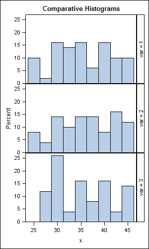
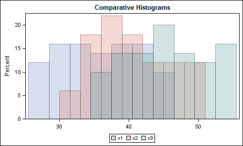
Using Mike's code, you can make a RowLattice to compare the distributions, or overlay each variable on the same plot:
data test;
do var = 1 to 3;
do j = 1 to 50;
x = ceil(20*ranuni(999)) + 25;
output;
end;
end;
drop j;
run;
ods html close;
ods graphics / reset width=3in height=5in imagename='MultiHist_RowLattice';
title 'Comparative Histograms';
proc sgpanel data=test noautolegend;
panelby var / layout=rowlattice;
histogram x;
rowaxis offsetmin=0;
run;
data test2;
do j = 1 to 50;
x1 = ceil(20*ranuni(999)) + 25;
x2 = ceil(20*ranuni(999)) + 30;
x3 = ceil(20*ranuni(999)) + 35;
output;
end;
drop j;
run;
ods graphics / reset width=5in height=3in imagename='MultiHist_Overlay';
title 'Comparative Histograms';
proc sgplot data=test2;
histogram x1 / transparency=0.7;
histogram x2 / transparency=0.7;
histogram x3 / transparency=0.7;
yaxis offsetmin=0;
xaxis display=(nolabel);
run;
This second version works better with SAS9.3 where you can control the bins. Or, with SAS 9.2, you can use GTL to do that.
here is a related article: Comparative Density Plots
Images attached.


Catch up on SAS Innovate 2026
Dive into keynotes, announcements and breakthroughs on demand.
Explore Now →Learn how use the CAT functions in SAS to join values from multiple variables into a single value.
Find more tutorials on the SAS Users YouTube channel.
SAS Training: Just a Click Away
Ready to level-up your skills? Choose your own adventure.


