- Home
- /
- Programming
- /
- Graphics
- /
- Tableplots in SAS/GRAPH
- RSS Feed
- Mark Topic as New
- Mark Topic as Read
- Float this Topic for Current User
- Bookmark
- Subscribe
- Mute
- Printer Friendly Page
- Mark as New
- Bookmark
- Subscribe
- Mute
- RSS Feed
- Permalink
- Report Inappropriate Content
Hello everdone,
I routinely work with rather large datasets (several millions rows, hundreds of variables) which i need to check for data quality.
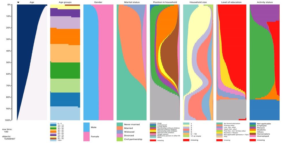
I stumbled upon a paper that prevents an interesting plot for large dataset exploration that the authors call a tableplot.
Observations are first sorted by one or more numeric variables, then the rows are binned by centiles.
it is produced as a number of panels, one for each variable. In each panel there is a stacked barplot. In the case of numeric variables the bar has a lighter colour depending on the number of missing. Qualitative variables are instead presented as frequency bars.
It looks like this:
The authors of the paper, available at, presented a R package to produce the plot. I am a decent R programmer and I could use that for small datasets. but all my data is either on SAS tables or on DBMS that I can access through remote SAS servers.
Is there a way to make a plot like that using base SAS?
As an alternative I guess that it would not be too hard to use SAS to bin the rows and compute all the needed frequencies, outputting a long format table that I could then process with local R. But it would be nice if there was a pure SAS solution.
Any pointer is welcome, thanks in advance
Accepted Solutions
- Mark as New
- Bookmark
- Subscribe
- Mute
- RSS Feed
- Permalink
- Report Inappropriate Content
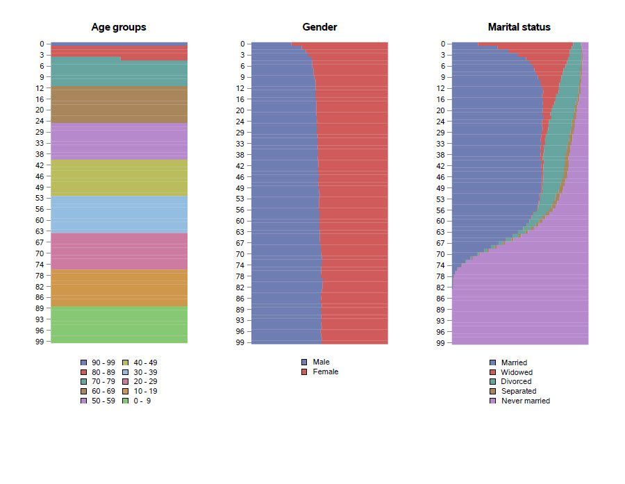
This time I used the SAS data sets from the 2015 American Community Survey 1-year Public Use Microdata Sample file. The national file is split into an "a" data set and a "b" data set.
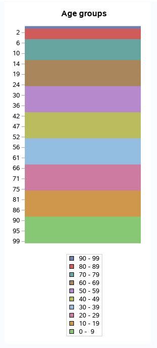
After figuring out how each individual plot should look, I tried using PROC SGPANEL, after transposing the data, but the automatically generated legend statement didn't make any sense.
I thought about using ODS LAYOUT to put the plots side by side. However, as Scott Huntley pointed out in An Insider’s Guide to ODS LAYOUT Using SAS® 9.4, you don't need ODS LAYOUT if you want columns that are equally sized.
Using the PAD= option on the gender plot helped make that plot look about the same size as the age groups plot and the marital status plot.
libname acs '/folders/myfolders/ACS PUMS';

%let path=/folders/myfolders/ACS PUMS;

data acs_2015;
  set acs.psam_pusa(keep=agep sex mar)
      acs.psam_pusb(keep=agep sex mar);
run;

proc rank data=acs_2015
          out=acs_centiles
          groups=100
          descending;
  var agep;
  ranks age_centile;
run;

proc datasets nolist;
  delete acs_2015;
quit;

proc format;
  value $marital
    '1'='Married'
    '2'='Widowed'
    '3'='Divorced'
    '4'='Separated'
    '5'='Never married'
      ;

  value $sex
    '1'='Male'
    '2'='Female'
      ;

  value agegroup
    0 -  9 = ' 0 -  9'
   10 - 19 = '10 - 19'
   20 - 29 = '20 - 29'
   30 - 39 = '30 - 39'
   40 - 49 = '40 - 49'
   50 - 59 = '50 - 59'
   60 - 69 = '60 - 69'
   70 - 79 = '70 - 79'
   80 - 89 = '80 - 89'
   90 - 99 = '90 - 99'
  100 - high = '100+'
      ;

run;

* need to set MAXOBS in ods graphics statement, because default is 2 million.
* we have more than 2 million records to plot. ;

* doing each plot separately in this section ;

ods graphics / height=7in width=3in noborder MAXOBS=3147005;

proc sgplot data=acs_centiles pctlevel=group noborder;
  hbar age_centile / group=agep
                     groupdisplay=stack
                     stat=pct
                     nooutline
                     baselineattrs=(thickness=0)
                     barwidth=1;
  xaxis display=none;
  yaxis display=(nolabel noline);
  format agep agegroup. ;
  keylegend / across=1 title='';
  title 'Age groups';
run;

proc sgplot data=acs_centiles pctlevel=group noborder;
  hbar age_centile / group=sex
                     groupdisplay=stack
                     stat=pct
                     nooutline
                     baselineattrs=(thickness=0)
                     barwidth=1;
  xaxis display=none;
  yaxis display=(nolabel noline);
  format sex $sex. ;
  keylegend / across=1 title='';
  title 'Gender';
run;

proc sgplot data=acs_centiles pctlevel=group noborder;
  hbar age_centile / group=mar
                     groupdisplay=stack
                     stat=pct
                     nooutline
                     baselineattrs=(thickness=0)
                     barwidth=1;
  xaxis display=none;
  yaxis display=(nolabel noline);
  format mar $marital. ;
  keylegend / across=1 title='';
  title 'Marital status';
run;

* tried using PROC SGPANEL to put plots side by side.
* transposed the data and produced a panel graphic,
* but then the automatically generated legends don't
* make sense.  try placing multiple plots on one page
* instead by using ODS PDF with columns option. ;

options orientation=landscape nodate nonumber;

* since i want equally sized columns, i don't need ods
* layout.  but if i need to use ods layout, should
* probably read Scott Huntley's paper, "An Insider's
* Guide to ODS Layout Using SAS 9.4", available at
* https://support.sas.com/resources/papers/proceedings15/SAS1836-2015.pdf ;

ods pdf file="&path/panel of demographic tableplots.pdf"
  columns=3;

* specify legend with 5 rows for age groups, so that the graphic is
* about the same size as the marital status graphic, which has 5
* values. ;

proc sgplot data=acs_centiles pctlevel=group noborder;
  hbar age_centile / group=agep
                     groupdisplay=stack
                     stat=pct
                     nooutline
                     baselineattrs=(thickness=0)
                     barwidth=1;
  xaxis display=none;
  yaxis display=(nolabel noline);
  format agep agegroup. ;
  keylegend / down=5 title='' noborder;
  title 'Age groups';
run;

ods pdf startpage=now;

* since gender plot only has 2 values, need to pad the bottom of the graphic
* to make it look about the same size as the other graphics.  pleasantly
* surprised that padding works even though i'm not using an annotation data set! ;

proc sgplot data=acs_centiles pctlevel=group noborder pad=(bottom=9.5pct);
  hbar age_centile / group=sex
                     groupdisplay=stack
                     stat=pct
                     nooutline
                     baselineattrs=(thickness=0)
                     barwidth=1;
  xaxis display=none;
  yaxis display=(nolabel noline);
  format sex $sex. ;
  keylegend / across=1 title='' noborder;
  title 'Gender';
run;

ods pdf startpage=now;

proc sgplot data=acs_centiles pctlevel=group noborder;
  hbar age_centile / group=mar
                     groupdisplay=stack
                     stat=pct
                     nooutline
                     baselineattrs=(thickness=0)
                     barwidth=1;
  xaxis display=none;
  yaxis display=(nolabel noline);
  format mar $marital. ;
  keylegend / across=1 title='' noborder;
  title 'Marital status';
run;

ods pdf close;
Screen shot of PDF output:
- Mark as New
- Bookmark
- Subscribe
- Mute
- RSS Feed
- Permalink
- Report Inappropriate Content
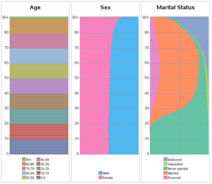
I tried to do something similar with the 2015 American Community Survey 1-year Public Use Microdata Sample file. The SAS data set is available at https://www2.census.gov/programs-surveys/acs/data/pums/2015/1-Year/unix_pus.zip.
EDITED TO ADD: Apparently I was working with part of the file. I downloaded the CSV version of the files last summer. The results should be the same whether you start with the CSV version or the SAS data set.
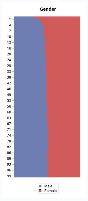
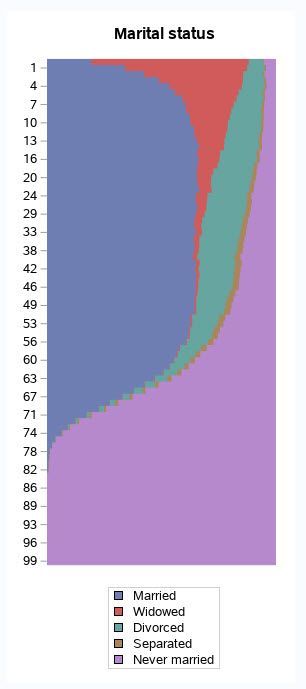
I used PROC RANK to create 100 bins based on age. Then I used PROC SGPLOT to do the plots for age groups, gender, and marital status. There are 1,618,489 observations in the data set.
Sample code:
libname acs '/folders/myfolders/ACS PUMS';

proc rank data=acs.ss15pusa(keep=agep sex mar)
          out=acs_centiles
          groups=100
          descending;
  var agep;
  ranks age_centile;
run;

proc format;
  value marital
    1='Married'
    2='Widowed'
    3='Divorced'
    4='Separated'
    5='Never married'
      ;

  value sex
    1='Male'
    2='Female'
      ;

  value agegroup
    0 -  9 =  '0 -  9'
   10 - 19 = '10 - 19'
   20 - 29 = '20 - 29'
   30 - 39 = '30 - 39'
   40 - 49 = '40 - 49'
   50 - 59 = '50 - 59'
   60 - 69 = '60 - 69'
   70 - 79 = '70 - 79'
   80 - 89 = '80 - 89'
   90 - 99 = '90 - 99'
  100 - high = '100+'
      ;
run;

ods graphics / height=7in width=3in noborder;

proc sgplot data=acs_centiles pctlevel=group noborder;
  hbar age_centile / group=agep
                     groupdisplay=stack
                     stat=pct
                     nooutline
                     baselineattrs=(thickness=0)
                     barwidth=1;
  xaxis display=none;
  yaxis display=(nolabel noline);
  format agep agegroup. ;
  keylegend / across=1 title='';
  title 'Age groups';
run;

proc sgplot data=acs_centiles pctlevel=group noborder;
  hbar age_centile / group=sex
                     groupdisplay=stack
                     stat=pct
                     nooutline
                     baselineattrs=(thickness=0)
                     barwidth=1;
  xaxis display=none;
  yaxis display=(nolabel noline);
  format sex sex. ;
  keylegend / across=1 title='';
  title 'Gender';
run;

proc sgplot data=acs_centiles pctlevel=group noborder;
  hbar age_centile / group=mar
                     groupdisplay=stack
                     stat=pct
                     nooutline
                     baselineattrs=(thickness=0)
                     barwidth=1;
  xaxis display=none;
  yaxis display=(nolabel noline);
  format mar marital. ;
  keylegend / across=1 title='';
  title 'Marital status';
run;
Plots:
- Mark as New
- Bookmark
- Subscribe
- Mute
- RSS Feed
- Permalink
- Report Inappropriate Content
This time I used the SAS data sets from the 2015 American Community Survey 1-year Public Use Microdata Sample file. The national file is split into an "a" data set and a "b" data set.
After figuring out how each individual plot should look, I tried using PROC SGPANEL, after transposing the data, but the automatically generated legend statement didn't make any sense.
I thought about using ODS LAYOUT to put the plots side by side. However, as Scott Huntley pointed out in An Insider’s Guide to ODS LAYOUT Using SAS® 9.4, you don't need ODS LAYOUT if you want columns that are equally sized.
Using the PAD= option on the gender plot helped make that plot look about the same size as the age groups plot and the marital status plot.
libname acs '/folders/myfolders/ACS PUMS';

%let path=/folders/myfolders/ACS PUMS;

data acs_2015;
  set acs.psam_pusa(keep=agep sex mar)
      acs.psam_pusb(keep=agep sex mar);
run;

proc rank data=acs_2015
          out=acs_centiles
          groups=100
          descending;
  var agep;
  ranks age_centile;
run;

proc datasets nolist;
  delete acs_2015;
quit;

proc format;
  value $marital
    '1'='Married'
    '2'='Widowed'
    '3'='Divorced'
    '4'='Separated'
    '5'='Never married'
      ;

  value $sex
    '1'='Male'
    '2'='Female'
      ;

  value agegroup
    0 -  9 = ' 0 -  9'
   10 - 19 = '10 - 19'
   20 - 29 = '20 - 29'
   30 - 39 = '30 - 39'
   40 - 49 = '40 - 49'
   50 - 59 = '50 - 59'
   60 - 69 = '60 - 69'
   70 - 79 = '70 - 79'
   80 - 89 = '80 - 89'
   90 - 99 = '90 - 99'
  100 - high = '100+'
      ;

run;

* need to set MAXOBS in ods graphics statement, because default is 2 million.
* we have more than 2 million records to plot. ;

* doing each plot separately in this section ;

ods graphics / height=7in width=3in noborder MAXOBS=3147005;

proc sgplot data=acs_centiles pctlevel=group noborder;
  hbar age_centile / group=agep
                     groupdisplay=stack
                     stat=pct
                     nooutline
                     baselineattrs=(thickness=0)
                     barwidth=1;
  xaxis display=none;
  yaxis display=(nolabel noline);
  format agep agegroup. ;
  keylegend / across=1 title='';
  title 'Age groups';
run;

proc sgplot data=acs_centiles pctlevel=group noborder;
  hbar age_centile / group=sex
                     groupdisplay=stack
                     stat=pct
                     nooutline
                     baselineattrs=(thickness=0)
                     barwidth=1;
  xaxis display=none;
  yaxis display=(nolabel noline);
  format sex $sex. ;
  keylegend / across=1 title='';
  title 'Gender';
run;

proc sgplot data=acs_centiles pctlevel=group noborder;
  hbar age_centile / group=mar
                     groupdisplay=stack
                     stat=pct
                     nooutline
                     baselineattrs=(thickness=0)
                     barwidth=1;
  xaxis display=none;
  yaxis display=(nolabel noline);
  format mar $marital. ;
  keylegend / across=1 title='';
  title 'Marital status';
run;

* tried using PROC SGPANEL to put plots side by side.
* transposed the data and produced a panel graphic,
* but then the automatically generated legends don't
* make sense.  try placing multiple plots on one page
* instead by using ODS PDF with columns option. ;

options orientation=landscape nodate nonumber;

* since i want equally sized columns, i don't need ods
* layout.  but if i need to use ods layout, should
* probably read Scott Huntley's paper, "An Insider's
* Guide to ODS Layout Using SAS 9.4", available at
* https://support.sas.com/resources/papers/proceedings15/SAS1836-2015.pdf ;

ods pdf file="&path/panel of demographic tableplots.pdf"
  columns=3;

* specify legend with 5 rows for age groups, so that the graphic is
* about the same size as the marital status graphic, which has 5
* values. ;

proc sgplot data=acs_centiles pctlevel=group noborder;
  hbar age_centile / group=agep
                     groupdisplay=stack
                     stat=pct
                     nooutline
                     baselineattrs=(thickness=0)
                     barwidth=1;
  xaxis display=none;
  yaxis display=(nolabel noline);
  format agep agegroup. ;
  keylegend / down=5 title='' noborder;
  title 'Age groups';
run;

ods pdf startpage=now;

* since gender plot only has 2 values, need to pad the bottom of the graphic
* to make it look about the same size as the other graphics.  pleasantly
* surprised that padding works even though i'm not using an annotation data set! ;

proc sgplot data=acs_centiles pctlevel=group noborder pad=(bottom=9.5pct);
  hbar age_centile / group=sex
                     groupdisplay=stack
                     stat=pct
                     nooutline
                     baselineattrs=(thickness=0)
                     barwidth=1;
  xaxis display=none;
  yaxis display=(nolabel noline);
  format sex $sex. ;
  keylegend / across=1 title='' noborder;
  title 'Gender';
run;

ods pdf startpage=now;

proc sgplot data=acs_centiles pctlevel=group noborder;
  hbar age_centile / group=mar
                     groupdisplay=stack
                     stat=pct
                     nooutline
                     baselineattrs=(thickness=0)
                     barwidth=1;
  xaxis display=none;
  yaxis display=(nolabel noline);
  format mar $marital. ;
  keylegend / across=1 title='' noborder;
  title 'Marital status';
run;

ods pdf close;
Screen shot of PDF output:

- Mark as New
- Bookmark
- Subscribe
- Mute
- RSS Feed
- Permalink
- Report Inappropriate Content
When the number of age categories is large (as it is here with centile), you can replace the HBAR or VBAR statements with a BAND statement. The resulting graph is called a stacked band plot. For an example and discussion, see the article "Create a stacked band plot in SAS." I think a band plot would be ideal for these data.
- Mark as New
- Bookmark
- Subscribe
- Mute
- RSS Feed
- Permalink
- Report Inappropriate Content
Since your title said "SAS/Graph", I also came up with a SAS/Graph way to do it! 🙂
https://blogs.sas.com/content/sastraining/2018/06/21/tableplots-and-acs-data/
- Mark as New
- Bookmark
- Subscribe
- Mute
- RSS Feed
- Permalink
- Report Inappropriate Content
Suzanne:
I think that this is an interesting and useful visual tool, but, if you were to deliver the tableplot(s) via HTML, can you provide mouseover text to provide the precise value of the number and percent of whole for, say, females of a certain age and marital status? And the total number of females of that same age? Estimating is never a substitute for precise data, and estimating between curved lines is an effort with an even more unreliable outcome. Thanks.
LeRoy
LeRoy Bessler PhD
Visual Data Insights™
Le_Roy_Bessler@wi.rr.com
- Mark as New
- Bookmark
- Subscribe
- Mute
- RSS Feed
- Permalink
- Report Inappropriate Content
Yes, since it's a bar chart (albeit with very skinny bar segments), you could use Gchart's html= option to add custom mouse-over text for each bar segment.
Catch up on SAS Innovate 2026
Nearly 200 sessions are now available on demand with the SAS Innovate Digital Pass.
Explore Now →Learn how use the CAT functions in SAS to join values from multiple variables into a single value.
Find more tutorials on the SAS Users YouTube channel.
SAS Training: Just a Click Away
Ready to level-up your skills? Choose your own adventure.
