- Home
- /
- Programming
- /
- Graphics
- /
- Suppress the Custom Confidence Interval data labels on SGPLOT VBARPARM...
- RSS Feed
- Mark Topic as New
- Mark Topic as Read
- Float this Topic for Current User
- Bookmark
- Subscribe
- Mute
- Printer Friendly Page
- Mark as New
- Bookmark
- Subscribe
- Mute
- RSS Feed
- Permalink
- Report Inappropriate Content
I'm using SAS 9.3 and trying to create a vertical bar chart with custom confidence intervals that includes the data label values for the bar charts but not the confidence intervals.
When I use the DATALABEL option of VBARPARM, I also get the the confidence interval data labels which makes the chart very busy.
Any help appreciated.
Thanks.
I'm using the following code:
proc template;
define style barcolor;
parent=styles.sasweb;
style GraphData1 from GraphData1 / color= DAG;
style GraphData2 from GraphData2 / color= VIBG;
style GraphData3 from GraphData3 / color= LIOLGR;
class GraphFonts / 'GraphLabelFont'=("Arial", 10pt, bold)
'GraphValueFont'=("Arial", 10pt, bold)
'GraphTitleFont'=("Arial", 16pt, bold)
'GraphLabelFont' =("Arial", 14pt, bold)
'GraphDataFont' =("Arial", 10pt, bold) ;
class graphwalls / frameborder=off;
end;
run;
ods html style=barcolor file='final.htm';
%macro sexid (var, text, text2);
**Looking at data by other variables and year to understand trends in reporting of sexual identity**;
proc surveyfreq data=illinois_psu varheader=label nomcar ;
stratum stratum2;
cluster psu;
weight weight;
tables &var.*sexid/ row chisq CL ;
ods output CrossTabs=&var._sexid;
run;
proc sgplot data=&var._sexid
noautolegend ;
format rowpercent 3.1;
vbarparm category=&var. response=rowpercent / group=sexid name="&var." barwidth=0.6 limitupper=RowUpperCL limitlower=RowLowerCL;
where sexid in (2,3,4) and &var. ne .;
xaxis display=(nolabel);
yaxis label='Percent' values=(1 2 3 4 5 6 7 8 9 10);
TITLE "Proportion of High School Students Identifying as &text. by &text2.", 2009-2015;
keylegend "&var." / noborder location=inside position=top;
run;
%mend;
%sexid (race4,Gay/Lesbian Bisexual or Not Sure, Race);
Accepted Solutions
- Mark as New
- Bookmark
- Subscribe
- Mute
- RSS Feed
- Permalink
- Report Inappropriate Content
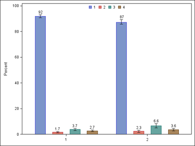
Code and graph included below.
SAS 9.3 does not support AxisTable. So, we have to use SCATTER with MARKERCHAR overlay.
The y position for char markers is set just above the RowUpperCL.
Data race4_sexid;
input race4 sexid rowpercent RowLowerCL RowUpperCL;
ylbl=RowUpperCL+2;
datalines;
1 1 91.8821 90.6684 93.0957
1 2 1.6792 1.2078 2.1507
1 3 3.7270 2.9502 4.5038
1 4 2.7118 2.1308 3.2927
2 1 87.15 85.7038 89.2629
2 2 2.3095 1.5431 3.0759
2 3 6.6199 5.0172 8.2227
2 4 3.5872 2.6824 4.4920
;
run;
proc sgplot data=race4_sexid noautolegend ;
format rowpercent 3.1;
vbarparm category=race4 response=rowpercent / group=sexid name="race4"
barwidth=0.6 limitupper=RowUpperCL limitlower=RowLowerCL;
scatter x=race4 y=ylbl / markerchar=rowpercent group=sexid groupdisplay=cluster
markercharattrs=(color=black size=9pt);
xaxis display=(nolabel);
yaxis label='Percent' offsetmin=0;
keylegend "race4" / noborder location=inside position=top;
run;
- Mark as New
- Bookmark
- Subscribe
- Mute
- RSS Feed
- Permalink
- Report Inappropriate Content
Can you share sample data. So i can help you.
- Mark as New
- Bookmark
- Subscribe
- Mute
- RSS Feed
- Permalink
- Report Inappropriate Content
Thanks for your help.
The data are frequency data that output from the proc survey freq procedure which also outputs 95% confidence intervals that account for the complex survey design of the data I'm using.
The output data set that is used for the graph looks something like this:
Data race4_sexid;
input race4 sexid rowpercent RowLowerCL RowUpperCL;
datalines;
1 1 91.8821 90.6684 93.0957
1 2 1.6792 1.2078 2.1507
1 3 3.7270 2.9502 4.5038
1 4 2.7118 2.1308 3.2927
2 1 0.9015 85.7038 89.2629
2 2 2.3095 1.5431 3.0759
2 3 6.6199 5.0172 8.2227
2 4 3.5872 2.6824 4.4920;
- Mark as New
- Bookmark
- Subscribe
- Mute
- RSS Feed
- Permalink
- Report Inappropriate Content
Thanks
- Mark as New
- Bookmark
- Subscribe
- Mute
- RSS Feed
- Permalink
- Report Inappropriate Content
I only included that code so that it would be clear that I what I was trying to plot was the output of a surveyfreq procedure i.e., frequency data with associated custom confidence intervals, as I listed in reponse to your intial request to see what data I was trying to graph.
I do not believe having those data will help with providing a solution to my question of whether there is a way to suppress the confidence interval labels from appearing on the graph when using the DATALABEL option.
Thank you agan for your willingess to help.
- Mark as New
- Bookmark
- Subscribe
- Mute
- RSS Feed
- Permalink
- Report Inappropriate Content
Code and graph included below.
SAS 9.3 does not support AxisTable. So, we have to use SCATTER with MARKERCHAR overlay.
The y position for char markers is set just above the RowUpperCL.
Data race4_sexid;
input race4 sexid rowpercent RowLowerCL RowUpperCL;
ylbl=RowUpperCL+2;
datalines;
1 1 91.8821 90.6684 93.0957
1 2 1.6792 1.2078 2.1507
1 3 3.7270 2.9502 4.5038
1 4 2.7118 2.1308 3.2927
2 1 87.15 85.7038 89.2629
2 2 2.3095 1.5431 3.0759
2 3 6.6199 5.0172 8.2227
2 4 3.5872 2.6824 4.4920
;
run;
proc sgplot data=race4_sexid noautolegend ;
format rowpercent 3.1;
vbarparm category=race4 response=rowpercent / group=sexid name="race4"
barwidth=0.6 limitupper=RowUpperCL limitlower=RowLowerCL;
scatter x=race4 y=ylbl / markerchar=rowpercent group=sexid groupdisplay=cluster
markercharattrs=(color=black size=9pt);
xaxis display=(nolabel);
yaxis label='Percent' offsetmin=0;
keylegend "race4" / noborder location=inside position=top;
run;
Catch up on SAS Innovate 2026
Dive into keynotes, announcements and breakthroughs on demand.
Explore Now →Learn how use the CAT functions in SAS to join values from multiple variables into a single value.
Find more tutorials on the SAS Users YouTube channel.
SAS Training: Just a Click Away
Ready to level-up your skills? Choose your own adventure.


