- Home
- /
- Programming
- /
- Graphics
- /
- Summary trellis plot/corr matrix code
- RSS Feed
- Mark Topic as New
- Mark Topic as Read
- Float this Topic for Current User
- Bookmark
- Subscribe
- Mute
- Printer Friendly Page
- Mark as New
- Bookmark
- Subscribe
- Mute
- RSS Feed
- Permalink
- Report Inappropriate Content
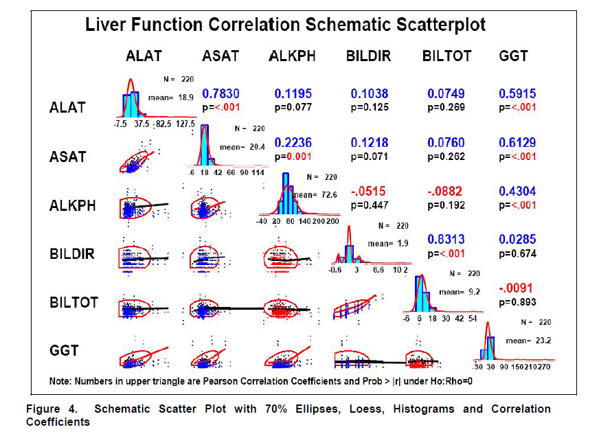
I am looking for some code to make my ideal summary display of data for reports. On the diagonal and one triangle would be the output of: proc sgscatter; matrix var1--var5/ diagonal = (historgram normal); So, the scatter plots on the triangle, the histograms with a normal curve for the data users to compare the histograms to on the diagonal. On the other triangle, would be the correlation matrix information: rho and p-values at least. Bonus would be mean and sd on the diagonal and highlighting by significance on the correlations. If found an example form NESUG 2007 (http://www.nesug.org/proceedings/nesug07/np/np18.pdf, figure 4), that is close, but no code was included. There has recently been a similar post, but not quite what I was looking for. Can anyone point me in the correct direction?
- Mark as New
- Bookmark
- Subscribe
- Mute
- RSS Feed
- Permalink
- Report Inappropriate Content
The graphs in that paper look pretty good! - I'd suggest contact the author and see if they can share the code with you, and that will make a good starting place. Then, once you've got your data plotted with that code, you can post up some specific questions about possibly adding the extras you're wanting.
- Mark as New
- Bookmark
- Subscribe
- Mute
- RSS Feed
- Permalink
- Report Inappropriate Content
Unfortunately, I have tried that route. The author is no longer at that company and has stopped contributing to NESUG.
- Mark as New
- Bookmark
- Subscribe
- Mute
- RSS Feed
- Permalink
- Report Inappropriate Content
I am still wondering if you have any hints/ideas on how to re-create this trellis plot plus. Trying to contact the author is fruitless
- Mark as New
- Bookmark
- Subscribe
- Mute
- RSS Feed
- Permalink
- Report Inappropriate Content
Hopefully some of the ODS Graphics folks will chime in...

- Mark as New
- Bookmark
- Subscribe
- Mute
- RSS Feed
- Permalink
- Report Inappropriate Content
The simple answer is "Yes, you can do this with GTL". And here comes the "But"...
But, you have to do it using GTL LAYOUT LATTICE to define the grid as you want, and then populate each cell with the graph you need. I posted an article in Graphically Speaking in August 20012 on creating a Compact Scatter Plot Matrix. This will get you half the way there to build the lower triangle. You can pick it up from there and add the other features.
- Mark as New
- Bookmark
- Subscribe
- Mute
- RSS Feed
- Permalink
- Report Inappropriate Content
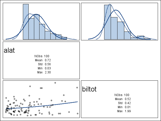
Thank you Sanjay! I have been playing around with GTL and learning a lot. I also incorporated your histogram on the top row from another blog. This left more room on the diagonal for more summary numbers. I put them in there using the eval function. Below, I have the simple version I have created so far with two variables. I still have one cell empty where I want to put the correlations and the significance of the correlation. That part is stumping me right now. Could you point me in the right direction?

Catch up on SAS Innovate 2026
Nearly 200 sessions are now available on demand with the SAS Innovate Digital Pass.
Explore Now →Learn how use the CAT functions in SAS to join values from multiple variables into a single value.
Find more tutorials on the SAS Users YouTube channel.
SAS Training: Just a Click Away
Ready to level-up your skills? Choose your own adventure.


