- Home
- /
- Programming
- /
- Graphics
- /
- Re: Stacked area Surface Plots on Maps?
- RSS Feed
- Mark Topic as New
- Mark Topic as Read
- Float this Topic for Current User
- Bookmark
- Subscribe
- Mute
- Printer Friendly Page
- Mark as New
- Bookmark
- Subscribe
- Mute
- RSS Feed
- Permalink
- Report Inappropriate Content
All,
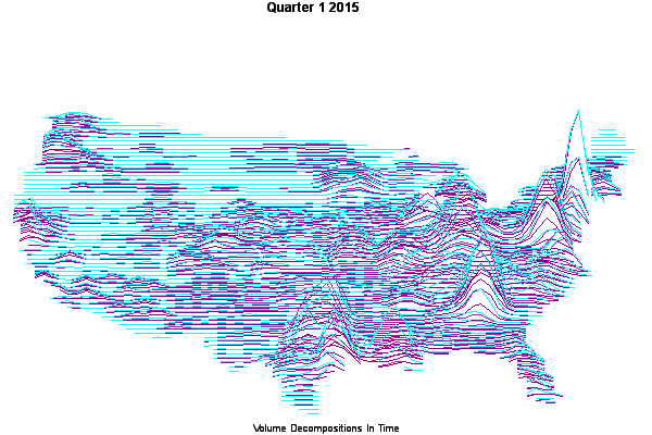
I've been making 3D surface plots on top of maps with proc gmap (surface):
proc gmap data=imscounty3 map=uscounty all;
  where week=&week;
  id state county;
 surface ScaledAF / tilt=20 rotate=90 cbody=CXB21DAC;
run;quit;
(I'm cycling through weeks in a macro loop to build an animated gif. )
My question is, can anyone think of a way to have the surface plot be stacked areas instead of a single color wireframe? So instead of a plot with ScaledAF, I'd like to show SCaledAF (in color1), Var2 (in color2), Var3 (in color3) on top of the same location over time.
I was thinking I might use proc template and proc sgrender to overlay 3 surface plots where I have manually scaled the 3 variables to appear stacked, but the surfaceplotparm GTL object requires evenly gridded points for the surface and I haven't been able to render a map as a result.
I do have a setup that produces 3 separate surface plots with proc gmap and then get ovleraid by proc greplay, but because gmap doesn't let me control the scaling of the surface plots the 3 variables do not appear to be stacked. I've attached that version here, to help point the way to the visual I'm trying to create.
Many thanks,
TL
- Mark as New
- Bookmark
- Subscribe
- Mute
- RSS Feed
- Permalink
- Report Inappropriate Content
I have to say that I am having a very hard time imagining what a "stacked surface plot" would look like.
The surfaceplotparm supports colorresponse which would allow using a rangeattrvar to set colors for ranges of responses using range attribute map set.
So you could have another variable in the data associated with an (x,y,z) to set the color based on another variable. And you could have the same (x,y,z) point in the data with different values of the attribute variable.
- Mark as New
- Bookmark
- Subscribe
- Mute
- RSS Feed
- Permalink
- Report Inappropriate Content
Thanks for the reply.
Do you have any thoughts on how to get surfaceplotparm working with an irregular grid? Or, better yet, how to regularize the map data but still plot the map shape? My naive use of proc g3grid put made my map into a square . . .So while coloring the surface colorresponse might help me get close (e.g. create total z -axis as the sum of 3 variables and then color based on the percentage due to one of the variables . . . but how do i get the 3rd variable?), I can't figure out how to make it a map.
As to the picture I'm trying to make 'surface plot' probably isn't a good word for what I have in my head (which I can't draw for you, because figuring out how to draw it would is where I got stuck). If we lsay the image I included (from proc gmap) is a series of line charts along each lattitude, where as the longitude changes the height of the line varies with the value of a variable, what i want is to fill the area between the line and the 0 height plane with 3 (transparent) color bands with the height of each band representing the value of one variable.
Re-reading that, I'm pretty sure that doesn't make much more sense . . .
Thanks again,
TL
P.S. -- in my head it's like the aurora borealis 'riboon' in this picture, but lined up on the map to show the geographic arrangement of the values of my 3 variables
- Mark as New
- Bookmark
- Subscribe
- Mute
- RSS Feed
- Permalink
- Report Inappropriate Content
Proc GINSIDE will compare a dataset of points with a map set. So take the results from your G3grid output and run it through Proc Ginside and have the output set created using the Ginside options INSIDEONLY, maybe iNCLUDEBORDER.
- Mark as New
- Bookmark
- Subscribe
- Mute
- RSS Feed
- Permalink
- Report Inappropriate Content
Mmm I feel your pain.
Have you tried proc g3grid to make the map grid uniform?
- Mark as New
- Bookmark
- Subscribe
- Mute
- RSS Feed
- Permalink
- Report Inappropriate Content
ChrisnNZ,
Thanks for the tip.
But the output from proc g3d makes a uniform grid allowing the surface plot to be made with the GTL template and greplay, but as it does so the z values for the off map coordinates become non zero and the shape of the data becomes a square instead of the underlying map.
I still haven't tried the application of proc Ginside application that was recommended above, but I believe that the output will be the map dataset I'm starting with (except that the z axis variable will have been potentially messed around a bit).
This is probably going to be on hold for the next day or two.
I appreciate the advice,
TL
- Mark as New
- Bookmark
- Subscribe
- Mute
- RSS Feed
- Permalink
- Report Inappropriate Content
@TedLorenzen wrote:
ChrisnNZ,
Thanks for the tip.
But the output from proc g3d makes a uniform grid allowing the surface plot to be made with the GTL template and greplay, but as it does so the z values for the off map coordinates become non zero and the shape of the data becomes a square instead of the underlying map.
I still haven't tried the application of proc Ginside application that was recommended above, but I believe that the output will be the map dataset I'm starting with (except that the z axis variable will have been potentially messed around a bit).
This is probably going to be on hold for the next day or two.
I appreciate the advice,
TL
You would want to use the NOSCALE option in Prog G3Grid to help prevent distortion of cooridinates. Depending on the smoothing or interpolation options chosen you may want to take the output data set through a data step to set any negative Z values to 0 (if I am understanding what you are doing with the surface map). Any x,y pairs and associated z values outside of the map area can be removed with Proc Ginside.
You should look at the actual range of x,y coordinates in the map data set to set the options for G3Grid. Use proc means to find the min and max of x and y and then you have values to use iwth the axis1 and axis2 statements (would round those significantly ) and determine reasonable by increment values for each dimension. Or just use a "reasonable" increment to set Naxis1 and Naxis2.
Stacking (still not sure what the result should look like) may be accomplished by having a BY variable for each layer and running the data through G3Grid with a by statement using that variable and then the plot would use that variable as a group variable.
- Mark as New
- Bookmark
- Subscribe
- Mute
- RSS Feed
- Permalink
- Report Inappropriate Content
Hi,
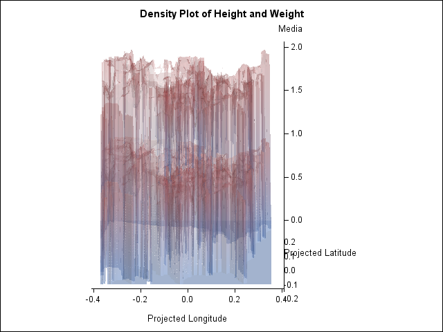
I wanted you to know that changing the axis options on proc g3grid and then fiddling the z-axis a bit based on the proc ginside output data got me a recognizable map.
I am busy goofing around with rescaling the z axis on proc g3grid to see if I can get something recognizably like my input data (right now I'm starting with values between 0 and 1 and ending up with values much larger, as you can see). The spline fit options require more memory than I have available, so I'm planning to rescale the output.
Also, the appearance is not attractive . . . my time to work on this is coming to a close, so it might just go in the bin of 'that didn't quite work out'.
TL
I actually think I should maybe do this as a series of bandplots on top of a polygonplot . . .but I'd have to figure all my own projections (from 3-D to 2-D, I mean) and I'm not ready to digout the heavy math yet.
Not to mention I don't have IML, so I'd be doing the projections in datasteps.
Thanks for the help!
TL
- Mark as New
- Bookmark
- Subscribe
- Mute
- RSS Feed
- Permalink
- Report Inappropriate Content
Well done. Thats' a cute graph, if still too busy to be exploited as is.
- Mark as New
- Bookmark
- Subscribe
- Mute
- RSS Feed
- Permalink
- Report Inappropriate Content
> the z values for the off map coordinates become non zero
Have you tried setting them back to zero before plotting? Or removing them?
- Mark as New
- Bookmark
- Subscribe
- Mute
- RSS Feed
- Permalink
- Report Inappropriate Content
Hi,
I have fiddled around with 0 -ing them out (see post above).
Probably won't drive this to a conclusion as I'm about to be busy with 'real work.'
Happy to share the code to date if anyone is interested.
TL
Catch up on SAS Innovate 2026
Nearly 200 sessions are now available on demand with the SAS Innovate Digital Pass.
Explore Now →Learn how use the CAT functions in SAS to join values from multiple variables into a single value.
Find more tutorials on the SAS Users YouTube channel.
SAS Training: Just a Click Away
Ready to level-up your skills? Choose your own adventure.


