- Home
- /
- Programming
- /
- Graphics
- /
- Stacked Bar Charts in Proc sgrender
- RSS Feed
- Mark Topic as New
- Mark Topic as Read
- Float this Topic for Current User
- Bookmark
- Subscribe
- Mute
- Printer Friendly Page
- Mark as New
- Bookmark
- Subscribe
- Mute
- RSS Feed
- Permalink
- Report Inappropriate Content
My goal:
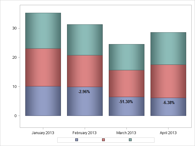
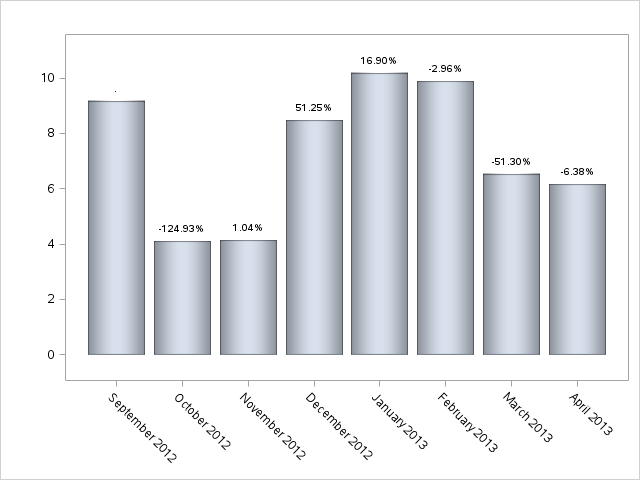
Produce a stacked bar chart by frequency of a variable that lists the decrease or increase of each group from the previous bar.
I have done this with a regular bar chart by overlaying a bubbleplot in Proc Template with transparent bubbles that labels the data point with my increase/decrease variable value; this is displayed in the "Bar Chart" image attached. Now, I need to do the same thing, only for a stacked bar chart, which is proving difficult. I have attached a second image, "Stacked Bar Chart," where I have manually added the values to illustrate what I am trying to accomplish.
Does anybody have an idea of how I would approach this?


- Mark as New
- Bookmark
- Subscribe
- Mute
- RSS Feed
- Permalink
- Report Inappropriate Content
This can be tricky as the (stacked) group bar chart is summarizing the data, and you don't know where to place the labels. One way would be to summarize the data yourself and precompute the low and high (and middle) of each bar segment in your data step. Put the delta values in another column. Then, use the HIGHLOW plot to draw the bars and use an overlaid scatter with MarkerChar to draw the delta values in the middle location.
- Mark as New
- Bookmark
- Subscribe
- Mute
- RSS Feed
- Permalink
- Report Inappropriate Content
Thank you, Sanjay; I will try this now.
Catch up on SAS Innovate 2026
Nearly 200 sessions are now available on demand with the SAS Innovate Digital Pass.
Explore Now →Learn how use the CAT functions in SAS to join values from multiple variables into a single value.
Find more tutorials on the SAS Users YouTube channel.
SAS Training: Just a Click Away
Ready to level-up your skills? Choose your own adventure.


