- Home
- /
- Programming
- /
- Graphics
- /
- Re: Stacked Bar Chart with 3 variables that total
- RSS Feed
- Mark Topic as New
- Mark Topic as Read
- Float this Topic for Current User
- Bookmark
- Subscribe
- Mute
- Printer Friendly Page
- Mark as New
- Bookmark
- Subscribe
- Mute
- RSS Feed
- Permalink
- Report Inappropriate Content
Good day,
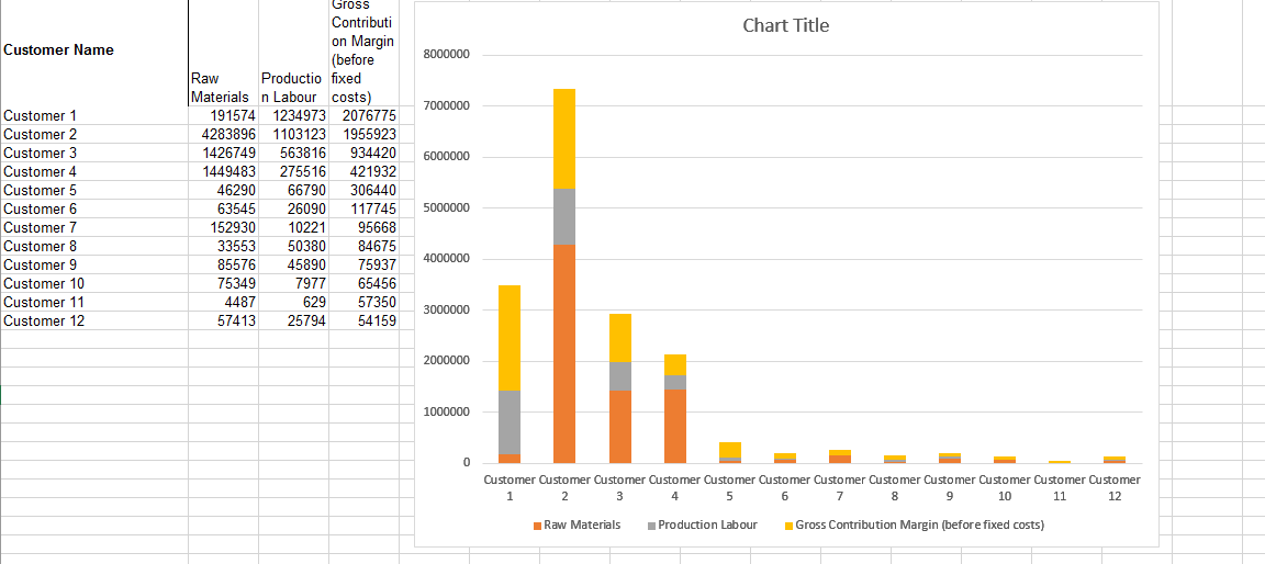
I am trying to re-create a chart created with Excel where the value of 3 variables are stacked to show a total $ value for each customer.
See Excel example below.
Working in Enterprise Guide 7.12 with SAS 9.4 I haven't found any way to do this. I've tried Proc Chart, SGPLOT, FREQ.
Seems this should be simple to do...any help is appreciated.
Thanks!
Accepted Solutions
- Mark as New
- Bookmark
- Subscribe
- Mute
- RSS Feed
- Permalink
- Report Inappropriate Content
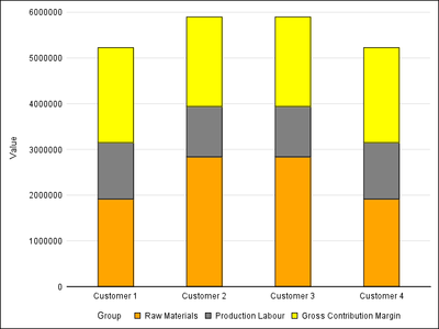
If your data is in the Excel multi-column format, transform it into the grouped data like shown below. Then you can create the required bar chart. You can some options to make it look closer to what you have shown. You can add other options to to get data or segment labels. Fixed code.
data excel;
label Materials='Raw Materials';
label Labour='Production Labour';
label Contrib='Gross Contribution Margin';
input Customer $1-12 Materials Labour Contrib;
datalines;
Customer 1 1915740 1234973 2076755
Customer 2 2838960 1103123 1955923
Customer 3 2838960 1103123 1955923
Customer 4 1915740 1234973 2076755
;
run;
data stacked;
length Group $25;
keep Customer Group Value;
set excel;
Group='Raw Materials'; Value=Materials; output;
Group='Production Labour'; Value=Labour; output;
Group='Gross Contribution Margin'; Value=Contrib; output;
run;
ods listing;
proc sgplot data=stacked noborder;
styleattrs datacolors=(orange gray yellow) datacontrastcolors=(black);
vbarparm category=customer response=value / group=group
barwidth=0.4;
yaxis display=(noline noticks) grid;
xaxis display=(nolabel noticks);
keylegend / noborder;
run;
- Mark as New
- Bookmark
- Subscribe
- Mute
- RSS Feed
- Permalink
- Report Inappropriate Content
You just need to transpose you data so that you have three columns: one for the category, one for the response, and one for the group. The first two customers will look like this:
Customer Value Breakdown
Customer 1 191574 Raw Materials
Customer 1 1234973 Production Labor
Customer 1 2076775 Gross Contribution Margin (before fixed cost)
Customer 2 4283896 Raw Materials
Customer 2 1103123 Production Labor
Customer 2 1955923 Gross Contribution Margin (before fixed cost)
Then, any of the rendering methods you listed should work.
Hope this helps!
Dan
- Mark as New
- Bookmark
- Subscribe
- Mute
- RSS Feed
- Permalink
- Report Inappropriate Content
If your data is in the Excel multi-column format, transform it into the grouped data like shown below. Then you can create the required bar chart. You can some options to make it look closer to what you have shown. You can add other options to to get data or segment labels. Fixed code.
data excel;
label Materials='Raw Materials';
label Labour='Production Labour';
label Contrib='Gross Contribution Margin';
input Customer $1-12 Materials Labour Contrib;
datalines;
Customer 1 1915740 1234973 2076755
Customer 2 2838960 1103123 1955923
Customer 3 2838960 1103123 1955923
Customer 4 1915740 1234973 2076755
;
run;
data stacked;
length Group $25;
keep Customer Group Value;
set excel;
Group='Raw Materials'; Value=Materials; output;
Group='Production Labour'; Value=Labour; output;
Group='Gross Contribution Margin'; Value=Contrib; output;
run;
ods listing;
proc sgplot data=stacked noborder;
styleattrs datacolors=(orange gray yellow) datacontrastcolors=(black);
vbarparm category=customer response=value / group=group
barwidth=0.4;
yaxis display=(noline noticks) grid;
xaxis display=(nolabel noticks);
keylegend / noborder;
run;
- Mark as New
- Bookmark
- Subscribe
- Mute
- RSS Feed
- Permalink
- Report Inappropriate Content
Works perfectly...THANKS eveyone!
Learn how use the CAT functions in SAS to join values from multiple variables into a single value.
Find more tutorials on the SAS Users YouTube channel.
SAS Training: Just a Click Away
Ready to level-up your skills? Choose your own adventure.


