- Home
- /
- Programming
- /
- Graphics
- /
- Separator bars in a datalattice
- RSS Feed
- Mark Topic as New
- Mark Topic as Read
- Float this Topic for Current User
- Bookmark
- Subscribe
- Mute
- Printer Friendly Page
- Mark as New
- Bookmark
- Subscribe
- Mute
- RSS Feed
- Permalink
- Report Inappropriate Content
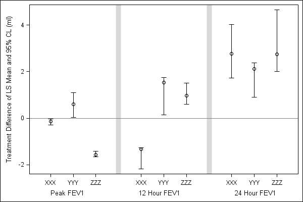
I would like to insert these separator bars into an existing graph produced using proc template with a layout datalattice to get two different x-axis variables. I have tried using a reference line at x=0 for the middle and right side graph but that distorts the tick mark spacing along the x-axis. Can you offer any suggestions on how this might be accomplished?
Thank you for your help.
- Mark as New
- Bookmark
- Subscribe
- Mute
- RSS Feed
- Permalink
- Report Inappropriate Content
Couldn't you just use annotate to add the desired grey lines? For example code take a look at:
- Mark as New
- Bookmark
- Subscribe
- Mute
- RSS Feed
- Permalink
- Report Inappropriate Content
Art - (almost) all of my examples use the traditional SAS/Graph procs.
Unfortunately the new GTL-based procs (proc template, etc) would not be able to leverage any of my traditional code or the "tricks" that I typically use to customize my graphs.
- Mark as New
- Bookmark
- Subscribe
- Mute
- RSS Feed
- Permalink
- Report Inappropriate Content
DataLattice normally draws outlines around the cells tha the cell headers. So, you have already used the options to suppress this. DataLattice supports COLUMNGUTTER=value. You can use this to increase separation betrween the cells (unless you want the appearance of a continuous X axis line). Which SAS 9.2 maintenance release are you using (TS2 M?) ?
- Mark as New
- Bookmark
- Subscribe
- Mute
- RSS Feed
- Permalink
- Report Inappropriate Content
Thank you Sanjay. Once I have the gap between graphs created by setting a columngutter, is there any way I can fill it with a colored bar as in the original example?
I am using TS2 M0.
Ideally I would like to maintain the appearance of a continuous x-axis (instead of breaking into 3 "separate" graphs) with separator bars, but if it is not possible in the installed release of SAS then I am open to exploring other possibilities.
- Mark as New
- Bookmark
- Subscribe
- Mute
- RSS Feed
- Permalink
- Report Inappropriate Content
Using the natural behavior of DATALATTICE in GTL (or PROC SGPANEL), you get the graph shown earlier. That will work without special intervention for different data.
No, you cannot color just the gutter in a different color. However, you can achieve most of the look you want by using a UDF with the data and customizing the graph as shown below. I cannot think of a way to extend the reference lines in to area below the X axis.

proc format;
value grid
1,5,9 ='XXX'
2,6,10='YYY'
3,7,11='ZZZ'
other=' ';
run;
data grid2;
format cat grid.;
do Cat=1 to 11;
if cat=4 or cat=8 then do;
value=.; upper=.; lower=.;
end;
else do;
value=5*ranuni(2)-2;
upper=value+value*ranuni(2);
lower=value-value*ranuni(2);
end;
output;
end;
run;
proc print;run;
ods listing;
ods graphics / reset width=6in height=4in imagename='Grid_Plot';
proc sgplot data=grid2;
scatter x=cat y=value / yerrorupper=upper yerrorlower=lower;
refline 0;
refline 4 8 / axis=x lineattrs=(thickness=10) transparency=0.7;
xaxis label='Peak FEV1 12 Hour FEV1 24 Hour FEV1'
values=(1 2 3 5 6 7 9 10 11) offsetmin=0.08 offsetmax=0.08;
yaxis label='Treatment Difference of LS Mean and 95% CL (ml)';
run;
Learn how use the CAT functions in SAS to join values from multiple variables into a single value.
Find more tutorials on the SAS Users YouTube channel.
SAS Training: Just a Click Away
Ready to level-up your skills? Choose your own adventure.


