- Home
- /
- Programming
- /
- Graphics
- /
- Scatterplot with negative data (SGPLOT)
- RSS Feed
- Mark Topic as New
- Mark Topic as Read
- Float this Topic for Current User
- Bookmark
- Subscribe
- Mute
- Printer Friendly Page
- Mark as New
- Bookmark
- Subscribe
- Mute
- RSS Feed
- Permalink
- Report Inappropriate Content
I have a scatterplot with mostly positive data, but some negative Y values. I want to distinguish between the positive and negative values. I'm currently drawing the axes with a refline statement at 0.
One option would be to have the x-axis labels next to this refline - emphasising that this where the x-axis lies. Can this be done?
Another would be to shade the positive area different from the negative area (sounds more difficult).
Any suggestions?
Accepted Solutions
- Mark as New
- Bookmark
- Subscribe
- Mute
- RSS Feed
- Permalink
- Report Inappropriate Content
This can also be done with band plots when you know the range of your data.
data example;
do t=1 to 50;
   x=ranuni(123);
   if (t <= 25) then
      y = -ranuni(456);
   else
      y = ranuni(456);
   output;
end;
run;

proc sgplot data=example;
band x=x upper=1 lower=0 / fillattrs=(color=yellow);
band x=x upper=0 lower=-1 / fillattrs=(color=lavender);
refline 0 / lineattrs=(thickness=3);
scatter x=x y=y;
run;
- Mark as New
- Bookmark
- Subscribe
- Mute
- RSS Feed
- Permalink
- Report Inappropriate Content
Hi,
Could you mock up a quick picture to explain what it looks like. Normally you would have xaxis and yaxis defined by those statements in you sgplot call, they then have options to control where labels go and such like. There would then be the four quadrants which highlight where the data fall. Have you removed the axis lines and are trying to draw them yourself?
- Mark as New
- Bookmark
- Subscribe
- Mute
- RSS Feed
- Permalink
- Report Inappropriate Content
You can use the BLOCK statement in PROC SGPLOT to make the background of the positive and negative regions different shades of gray (or color). I have an example in the article "Overlay categories on a histogram," which you ought to be able to modify for your case.
- Mark as New
- Bookmark
- Subscribe
- Mute
- RSS Feed
- Permalink
- Report Inappropriate Content
This can also be done with band plots when you know the range of your data.
data example;
do t=1 to 50;
   x=ranuni(123);
   if (t <= 25) then
      y = -ranuni(456);
   else
      y = ranuni(456);
   output;
end;
run;

proc sgplot data=example;
band x=x upper=1 lower=0 / fillattrs=(color=yellow);
band x=x upper=0 lower=-1 / fillattrs=(color=lavender);
refline 0 / lineattrs=(thickness=3);
scatter x=x y=y;
run;
- Mark as New
- Bookmark
- Subscribe
- Mute
- RSS Feed
- Permalink
- Report Inappropriate Content
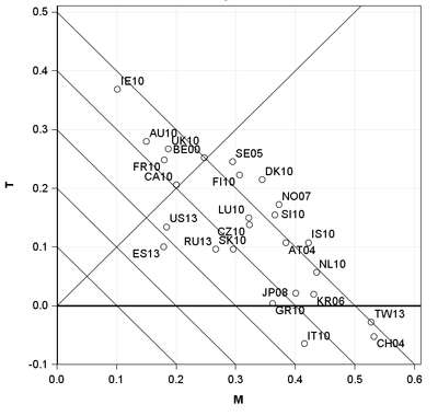
Thanks for the suggestions. The band option handles the shading issue well. But here is my output so far. I'm actually trying to represent the values of three variables: M on the x-axis, T on the y-axis and D=M+T - represented by the diagonal contours. (The points are different countries). Having the x-axis labels at the bottom is confusing if you are trying to read of the values of D (you need to read them off where the line crosses the x-axis).
- Mark as New
- Bookmark
- Subscribe
- Mute
- RSS Feed
- Permalink
- Report Inappropriate Content
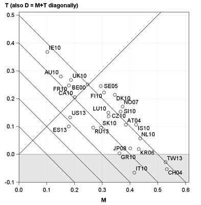
I think I've settled on the below as my solution. Moving the axis labels up to the x-axis would be too cluttered. Thanks for the 'band' suggestion. (I didn't test the 'block' suggestion) (The lineparam statement is how I plot the contour lines).
proc sgplot noautolegend aspect=1;
  band x=M upper=0 lower=-0.1 / transparency=0.8 fillattrs=(color=grey);
  scatter x=M y=T /datalabel=ID markerattrs=(size=10) ;
  lineparm x=x y=y slope=slope ;
  xaxis grid max=0.6 offsetmin=0 ;
  yaxis grid min=-0.1 max=0.5 offsetmin=0 values=(-0.1 to 0.5 by 0.1)
        Label = "T (also D = M+T diagonally)" labelpos=top;
  refline 0 /axis=x ;
  refline 0 /axis=y ;
run;
This produces
Catch up on SAS Innovate 2026
Dive into keynotes, announcements and breakthroughs on demand.
Explore Now →Learn how use the CAT functions in SAS to join values from multiple variables into a single value.
Find more tutorials on the SAS Users YouTube channel.
SAS Training: Just a Click Away
Ready to level-up your skills? Choose your own adventure.


