- Home
- /
- Programming
- /
- Graphics
- /
- SGPlot datalabels format when clm option is on
- RSS Feed
- Mark Topic as New
- Mark Topic as Read
- Float this Topic for Current User
- Bookmark
- Subscribe
- Mute
- Printer Friendly Page
- Mark as New
- Bookmark
- Subscribe
- Mute
- RSS Feed
- Permalink
- Report Inappropriate Content
I have the following code:
proc sgplot data = &lib..&sasdsn ;
format amyloplastheight 7.1 ;
vbar treat / group=gt response=amyloplastheight stat=mean  dataskin=crisp
					limits=both limitstat=clm groupdisplay=cluster datalabel datalabelattrs=(size=6);
yaxis label="amyloplastheight (^{unicode mu}m)" grid;
keylegend /position =bottom title="genotype" sortorder=ascending;
run;
However, I cannot control the format of the lower and upper limits that are also displayed.
Thanks for any suggestions.
- Mark as New
- Bookmark
- Subscribe
- Mute
- RSS Feed
- Permalink
- Report Inappropriate Content
Where do you want the confidence limits to appear?
Can you show us some sample data if you want a code answer?
- Mark as New
- Bookmark
- Subscribe
- Mute
- RSS Feed
- Permalink
- Report Inappropriate Content
Also which version of SAS are you running. There have been significant additions to graphics option in each release for quite awhile. A solution that works for SAS 9.4m5 may not work for 9.4m4.
- Mark as New
- Bookmark
- Subscribe
- Mute
- RSS Feed
- Permalink
- Report Inappropriate Content
I can give you an example with a sashelp datastep:
ods html style = analysis ;
title font=Arial height=14pt 'barchart with 95% CL' ;
proc sgplot data=sashelp.shoes;
format sales 8.2;
vbar region / response=sales stat=mean  dataskin=crisp
				   limits=both limitstat=clm groupdisplay=cluster
                   datalabel datalabelattrs=(size=6); ;
run;
title;
In the bottom, the mean is displayed with format 8.2 as requested, however also the limits are displayed with another format. I did not particularly want the limits in the bottom, but if they are, they should have the same format.
I am using SAS 9.4 1M5
- Mark as New
- Bookmark
- Subscribe
- Mute
- RSS Feed
- Permalink
- Report Inappropriate Content
Did you solve it?
I'm struggling with the same thing...
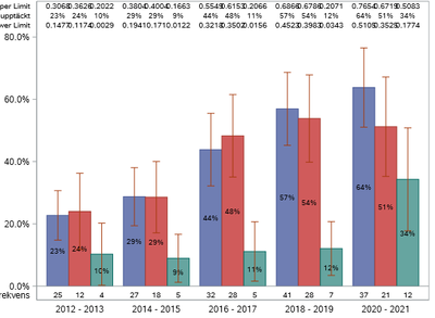
I'm using stat=mean on a variable containing 1/0 (formatted with percent8.) to get percentages (because I want upper and lower clm. The datalabel options gives the formatted value on the middle row but the upper limit and lower limit value is in decimal... Any way to change these to percent?
- Mark as New
- Bookmark
- Subscribe
- Mute
- RSS Feed
- Permalink
- Report Inappropriate Content
I did not solve it but now I am using axistables (https://support.sas.com/rnd/datavisualization/papers/2018/2180-2018.pdf)
- Mark as New
- Bookmark
- Subscribe
- Mute
- RSS Feed
- Permalink
- Report Inappropriate Content
For the record, the DATALABEL option on bar charts cannot put a label on top of a bar when there are limits enabled. If you try it, we will automatically switch to axis tables internally to display the information (we do this as a convenience). If you know that you want to customize these labels in this situation, it is best to go ahead and use axis tables directly.
Hope this helps!
Dan
Learn how use the CAT functions in SAS to join values from multiple variables into a single value.
Find more tutorials on the SAS Users YouTube channel.
SAS Training: Just a Click Away
Ready to level-up your skills? Choose your own adventure.


