- Home
- /
- Programming
- /
- Graphics
- /
- SGPlot axes through origin with negative data
- RSS Feed
- Mark Topic as New
- Mark Topic as Read
- Float this Topic for Current User
- Bookmark
- Subscribe
- Mute
- Printer Friendly Page
- Mark as New
- Bookmark
- Subscribe
- Mute
- RSS Feed
- Permalink
- Report Inappropriate Content
I'm creating a scatterplot using sgplot. My points have both positive and negative values. I would like to draw two axes through (0,0), but keep the axis labels at the edge of the graph. What's the best way to do this? (I know I can use lineparm, but I'm hoping there is a simpler option).
Accepted Solutions
- Mark as New
- Bookmark
- Subscribe
- Mute
- RSS Feed
- Permalink
- Report Inappropriate Content
REFLINE 0 / axis=y;
That draws the reference lines, but leaves the axes automatically positioned.
- Mark as New
- Bookmark
- Subscribe
- Mute
- RSS Feed
- Permalink
- Report Inappropriate Content
REFLINE 0 / axis=y;
That draws the reference lines, but leaves the axes automatically positioned.
- Mark as New
- Bookmark
- Subscribe
- Mute
- RSS Feed
- Permalink
- Report Inappropriate Content
Many thanks. That solves my current problem. For future reference (if I want to present this data differently) how do I get the axes with tickmarks and labels to go through (0,0)?
- Mark as New
- Bookmark
- Subscribe
- Mute
- RSS Feed
- Permalink
- Report Inappropriate Content
I'll let someone else advice as to how it might be accomplished. In my opinion, you shouldn't do it. The center of the plot should be reserved for the data, with the axis ticks, values, and labels positioned to the outside. This is based on basic principles of graphing (a la Tufte) which state that the data should be presented as purely and unadorned as possible.
- Mark as New
- Bookmark
- Subscribe
- Mute
- RSS Feed
- Permalink
- Report Inappropriate Content
Another thought: To obtain a whole grid of reference lines, where each line is aligned with axes ticks, use the GRID option on the XAXIS and YAXIS statements, like this:
xaxis grid;
yaxis grid;
That gives you all of the advantages of axes that cut through the plot area, but keeps the tick values and labels on the outside of the plot area.
- Mark as New
- Bookmark
- Subscribe
- Mute
- RSS Feed
- Permalink
- Report Inappropriate Content
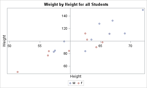
I don't think there is a way to do this in SGPLOT. However, you can do this using GTL.
In your case, your data would span across (0, 0), and you would set the x and y origins at zero.
proc template;
define statgraph class;
begingraph;
entrytitle 'Weight by Height for all Students';
layout overlay / xaxisopts=(linearopts=(origin=60))
yaxisopts=(linearopts=(origin=100));
scatterplot x=height y=weight / group=sex name='a';
discretelegend 'a';
endlayout;
endgraph;
end;
run;
proc sgrender data=sashelp.class template=class;
run;
Catch up on SAS Innovate 2026
Nearly 200 sessions are now available on demand with the SAS Innovate Digital Pass.
Explore Now →Learn how use the CAT functions in SAS to join values from multiple variables into a single value.
Find more tutorials on the SAS Users YouTube channel.
SAS Training: Just a Click Away
Ready to level-up your skills? Choose your own adventure.


