- Home
- /
- Programming
- /
- Graphics
- /
- Re: SGPlot annotation on a grouped VBAR plot
- RSS Feed
- Mark Topic as New
- Mark Topic as Read
- Float this Topic for Current User
- Bookmark
- Subscribe
- Mute
- Printer Friendly Page
- Mark as New
- Bookmark
- Subscribe
- Mute
- RSS Feed
- Permalink
- Report Inappropriate Content
Hello,
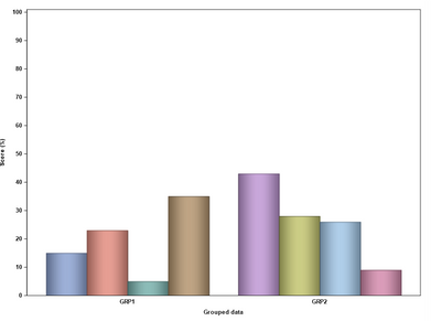
I'm having some trouble displaying annotated data on a grouped VBAR. Example code below.
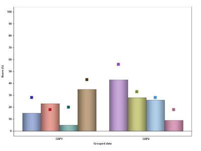
I want to display an 'x' at the bottom of each Bar, i.e. the position of the 'x' is tied to the data value of each bar.
However when I run I get the following Warning and the 'x' is not displayed on the output:
WARNING: DrawText statement has missing/invalid value for position (X or Y). Draw statement discarded.
data data1;
 length genx genid $ 10;
  genx = 'GRP1';
  genid = 'HRD1'; d1=15; output;
  genid = 'HRD2'; d1=23; output;
  genid = 'HRD3'; d1=5; output;
  genid = 'HRD4'; d1=35; output;
  genx = 'GRP2';
  genid = 'NONHRD1'; d1=43; output;
  genid = 'NONHRD2'; d1=28; output;
  genid = 'NONHRD3'; d1=26; output;
  genid = 'NONHRD4'; d1=9; output;
run;

data anno_ds;
 set data1;
   function = 'text';
   x1space = 'datavalue';
   y1space = 'layoutpercent';
   textsize = 6;
   textweight = 'normal';
   width = 20;
   widthunit = 'percent';
   anchor = 'center';
   xc1 = genid;
   y1 = -1;
   label = 'x';
run;

  ods graphics on / reset height=6.8in width=8.5in imagename='test' noborder;

  proc sgplot data=data1 noautolegend sganno=anno_ds  pad=(bottom=10pct);
   vbar genx / group=genid response=d1 groupdisplay=cluster
              dataskin=pressed ;

   xaxis label='Grouped data' display=(noticks) valueattrs=(size=7 family=Arial weight=bold) labelattrs=(size=7 family=Arial weight=bold);
   yaxis label='Score (%)' values=(0 to 100 by 10) valueattrs=(size=7 family=Arial weight=bold) labelattrs=(size=7 family=Arial weight=bold);
  run;
Thank you for looking,
Chris.
Accepted Solutions
- Mark as New
- Bookmark
- Subscribe
- Mute
- RSS Feed
- Permalink
- Report Inappropriate Content
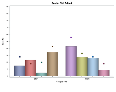
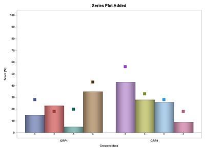
You could use a SERIES plot, or you could also recreate the type of figure you attached using a SCATTER plot.
data data1;
 length genx genid $ 10;
  genx = 'GRP1';
  genid = 'HRD1'; d1=15; d2=28; output;
  genid = 'HRD2'; d1=23; d2=18; output;
  genid = 'HRD3'; d1=5; d2=20; output;
  genid = 'HRD4'; d1=35; d2=43; output;
  genx = 'GRP2';
  genid = 'NONHRD1'; d1=43; d2=56; output;
  genid = 'NONHRD2'; d1=28; d2=33; output;
  genid = 'NONHRD3'; d1=26; d2=28; output;
  genid = 'NONHRD4'; d1=9; d2=18; output;
run;
data data1;
  set data1;
  mark = 'x';
  ylbl = -1;
run;
ods graphics on / reset height=6.8in width=8.5in imagename='test' noborder;


proc sgplot data=data1 noautolegend   pad=(bottom=10pct);
   vbarparm category=genx  response=d1/ group=genid groupdisplay=cluster
            dataskin=pressed ;
   scatter x=genx y=d2 / group=genid groupdisplay=cluster  dataskin=pressed
          markerattrs=(symbol=squarefilled size=8 ) ;
   text x=genx y=ylbl text=mark/ group=genid groupdisplay=cluster
          textattrs=(color=black size=7)  contributeoffsets=none;
   xaxis label='Grouped data' display=(noticks) valueattrs=(size=7 family=Arial weight=bold) labelattrs=(size=7 family=Arial weight=bold);
   yaxis label='Score (%)' values=(0 to 100 by 10) valueattrs=(size=7 family=Arial weight=bold) labelattrs=(size=7 family=Arial weight=bold);
   title "Scatter Plot Added";
run;

proc sgplot data=data1 noautolegend   pad=(bottom=10pct);
   vbarparm category=genx  response=d1/ group=genid groupdisplay=cluster
            dataskin=pressed ;
   series x=genx y=d2 / group=genid groupdisplay=cluster  dataskin=pressed
          lineattrs=(pattern=solid thickness=10); ;
   text x=genx y=ylbl text=mark/ group=genid groupdisplay=cluster
          textattrs=(color=black size=7)  contributeoffsets=none;
   xaxis label='Grouped data' display=(noticks) valueattrs=(size=7 family=Arial weight=bold) labelattrs=(size=7 family=Arial weight=bold);
   yaxis label='Score (%)' values=(0 to 100 by 10) valueattrs=(size=7 family=Arial weight=bold) labelattrs=(size=7 family=Arial weight=bold);
   title "Series Plot Added";
run;- Mark as New
- Bookmark
- Subscribe
- Mute
- RSS Feed
- Permalink
- Report Inappropriate Content
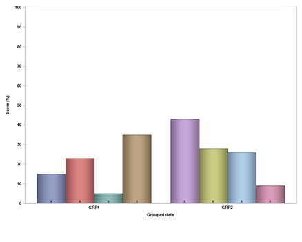
I think the issue is that the xc1 values are based on the genid group variable but the x-axis is determined by the genx variable, so the procedure is expecting xc1 to be wither 'GRP1' or 'GRP2'.
You might try some of the approaches described in this blogs post
https://blogs.sas.com/content/graphicallyspeaking/2016/04/08/displaying-group-values-on-axis/
Using the code you provided (which was great by the way) and looking at that post the following code might be close to what you have in mind.
data data1;
 length genx genid $ 10;
  genx = 'GRP1';
  genid = 'HRD1'; d1=15;  output;
  genid = 'HRD2'; d1=23;  output;
  genid = 'HRD3'; d1=5; output;
  genid = 'HRD4'; d1=35;  output;
  genx = 'GRP2';
  genid = 'NONHRD1'; d1=43;  output;
  genid = 'NONHRD2'; d1=28;  output;
  genid = 'NONHRD3'; d1=26; output;
  genid = 'NONHRD4'; d1=9; output;
run;

data data1;
  set data1;
  mark = 'x';
  ylbl = 1;
run;

ods graphics on / reset height=6.8in width=8.5in imagename='test' noborder;
proc sgplot data=data1 noautolegend   pad=(bottom=10pct);
   vbarparm category=genx  response=d1/ group=genid groupdisplay=cluster
            dataskin=pressed ;
   text x=genx y=ylbl text=mark/ group=genid groupdisplay=cluster
          textattrs=(color=black size=7)  contributeoffsets=none;
   xaxis label='Grouped data' display=(noticks) valueattrs=(size=7 family=Arial weight=bold) labelattrs=(size=7 family=Arial weight=bold);
   yaxis label='Score (%)' values=(0 to 100 by 10) valueattrs=(size=7 family=Arial weight=bold) labelattrs=(size=7 family=Arial weight=bold);
run;
Note the switch from using a VBAR to VBARPARM so it can be layered with the TEXT plot. A more involved approach might be to keep using the annotation data set but set the x1 position based on some percentage value. Not sure if others might have some other better suggestions.
- Mark as New
- Bookmark
- Subscribe
- Mute
- RSS Feed
- Permalink
- Report Inappropriate Content
Hi Michael,
Thanks for the suggestion.
Yes that will work. Unfortunately there is a specific reason I'm using VBAR which is I also have a VLINE statement in my SGPLOT, which I had left out for convenience to explain the issue.
Is there also an equivalent of VBARPARM for VLINE so that I can still overlay the text as in your example?
data data1;
 length genx genid $ 10;
  genx = 'GRP1';
  genid = 'HRD1'; d1=15; d2=28; output;
  genid = 'HRD2'; d1=23; d2=18; output;
  genid = 'HRD3'; d1=5; d2=20; output;
  genid = 'HRD4'; d1=35; d2=43; output;
  genx = 'GRP2';
  genid = 'NONHRD1'; d1=43; d2=56; output;
  genid = 'NONHRD2'; d1=28; d2=33; output;
  genid = 'NONHRD3'; d1=26; d2=28; output;
  genid = 'NONHRD4'; d1=9; d2=18; output;
run;


  ods graphics on / reset height=6.8in width=8.5in imagename='test' noborder;

  proc sgplot data=data1 noautolegend sganno=anno_ds  pad=(bottom=10pct);
   vbar genx / group=genid response=d1 groupdisplay=cluster
             dataskin=pressed ;

   vline genx / group=genid response=d2 groupdisplay=cluster
              dataskin=pressed markerattrs=(symbol=trianglefilled size=8 color=red) lineattrs=(pattern=solid thickness=10);

   xaxis label='Grouped data' display=(noticks) valueattrs=(size=7 family=Arial weight=bold) labelattrs=(size=7 family=Arial weight=bold);
   yaxis label='Score (%)' values=(0 to 100 by 10) valueattrs=(size=7 family=Arial weight=bold) labelattrs=(size=7 family=Arial weight=bold);
  run;
Thanks again,
Chris.
- Mark as New
- Bookmark
- Subscribe
- Mute
- RSS Feed
- Permalink
- Report Inappropriate Content
You could use a SERIES plot, or you could also recreate the type of figure you attached using a SCATTER plot.
data data1;
 length genx genid $ 10;
  genx = 'GRP1';
  genid = 'HRD1'; d1=15; d2=28; output;
  genid = 'HRD2'; d1=23; d2=18; output;
  genid = 'HRD3'; d1=5; d2=20; output;
  genid = 'HRD4'; d1=35; d2=43; output;
  genx = 'GRP2';
  genid = 'NONHRD1'; d1=43; d2=56; output;
  genid = 'NONHRD2'; d1=28; d2=33; output;
  genid = 'NONHRD3'; d1=26; d2=28; output;
  genid = 'NONHRD4'; d1=9; d2=18; output;
run;
data data1;
  set data1;
  mark = 'x';
  ylbl = -1;
run;
ods graphics on / reset height=6.8in width=8.5in imagename='test' noborder;


proc sgplot data=data1 noautolegend   pad=(bottom=10pct);
   vbarparm category=genx  response=d1/ group=genid groupdisplay=cluster
            dataskin=pressed ;
   scatter x=genx y=d2 / group=genid groupdisplay=cluster  dataskin=pressed
          markerattrs=(symbol=squarefilled size=8 ) ;
   text x=genx y=ylbl text=mark/ group=genid groupdisplay=cluster
          textattrs=(color=black size=7)  contributeoffsets=none;
   xaxis label='Grouped data' display=(noticks) valueattrs=(size=7 family=Arial weight=bold) labelattrs=(size=7 family=Arial weight=bold);
   yaxis label='Score (%)' values=(0 to 100 by 10) valueattrs=(size=7 family=Arial weight=bold) labelattrs=(size=7 family=Arial weight=bold);
   title "Scatter Plot Added";
run;

proc sgplot data=data1 noautolegend   pad=(bottom=10pct);
   vbarparm category=genx  response=d1/ group=genid groupdisplay=cluster
            dataskin=pressed ;
   series x=genx y=d2 / group=genid groupdisplay=cluster  dataskin=pressed
          lineattrs=(pattern=solid thickness=10); ;
   text x=genx y=ylbl text=mark/ group=genid groupdisplay=cluster
          textattrs=(color=black size=7)  contributeoffsets=none;
   xaxis label='Grouped data' display=(noticks) valueattrs=(size=7 family=Arial weight=bold) labelattrs=(size=7 family=Arial weight=bold);
   yaxis label='Score (%)' values=(0 to 100 by 10) valueattrs=(size=7 family=Arial weight=bold) labelattrs=(size=7 family=Arial weight=bold);
   title "Series Plot Added";
run;- Mark as New
- Bookmark
- Subscribe
- Mute
- RSS Feed
- Permalink
- Report Inappropriate Content
Hi Michael,
Thank you for this - it works very well for what I need. It's a case of getting used the different statements available within SGPLOT and how they compliment each other.
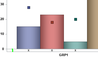
Out of interest is there a way to increase the space between the x-axis 0 line and the line at the bottom of the plot (where I have drawn the green line in the below image). Apologies I know this is a separate question - happy to submit it as new if required.
Best regards,
Chris.
- Mark as New
- Bookmark
- Subscribe
- Mute
- RSS Feed
- Permalink
- Report Inappropriate Content
Glad to help.
You can adjust the axis range by using the RANGES= option in the YAXIS statement, so something like:
 yaxis label='Score (%)' values=(0 to 100 by 10) ranges=(-2-100)
       valueattrs=(size=7 family=Arial weight=bold) labelattrs=(size=7 family=Arial weight=bold);
The "Plot Type Compatibility" section in the ODS Graphics documentation is a nice quick reference for information what type of plots can and cannot be overlaid.
- Mark as New
- Bookmark
- Subscribe
- Mute
- RSS Feed
- Permalink
- Report Inappropriate Content
I suggest to specify a CLUSTERWIDTH= in your VBAR statement then you can use the DISCRETEOFFSET variable in the annotate dataset to shift the value according to the number of bars you have. This should also work together with VLINE as long as you also specify the clusterwidth.
See example code for an illustration of the concept
data data1;
 length genx genid $ 10;
  genx = 'GRP1';
  genid = 'HRD1'; d1=15;  output;
  genid = 'HRD2'; d1=23;  output;
  genid = 'HRD3'; d1=5; output;
  genid = 'HRD4'; d1=35;  output;
  genx = 'GRP2';
  genid = 'NONHRD1'; d1=43;  output;
  genid = 'NONHRD2'; d1=28;  output;
  genid = 'NONHRD3'; d1=26; output;
  genid = 'NONHRD4'; d1=9; output;
  genx = 'GRP3';
  genid = 'NONHRD1'; d1=43;  output;
  genid = 'NONHRD2'; d1=28;  output;
  genid = 'NONHRD3'; d1=26; output;
  genid = 'NONHRD4'; d1=9; output;

run;

data anno_ds;
  set data1;
  by genx;

  if first.genx then do;
    function = 'text';
    x1space = 'datavalue';
    y1space = 'wallpercent';
    textsize = 10;
    textweight = 'normal';
    width = 20;
    widthunit = 'percent';
    anchor = 'center';
    xc1 = genx;
    y1 = 75;

    do myoffset =   -0.4 to 0.4 by 0.1;
      discreteoffset = round(myoffset, 0.1);
      label = cats(discreteoffset);
      output;
    end;

    function = "line";
    x1space = 'datavalue';
    x2space = 'datavalue';
    y1space = 'wallpercent';
    y2space = 'wallpercent';
    xc1=genx;
    xc2=genx;
    y1=0;
    y2=75;

    do myoffset =   -0.4 to 0.4 by 0.1;
      discreteoffset = round(myoffset, 0.1);
      label = cats(discreteoffset);
      output;
    end;
  end;
run;

ods graphics on / reset height=6.8in width=8.5in imagename='test' noborder;

proc sgplot data=data1  sganno=anno_ds  pad=(bottom=10pct);
  * where genid like '%2%' or genid like '%1%';
  vbar genx / group=genid response=d1 groupdisplay=cluster barwidth=1 clusterwidth=0.8;
run;

proc sgplot data=data1  sganno=anno_ds  pad=(bottom=10pct);
  where genid like '%2%' or genid like '%1%';
  vbar genx / group=genid response=d1 groupdisplay=cluster barwidth=1 clusterwidth=0.8;
run;
V
- Mark as New
- Bookmark
- Subscribe
- Mute
- RSS Feed
- Permalink
- Report Inappropriate Content
Hi Bruno,
Thanks for this example. It's interesting to see how the discreteoffset works and I'll remember this for future reference.
The main problem I have with this is that each group (HRD and NONHRD) has a different number of bars and the number of bars can change for each group each time the program is run so then I have to re-calculate the exact position of the centre of each bar as the number of bars change.
Whilst this is easily done with macro vars to determine the number of bars it would still take trial and error to figure out the exact offset to use each time.
However it's good to know this approach is possible so I'll keep this in mind.
Regards,
Chris.
- Mark as New
- Bookmark
- Subscribe
- Mute
- RSS Feed
- Permalink
- Report Inappropriate Content
This is a good use case for the AXISTABLE statement. Available both in GTL and SGPLOT.
https://blogs.sas.com/content/graphicallyspeaking/2016/07/17/graph-table-with-class/
April 27 – 30 | Gaylord Texan | Grapevine, Texas
Registration is open
Walk in ready to learn. Walk out ready to deliver. This is the data and AI conference you can't afford to miss.
Register now and save with the early bird rate—just $795!
Learn how use the CAT functions in SAS to join values from multiple variables into a single value.
Find more tutorials on the SAS Users YouTube channel.
SAS Training: Just a Click Away
Ready to level-up your skills? Choose your own adventure.

