- Home
- /
- Programming
- /
- Graphics
- /
- Re: SGPLOT Needle graph fitpolicy issues
- RSS Feed
- Mark Topic as New
- Mark Topic as Read
- Float this Topic for Current User
- Bookmark
- Subscribe
- Mute
- Printer Friendly Page
- Mark as New
- Bookmark
- Subscribe
- Mute
- RSS Feed
- Permalink
- Report Inappropriate Content
Hi all,
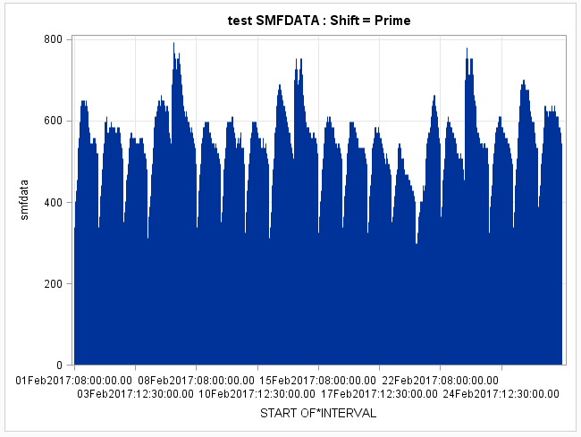
I'm trying to create graph using SGPLOT with datetime variable on X axis that contains in excess of 500 datapoints. I need to show all datapoints so utilized the NEEDLE graph for this. Without any specialized coding the x axis labels becomes unreadable. After reading up on SGPLOT (and we are on SAS 9.4) I found the FITPOLICY settings that allow us to select differing STAGGER options. I used STAGGERTHIN and the datetime variables are limited and readable however they are horizontal and would like to get them in a rotated angle to make it more readable. When I try to use STAGGERROTATE it goes back to showing all of the axis labels (appears stagger is not working). Is there another option or way to rotate the x axis datapoints that I am missing? Or do I need to revert back to GPLOT. Here is code that kind of works. (note discrete used as we removed weekends)
proc sgplot data=plotit;
needle x=datetime y=smfdata ;
yaxis grid ;
xaxis type=discrete grid FITPOLICY=STAGGERTHIN ;
run;
- Mark as New
- Bookmark
- Subscribe
- Mute
- RSS Feed
- Permalink
- Report Inappropriate Content
By default, the ROTATE fit policy rotates the baseline 45 degrees. You can change that to 90 degrees by also specifying VALUESROTATE=VERTICAL along with your ROTATE fit policy. For the STAGGERROTATE fit policy, the values are first staggered. If there are still collisions, the values are fit using ROTATE (as staggering and rotation cannot be done together).
Since your X variable is datetime, you might want to consider not using TYPE=DISCRETE and let the TIME axis be used. You can also control the interval displayed by using the INTERVAL option.
Hope this helps!
Dan
- Mark as New
- Bookmark
- Subscribe
- Mute
- RSS Feed
- Permalink
- Report Inappropriate Content
- Mark as New
- Bookmark
- Subscribe
- Mute
- RSS Feed
- Permalink
- Report Inappropriate Content
Which version of SAS are you using? The latest releases have all had noticeable changes to available options and we would like to not make a recommendation that you can't use.
You might consider adding a VALUES=() part to your Xaxis statement to control which values are displayed.
Also what format does your x variable currently have? You may want ot consider a Tickvalueformat option on Xaxis to control appearance better (shorted display).
You don't mention what your interval actually may or the actual total interval of time involved for your 500 points but since you say you "removoed weekendends" you might consider the options to display ticks at on one or two days per week with Values.
- Mark as New
- Bookmark
- Subscribe
- Mute
- RSS Feed
- Permalink
- Report Inappropriate Content
We are on SAS 9.4. We were trying to do a dynamic values for XAxis since this should be repeatable code for any month/week. We need type=discrete to remove 'blank' time reported. Maybe macro variable passed into the Values=() statement would work.I was also looking at the interval = and tick value format application and it looks like the following code gets us close to just the discrete - still would like to rotate the Xaxis interval/ticks. Here was code and attached the resulting chart is attached. If I remove the staggerthin it gets busy again.
proc sgplot data=plotit;
needle x=startime y=smfdata ;
yaxis grid ;
xaxis type=discrete grid FITPOLICY=staggerthin interval=week tickvalueformat=date;

Learn how use the CAT functions in SAS to join values from multiple variables into a single value.
Find more tutorials on the SAS Users YouTube channel.
SAS Training: Just a Click Away
Ready to level-up your skills? Choose your own adventure.


