- Home
- /
- Programming
- /
- Graphics
- /
- SAS Graph Options
- RSS Feed
- Mark Topic as New
- Mark Topic as Read
- Float this Topic for Current User
- Bookmark
- Subscribe
- Mute
- Printer Friendly Page
- Mark as New
- Bookmark
- Subscribe
- Mute
- RSS Feed
- Permalink
- Report Inappropriate Content
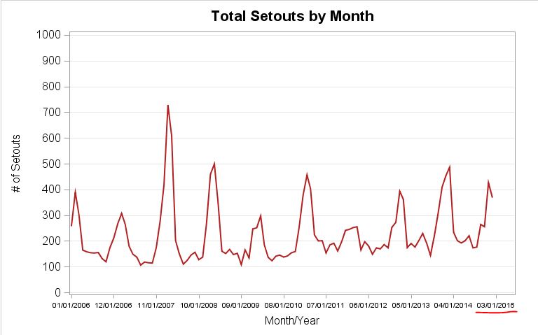
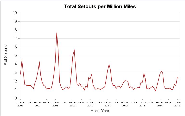
I'm having some issues with graphs in SAS EG. Below are two graphs with the SAME code for the xaxis options, yet they show different tick marks (underlined in red).
How can I get them to output the same last tick mark? I also want the tick mark to end with a different date, specifically '03/01/2015'.
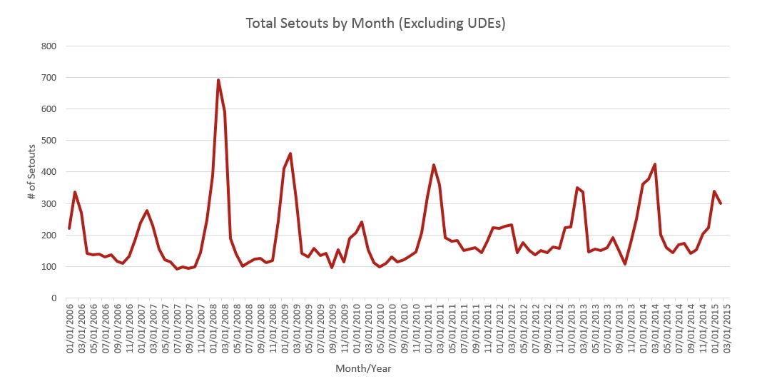
Is there any way to rotate the xaxis values 90 degrees so MORE tick marks will show up as well? Below is an example of how I would like these graphs to look (done in excel):
Here is my code:
goptions htext=15pt ;
title h=15pt "Total Setouts per Million Miles";
proc sgplot data=work.setouts_monthly_pmm;
series x=mondate y=PMM / lineattrs=(color=firebrick thickness=2.5);
xaxis fitpolicy=rotatethin valueattrs=(size=7pt) label="Month/Year" labelattrs=(size=12pt) values=('01jan2006'd to '01mar2015'd by semimonth) minor;
yaxis valueattrs=(size=12pt) label="# of Setouts" grid values=(0 to 10 by 1) labelattrs=(size=12pt);
run;
title;
ods graphics off;
- Mark as New
- Bookmark
- Subscribe
- Mute
- RSS Feed
- Permalink
- Report Inappropriate Content
Which version are you using? The graphics options have changed rapidly with the introduction of the ODS Graphics and solutions recommended may not match your installation.
If you want more axix ticks use Fitpolicy=rotate instead of Rotatethin. The 'thin' part means to reduce the number shown. Since your axis results aren't rotated then your results are not coming from the exact syntax shown (or EG is doing something weird)
With the apparent size difference between the two graphs you need to examine a few other options as well such as changes in width of the ODS graphics area.
- Mark as New
- Bookmark
- Subscribe
- Mute
- RSS Feed
- Permalink
- Report Inappropriate Content
Hi ballardw, it's SAS EG 6.1 (64 bit).
I tried the fitpolicy=rotate, and that did not result in the 90 rotation.
The size difference between the graphs is due to me resizing them after I imported the image into this text space (unless you're seeing something else that could be determined in SAS).
Here is my updated code (and I included the code for both graphs although the only difference is the title and the y= statement):
ods graphics on / width=8in height=5in ;
goptions reset=all ;
goptions htext=15pt ;
title h=15pt "Total Setouts by Month";
proc sgplot data=work.monthly_setouts_udes ;
series x=mondate y=SUM_of_points / lineattrs=(color=firebrick thickness=2.5);
xaxis fitpolicy=rotate valueattrs=(size=7pt) label="Month/Year" labelattrs=(size=12pt) values=('01jan2006'd to '03jul2015'd by semimonth) minor;
yaxis valueattrs=(size=12pt) label="# of Setouts" grid values=(0 to 1000 by 100) labelattrs=(size=12pt);
run;
title;
goptions reset=all;
goptions htext=15pt;
title h=15pt "Total Setouts per Million Miles";
proc sgplot data=work.setouts_monthly_pmm;
series x=mondate y=PMM / lineattrs=(color=firebrick thickness=2.5);
xaxis fitpolicy=rotate valueattrs=(size=7pt) label="Month/Year" labelattrs=(size=12pt) values=('01jan2006'd to '03jul2015'd by semimonth) minor;
yaxis valueattrs=(size=12pt) label="# of Setouts" grid values=(0 to 10 by 1) labelattrs=(size=12pt);
run;
title;
ods graphics off;
- Mark as New
- Bookmark
- Subscribe
- Mute
- RSS Feed
- Permalink
- Report Inappropriate Content
@laneylaners wrote:
Hi ballardw, it's SAS EG 6.1 (64 bit).
I tried the fitpolicy=rotate, and that did not result in the 90 rotation.
Documentation shows Rotate will generate angled text which might be as close as you get with the SGPLOT.
If you really need a vertical label you may need to move to another procedure.
I'm not sure why the missing labels aren't displayed. There may be something in EG that is enforcing only display ticks with y values. I don't use EG so I'm not sure on that bit.
You might investigate combining your data into a single set matching on the date and look at Proc SGSCATTER with join to show two graphs above each other with a common axis.
- Mark as New
- Bookmark
- Subscribe
- Mute
- RSS Feed
- Permalink
- Report Inappropriate Content
For the record, we added a new option to the SGPLOT and SGPANEL in 9.4m3 called, VALUESROTATE=DIAGONAL | VERTICAL. This options controls the amount of rotation to use when FITPOLICY=ROTATE kicks in.
- Mark as New
- Bookmark
- Subscribe
- Mute
- RSS Feed
- Permalink
- Report Inappropriate Content
Where would I type this into the code? I tried in the xaxis statement and goptions but it was not recognized.
- Mark as New
- Bookmark
- Subscribe
- Mute
- RSS Feed
- Permalink
- Report Inappropriate Content
Out of curiousity, have you tried creating this graph without the VALUES option? It should give you a nice split time axis. You can also set the interval of the time axis by using the INTERVAL option. For your case, try MONTH or QUARTER.
- Mark as New
- Bookmark
- Subscribe
- Mute
- RSS Feed
- Permalink
- Report Inappropriate Content
Hi DanH_sas,
I suppose that could work for now, but i'm guessing my boss will want a final report with the text rotated 90 degrees and like the example I provided (3rd graph in original post).
And this is what I currently have from using intervals=semimonth. it still doesn't give me the end date of 03/01/2015 that is desired.
- Mark as New
- Bookmark
- Subscribe
- Mute
- RSS Feed
- Permalink
- Report Inappropriate Content
If you include program AND sample data thta will run, it is easier to figure out what is going on.
With SAS 9.40M3, you can use VALUESROTATE option for discrete data. You can try using that option to see if it is supported.
What is the SAS version behind the EG 6.1?
There are differences in your data (Y axis values are bigger). This can change the space available for the x axis, and the graph layout. Is your x axis data (mondate) a numeric with a SAS Date format, or just alphanumeric?
- Mark as New
- Bookmark
- Subscribe
- Mute
- RSS Feed
- Permalink
- Report Inappropriate Content
Hi Sanjay,
How do I find out the SAS version behind EG?
I'll work on getting a full program and sample data to post here. Some of it is sensitive info.
- Mark as New
- Bookmark
- Subscribe
- Mute
- RSS Feed
- Permalink
- Report Inappropriate Content
Send us the result (in the SAS log) from submitting:
%put SYSVLONG4 = &SYSVLONG4;
For more information about SAS versions, see "Determine the version of SAS software at run time"
- Mark as New
- Bookmark
- Subscribe
- Mute
- RSS Feed
- Permalink
- Report Inappropriate Content
SYSVLONG4 = 9.04.01M2P07232014
- Mark as New
- Bookmark
- Subscribe
- Mute
- RSS Feed
- Permalink
- Report Inappropriate Content
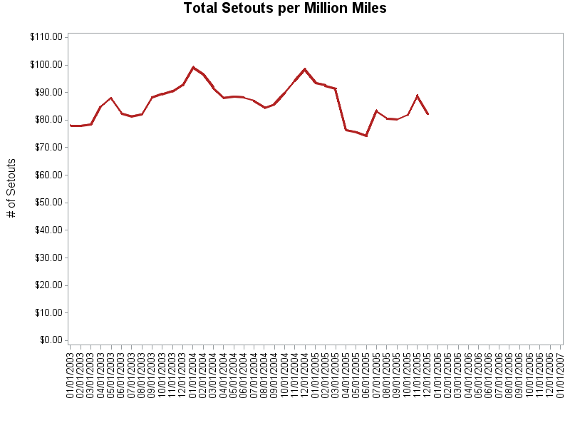
If you can't find a way using sgplot in your version of SAS, here's how to do it using SAS/Graph gplot. You can easily specify any axis endpoints you want, and the angle of the tickmark values, in the axis statement. (Since I don't have your data, I'm just 'faking' the data using some out of sashelp.)
data setouts_monthly_pmm; set sashelp.stocks (where=(stock='IBM'));
mondate=date;
PMM=close;
run;
goptions htext=10pt;
axis1 label=none order=('01jan2003'd to '01jan2007'd by month) value=(angle=90) minor=none;
axis2 label=(h=12pt angle=90 "# of Setouts") order=(0 to 110 by 10) minor=none;
symbol1 value=none interpol=join width=2.0 color=firebrick;
title h=15pt "Total Setouts per Million Miles";
proc gplot data=setouts_monthly_pmm;
format date mmddyy10.;
plot close*date=1 /
haxis=axis1 vaxis=axis2;
run;
Catch up on SAS Innovate 2026
Dive into keynotes, announcements and breakthroughs on demand.
Explore Now →Learn how use the CAT functions in SAS to join values from multiple variables into a single value.
Find more tutorials on the SAS Users YouTube channel.
SAS Training: Just a Click Away
Ready to level-up your skills? Choose your own adventure.


