- Home
- /
- Programming
- /
- Graphics
- /
- Recreate a graph with two mirrored histograms
- RSS Feed
- Mark Topic as New
- Mark Topic as Read
- Float this Topic for Current User
- Bookmark
- Subscribe
- Mute
- Printer Friendly Page
- Mark as New
- Bookmark
- Subscribe
- Mute
- RSS Feed
- Permalink
- Report Inappropriate Content
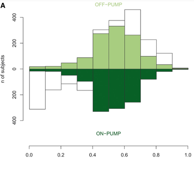
I have seen the following graph in this paper: https://doi.org/10.1093/ejcts/ezy167
It shows the distribution of propensity scores for two groups, highlighting the patients that have been matched using the score.
Imagine that I have a data set DATA with three variables:
- MATCHED: 0/1 variable to identify the matched patients
- PS: propensity scores for all the patients
- GROUP: variable that defines if the patients are in the ON-PUMP or OFF-PUMP group.
How could I replicate this graph using PROC SGPLOT ?
Accepted Solutions
- Mark as New
- Bookmark
- Subscribe
- Mute
- RSS Feed
- Permalink
- Report Inappropriate Content
This type of graph is sometimes called a butterfly plot.
Your example is slightly more complicated than the one in the blog post, "A butterfly plot for comparing distributions,"
but I think that article is a good place to start.
- Mark as New
- Bookmark
- Subscribe
- Mute
- RSS Feed
- Permalink
- Report Inappropriate Content
Google finds an answer quickly
https://blogs.sas.com/content/graphicallyspeaking/2013/11/21/comparative-histograms/
and other solutions are found via Google as well
Paige Miller
- Mark as New
- Bookmark
- Subscribe
- Mute
- RSS Feed
- Permalink
- Report Inappropriate Content
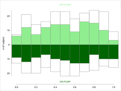
Check Rick.Wicklin 's blog:
Overlay a curve on a histogram in SAS - The DO Loop
/*
That would be better if you post some real data.
*/
data have;
call streaminit(123);
do group='ON-PUMP','OFF-PUMP';
 do id=1 to 200;
  matched=rand('bern',0.6);
  ps=rand('uniform');
  group2=group;
  output;
 end;
end;
run;


ods select none;
proc sgplot data=have;
histogram ps/group=group scale=count nbins=20;
ods output sgplot=sgplot1;
run;

proc sgplot data=have(where=(matched=1));
histogram ps/group=group2 scale=count nbins=20;
ods output sgplot=sgplot2;
run;
ods select all;

data sgplot1;
 set sgplot1;
 if BIN_PS_GROUP_GROUP_SCALE_cou__GP='ON-PUMP' then
 BIN_PS_GROUP_GROUP_SCALE_cou___Y=-BIN_PS_GROUP_GROUP_SCALE_cou___Y;
 keep BIN_PS_GROUP_GROUP_SCALE_cou__GP BIN_PS_GROUP_GROUP_SCALE_cou___Y BIN_PS_GROUP_GROUP_SCALE_cou___X;
run;
data sgplot2;
 set sgplot2;
 if BIN_PS_GROUP_GROUP2_SCALE_co__GP='ON-PUMP' then
 BIN_PS_GROUP_GROUP2_SCALE_co___Y=-BIN_PS_GROUP_GROUP2_SCALE_co___Y;
 keep BIN_PS_GROUP_GROUP2_SCALE_co__GP BIN_PS_GROUP_GROUP2_SCALE_co___Y BIN_PS_GROUP_GROUP2_SCALE_co___X;
run;
data want;
 merge sgplot1 sgplot2;
run;


proc format;
picture fmt
low-0='00009';
run;
proc sgplot data=want noautolegend;
format BIN_PS_GROUP_GROUP_SCALE_cou___Y fmt.;
styleattrs datacolors=( darkgreen lightgreen) AXISEXTENT=data;
/*styleattrs datacolors=( CX006837 CXC2E699) AXISEXTENT=data;*/
 vbarparm category=BIN_PS_GROUP_GROUP_SCALE_cou___X
          response=BIN_PS_GROUP_GROUP_SCALE_cou___Y /
          barwidth=1 group=BIN_PS_GROUP_GROUP_SCALE_cou__GP outlineattrs=(color=grey) nofill;
 inset 'OFF-PUMP'/textattrs=(color=lightgreen) position=top;

 vbarparm category=BIN_PS_GROUP_GROUP2_SCALE_co___X
          response=BIN_PS_GROUP_GROUP2_SCALE_co___Y /
          barwidth=1 group=BIN_PS_GROUP_GROUP_SCALE_cou__GP outlineattrs=(color=grey);
 inset 'ON-PUMP'/textattrs=(color=darkgreen) position=bottom;

xaxis values=(0 to 1 by 0.2) type=linear display=(nolabel) offsetmin=0.05 offsetmax=0.05;
yaxis label='n of subject' offsetmin=0.1 offsetmax=0.1;
run;
- Mark as New
- Bookmark
- Subscribe
- Mute
- RSS Feed
- Permalink
- Report Inappropriate Content
This type of graph is sometimes called a butterfly plot.
Your example is slightly more complicated than the one in the blog post, "A butterfly plot for comparing distributions,"
but I think that article is a good place to start.
Catch up on SAS Innovate 2026
Dive into keynotes, announcements and breakthroughs on demand.
Explore Now →Learn how use the CAT functions in SAS to join values from multiple variables into a single value.
Find more tutorials on the SAS Users YouTube channel.
SAS Training: Just a Click Away
Ready to level-up your skills? Choose your own adventure.


