- Home
- /
- Programming
- /
- Graphics
- /
- Proc gplot color and symbol question
- RSS Feed
- Mark Topic as New
- Mark Topic as Read
- Float this Topic for Current User
- Bookmark
- Subscribe
- Mute
- Printer Friendly Page
- Mark as New
- Bookmark
- Subscribe
- Mute
- RSS Feed
- Permalink
- Report Inappropriate Content
Hello,
I am running into this issue and it would be great if someone can help me out.
I am using the following statements:
goptions vsize=5 hsize=7 gunit=pct cback=white horigin=0.5
ftext=swiss ftitle=swissb htitle=3 htext=3;
symbol value=dot interpol=hilobj;
proc gplot data=all;
plot y * instrument = sample;
run;
Since I have about 30 samples, SAS seems to be running out of colors and after 12 samples, it starts with the same set of colors but now with other symbols. And, most importantly, it is not drawing those lines connecting the samples (across the 3 instruments) once it switches to the different symbol-so I have lines joining the first 12 samples only. Is there a way to make SAS draw the lines for all the samples (i.e. make SAS use only dots and some more colors additional to the first 12)?
Thanks so much for reading!
- Mark as New
- Bookmark
- Subscribe
- Mute
- RSS Feed
- Permalink
- Report Inappropriate Content
Sounds like you'll want to use the 'repeat=' option on your symbol statement, to repeat the marker value= and line interpol= for all ~30 of your samples. I typically use a repeat number much higher than I actually need, just to be on the safe side. Here's a short example to get you started...
symbol value=dot interpol=join repeat=100;
proc gplot data=maps.us;
plot y*x=state;
run;
- Mark as New
- Bookmark
- Subscribe
- Mute
- RSS Feed
- Permalink
- Report Inappropriate Content
Thanks so much! I finally had a chance to try that and it worked very well for me. Thanks for your answer
- Mark as New
- Bookmark
- Subscribe
- Mute
- RSS Feed
- Permalink
- Report Inappropriate Content
Hello,
I tried this approach (using SAS Studio in a SAS Grid environment, V3.5 (Enterprise Edition)) with proc gplot and I am successful in getting all of my data represented with a symbol value = dot, but even with the r=100 (for example) option I am still only seeing the same 12 colors repeated over my many series. Has something changed in since this post (e.g., a new option that I should be choosing) that might solve this issue for me?
symbol interpol=join value=dot r=100;
Thanks in advance for any guidance,
Chris
- Mark as New
- Bookmark
- Subscribe
- Mute
- RSS Feed
- Permalink
- Report Inappropriate Content
CRMcClure - I believe what you are seeing is the expected behavior. In recent versions of SAS, default colors are controlled by ods styles (the default style probably being htmlblue), and I believe the styles have about 12 colors in them. I think in most SAS/Graph procs, once the color list is exhausted, the colors are recycled with a slightly different shade (I forget if it's lighter or darker).
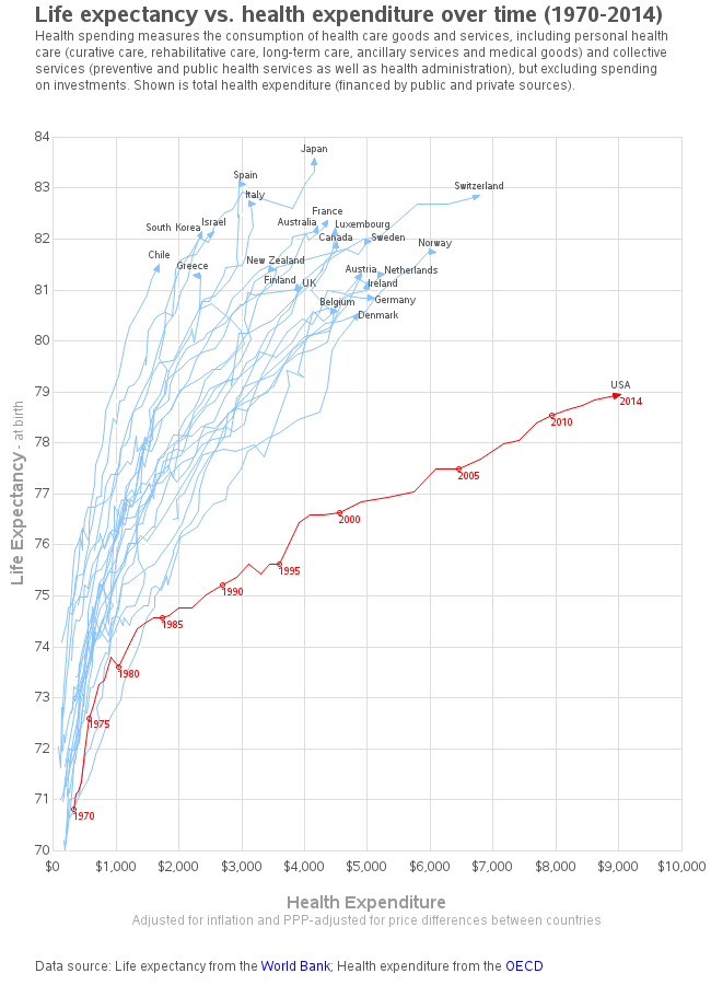
But really, once you have more than a few (maybe 5?) colors in a plot ... especially a line plot, I don't think most users will be able to discern them. I would suggest possibly using another strategy to color your lines. I often find that in a plot with a lot of lines, it is often useful to make all the lines a light color, and the the one line-of-interest red. Here's an example:
http://robslink.com/SAS/democd89/life_expectancy_healthcare.htm
http://robslink.com/SAS/democd89/life_expectancy_healthcare.sas
- Mark as New
- Bookmark
- Subscribe
- Mute
- RSS Feed
- Permalink
- Report Inappropriate Content
Much appreciated, this helped me solve my problem. Thanks.
April 27 – 30 | Gaylord Texan | Grapevine, Texas
Registration is open
Walk in ready to learn. Walk out ready to deliver. This is the data and AI conference you can't afford to miss.
Register now and save with the early bird rate—just $795!
Learn how use the CAT functions in SAS to join values from multiple variables into a single value.
Find more tutorials on the SAS Users YouTube channel.
SAS Training: Just a Click Away
Ready to level-up your skills? Choose your own adventure.


