- Home
- /
- Programming
- /
- Graphics
- /
- Proc SGPlot and tick marks for date values
- RSS Feed
- Mark Topic as New
- Mark Topic as Read
- Float this Topic for Current User
- Bookmark
- Subscribe
- Mute
- Printer Friendly Page
- Mark as New
- Bookmark
- Subscribe
- Mute
- RSS Feed
- Permalink
- Report Inappropriate Content
Please help me as these tick marks are driving me crazy!
I have a dataset with a sasdate variable called varDate. Every value of varDate is a date value that corresponds to the first of the month and I only have one observation per date on a monthly basis starting with april 2005, may 2005 and so on.
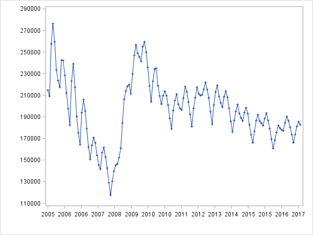
I want a major tick that starts with the value 2005 representing April 2005 and ends with 2017 but I also want minor ticks representing the months inbetween. How do I achieve this?
This is my code and below that the output that it produces:
proc sgplot data=myDatafile;
series x=varDate y=mar1 /markers markerattrs=(symbol=plus size=5);
xaxis interval=month label=' ' values=('01apr2005'd to '01SEP2017'd by 12) valuesformat=year4.;
yaxis label=' ' values=(110000 to 300000 by 20000);
run;
Accepted Solutions
- Mark as New
- Bookmark
- Subscribe
- Mute
- RSS Feed
- Permalink
- Report Inappropriate Content
values=('01apr2005'd to '01SEP2017'd by 12) is going to attempt to place a tick mark value every 12 days.
You may want to use the INTERVAL=YEAR , MINOR, to add minor tick marks, MINORCOUNT= , to specify the number of minor ticks, options instead of Values statement.
The version of SAS is going to limit the availability of these options though.
- Mark as New
- Bookmark
- Subscribe
- Mute
- RSS Feed
- Permalink
- Report Inappropriate Content
What version of SAS are you using?
- Mark as New
- Bookmark
- Subscribe
- Mute
- RSS Feed
- Permalink
- Report Inappropriate Content
I am using SAS 9.4 M3
- Mark as New
- Bookmark
- Subscribe
- Mute
- RSS Feed
- Permalink
- Report Inappropriate Content
values=('01apr2005'd to '01SEP2017'd by 12) is going to attempt to place a tick mark value every 12 days.
You may want to use the INTERVAL=YEAR , MINOR, to add minor tick marks, MINORCOUNT= , to specify the number of minor ticks, options instead of Values statement.
The version of SAS is going to limit the availability of these options though.
- Mark as New
- Bookmark
- Subscribe
- Mute
- RSS Feed
- Permalink
- Report Inappropriate Content
For this situation, you might want to use MINORINTERVAL=MONTH to make the minor ticks appear per month.
- Mark as New
- Bookmark
- Subscribe
- Mute
- RSS Feed
- Permalink
- Report Inappropriate Content
- Mark as New
- Bookmark
- Subscribe
- Mute
- RSS Feed
- Permalink
- Report Inappropriate Content
Thank you so much for trying to help me! Your code seem to work, almost at least.
I have modified the original code and moved the values to a where statement. Also, I have restricted the diagram to only show the last ten years. The minor tick marks are there but there are to many of them so they really doesn't make any sense. But still I want every year to be displayed on the x-axis. Any ideas?
proc sgplot data=_aux_ams;
where '01SEP2007'D <= dateVar <='01SEP2017'D
series x=dateVar y=mar1 /markers markerattrs=(symbol=plus size=5);
xaxis interval=year label=' ' valuesformat=year4. minor minorcount=120;
yaxis label=' ' values=(110000 to 300000 by 20000);
run;
- Mark as New
- Bookmark
- Subscribe
- Mute
- RSS Feed
- Permalink
- Report Inappropriate Content
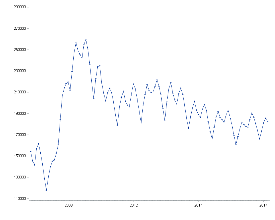
Finally, I managed to get the graph I wanted. Since I realized that the minor ticks would be far too many, I decided to not use them. By changing the xaxis interval to 'auto' and use a year-format the graph looked presentable.
proc sgplot data=myData;
series x=dateVar y=mar1 /markers markerattrs=(symbol=plus size=5);
xaxis interval=auto label=' '
values=('01SEP2007'd to '01SEP2017'd by year) valuesformat=year4.;
yaxis label=' ' values=(110000 to 300000 by 20000);
run;- Mark as New
- Bookmark
- Subscribe
- Mute
- RSS Feed
- Permalink
- Report Inappropriate Content
I'm having the same problem with a mixed vbar vline plot. What I would like is a daily plot with ticks at the 1st and 16th of the month like the simple series plot. What I get is a complete mess of every date. I have tried a lot of interval/ minorintervla adjustments without result. Plus, refline does not seem to work with a vline/vbar plot. Help!
proc sgplot data=regression1 noautolegend ;
vline bDateIn / response=bCaseCnt ;
vbar bDateIn / response=bHours y2axis;
/*xaxis interval=MONTH label = 'Date' ; */
xaxisInterval=auto label='Date' ;
refline '01APR2019'd /axis=x;
yaxislabel = 'Count';
y2axislabel = 'Hours';
refline '01APR2019'd /axis=x;
run;
- Mark as New
- Bookmark
- Subscribe
- Mute
- RSS Feed
- Permalink
- Report Inappropriate Content
On the XAXIS statement, set TYPE=TIME.
Hope that helps!
Dan
- Mark as New
- Bookmark
- Subscribe
- Mute
- RSS Feed
- Permalink
- Report Inappropriate Content
Perfect! Thank you.
Stan
Catch up on SAS Innovate 2026
Nearly 200 sessions are now available on demand with the SAS Innovate Digital Pass.
Explore Now →Learn how use the CAT functions in SAS to join values from multiple variables into a single value.
Find more tutorials on the SAS Users YouTube channel.
SAS Training: Just a Click Away
Ready to level-up your skills? Choose your own adventure.


