- Home
- /
- Programming
- /
- Graphics
- /
- Proc SGPLOT adding diagonal line
- RSS Feed
- Mark Topic as New
- Mark Topic as Read
- Float this Topic for Current User
- Bookmark
- Subscribe
- Mute
- Printer Friendly Page
- Mark as New
- Bookmark
- Subscribe
- Mute
- RSS Feed
- Permalink
- Report Inappropriate Content
Hi All,
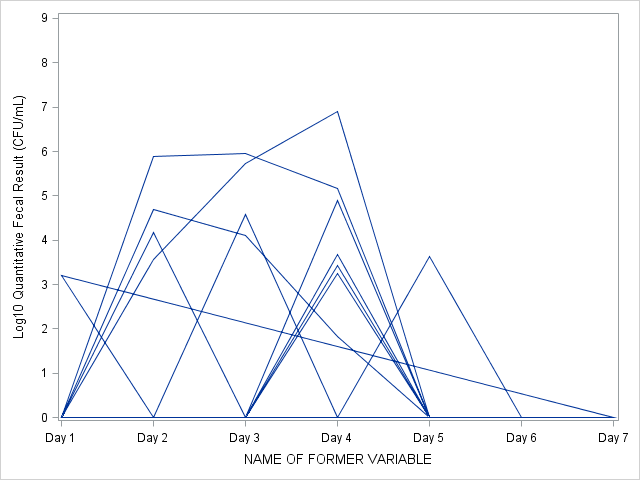
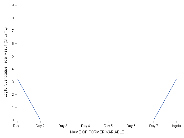
I am working on some graphs and getting a funky result with sgplot. I'm plotting fecal results by day. Most subjects have 0 fecal culture at day 1, but when I add in the subject with >0 fecal culture, sgplot creates a diagonal line. Graph 1 shows that one subject has a fecal culture of 3 and instead of dropping to 0 on the rest of the days as is in the dataset, sgplot draws a diagonal line. Graph 2 shows how this subject's results should be shown. How do I force sgplot to represent the true values for this subject? I have tried to set 0 values to 0.1 for this subject and get the same results. I also do not want to take out this subject from the graph.
Thanks,
Sarah


Accepted Solutions
- Mark as New
- Bookmark
- Subscribe
- Mute
- RSS Feed
- Permalink
- Report Inappropriate Content
Yes, give the same line color attribute to all lines with LINEATTRS. You might also want to add NOAUTOLEGEND to prevent the production of a meaningless legend :
proc sort data=myData; by subject day; run;
proc sgplot data=myData noautolegend;
series y=CFU x=day / group=subject lineattrs=(color=darkblue);
run;
PG
- Mark as New
- Bookmark
- Subscribe
- Mute
- RSS Feed
- Permalink
- Report Inappropriate Content
Can you post your code as well, possibly some sample data?
Is your data sorted by anything?
- Mark as New
- Bookmark
- Subscribe
- Mute
- RSS Feed
- Permalink
- Report Inappropriate Content
Your code should have the following structure:
proc sort data=myData;
by subject day;
run;
proc sgplot data=myData;
series y=CFU x=day / group=subject;
run;
PG
- Mark as New
- Bookmark
- Subscribe
- Mute
- RSS Feed
- Permalink
- Report Inappropriate Content
Thanks PGStats, that worked to get rid of the diagonal. However, is there a way to make the groups all one color? There are >30 subjects and 30 color and line combinations.
Thanks,
Sarah
- Mark as New
- Bookmark
- Subscribe
- Mute
- RSS Feed
- Permalink
- Report Inappropriate Content
Yes, give the same line color attribute to all lines with LINEATTRS. You might also want to add NOAUTOLEGEND to prevent the production of a meaningless legend :
proc sort data=myData; by subject day; run;
proc sgplot data=myData noautolegend;
series y=CFU x=day / group=subject lineattrs=(color=darkblue);
run;
PG
- Mark as New
- Bookmark
- Subscribe
- Mute
- RSS Feed
- Permalink
- Report Inappropriate Content
With that many groups I might be tempted to go to SGPanel an produce multiple graphs as you may not be able to tell which values are obscured by lines tracing over one another especially with lots of integer values.
Catch up on SAS Innovate 2026
Nearly 200 sessions are now available on demand with the SAS Innovate Digital Pass.
Explore Now →Learn how use the CAT functions in SAS to join values from multiple variables into a single value.
Find more tutorials on the SAS Users YouTube channel.
SAS Training: Just a Click Away
Ready to level-up your skills? Choose your own adventure.


