- Home
- /
- Programming
- /
- Graphics
- /
- Re: Proc GMap County and State Boundries
- RSS Feed
- Mark Topic as New
- Mark Topic as Read
- Float this Topic for Current User
- Bookmark
- Subscribe
- Mute
- Printer Friendly Page
- Mark as New
- Bookmark
- Subscribe
- Mute
- RSS Feed
- Permalink
- Report Inappropriate Content
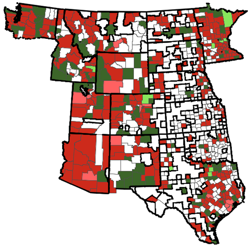
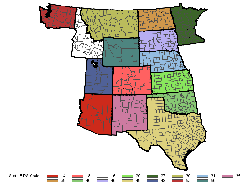
Hello, I am trying to create a county map for multiple states on one graphic. I have different style lines for the states and counties to give more emphasis to the states. My problem is that some of the county lines are being formatted like states. You can see what I'm talking about in the attached picture.
/*******************************************************************/
/* This sample program produces a map of Arizona, Colorado,        */
/* New Mexico, and Utah with thick state outline.                  */
/* You can change the width of the line by changing the value of   */
/* the SIZE variable in the ANNO annotate data set.                */
/*                                                                 */
/* Since we are using an unprojected county map, we need to use    */
/* the GPROJECT procedure to project the map data.  Subset the     */
/* specified states during the projection.                         */
/* If you include Alaska, you might want to use the GNOMON         */
/* projection with the POLELONG option to better center the map.   */
/*******************************************************************/

 /* Set the graphics environment */
goptions reset=all cback=white border htitle=12pt htext=10pt;

 /* Create a projected map data set named MAP */
proc sort data=newmap;by state;quit;

proc gproject data=newmap out=map;
  id state county;

  /* Use the state FIPS codes to subset the desired states */
/*Pacific*/
/*  where state in (6,41,32); */
/*Pacific - HI Only*/
/*  where state in (15); */

/*West*/
/*  where state in (53,16,49,4,30,56,8,35,38,46,31,20,40,48,27);*/
/*West - AK Only*/
/*where state in (2);*/

  /*Northeast*/
/*  where state in (19,55,17,26,18,39,42,36,50,23,33,25,44,9,34);*/

/*Southeast*/
  where state in (29,5,22,21,47,28,1,54,10,24,51,37,45,13,12);

run;
quit;

 /* Since we want to thicken the outline of the state boundaries,   */
 /* we need to get the coordinates for the state outlines.  Using   */
 /* the GREMOVE procedure, we can remove the county boundaries to   */
 /* create a data set of only the state boundaries.                 */

 /* Create a data set named STATES that contains the state boundaries */
proc gremove data=map out=states;

  /* STATE is the new identification variable */
  by state;

  /* STATE and COUNTY were the original identification variables */
  id state county;
run;
quit;

 /* Increment the SEGMENT variable value for all lake coordinates */
 /* indicated by missing X and Y values.                          */
data states;
  set states;
  by state;
  retain flag num 0;

  /* Reset the flag value for each state */
  if first.state then do;
     flag=0;
     num=0;
  end;

  /* Set the flag value when x and y are missing */
  if x=. and y=. then do;
    flag=1;
    num + 1;
    delete;
  end;

  /* Increment the segment value */
  if flag=1 then segment + num;
  drop flag num;
run;

/* Use the Annotate Facility to draw the outlines for the states   */
/*                                                                 */
/* The data coordinate system of '2' is used for XSYS and YSYS to  */
/* place the annotation on the map at the correct location. The    */
/* WHEN variable is set to 'A' to place the annotation after the   */
/* procedure output has been drawn.  The color for the outlines is */
/* set to black.  The size of the outline is set to 5.  The color  */
/* and size of the outlines can be changed by changing the values  */
/* in the COLOR and SIZE variables, respectively.                  */

 /* Create an annotate data set named ANNO for the state outlines */
data anno;
  length function color $8;
  retain xsys ysys '2' when 'a' color 'black' size 2;
  drop xsave ysave;

  set states;
  by state segment;

  /* Move to the first coordinate */
  if first.segment then function='poly';

  /* Draw to each successive coordinate */
  else function='polycont';
  output;
run;

 /* Specify distribution format */
proc format;
   value dist low--.10='large decrease' -.10--.03='moderate decrease' -.03-.03='no change' .03-.10='moderate increase' .1-high='large increase';
run;

/*http://www.devenezia.com/docs/SAS/sas-colors.html*/

/*title 'California Distribution';*/
/*title2 h=10pt 'By County';*/

pattern1 value=solid color=H07D74C3;
pattern2 value=solid color=H078B0FF;
pattern3 value=solid color=H000FF00;
pattern4 value=solid color=H0DDA1BA;
pattern5 value=solid color=H0DD476D;

 /* Generate a county map with thick state boundaries */
proc gmap data=combinedproducts2 map=map;
  id state county;
  choro count / anno=anno coutline=H0784F00 discrete;
     format count dist.;
   label count='YTD Referral Performance';
run;
quit;
Accepted Solutions
- Mark as New
- Bookmark
- Subscribe
- Mute
- RSS Feed
- Permalink
- Report Inappropriate Content
Unfortunately, Proc Gmap doesn't have a built-in option for that.
I have created & explained some code to do what you're wanting, towards the end of the following informal doc (in the "Annotating Borders" section):
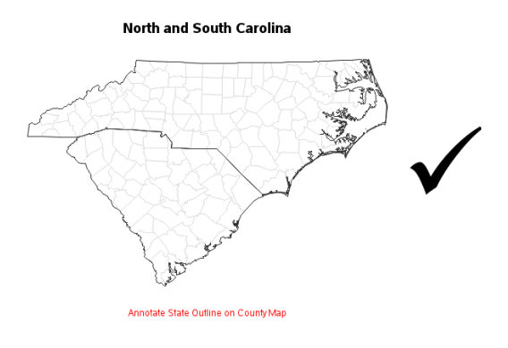
http://robslink.com/SAS/book2/Chapter_07_Annotating_on_Maps.pdf
Look for the following:
- Mark as New
- Bookmark
- Subscribe
- Mute
- RSS Feed
- Permalink
- Report Inappropriate Content
What version of SAS are you using? And what map are you using?
I used MAPS.COUNTIES and MAPSGFK.US_COUNTIES and both worked fine, I did not reduce them.
The attached image is using MAPS.COUNTIES and on GMAP, i used DATA=MAP (since I didn't have your COMBINEDPRODUCTS2 data set) and CHORO STATE.
It looks like the map is not correct somehow.
- Mark as New
- Bookmark
- Subscribe
- Mute
- RSS Feed
- Permalink
- Report Inappropriate Content
I am using SAS Enterprise Guide 5.1 and looks like I am using both maps.counties and maps.states. My goal is to be able to color inidividual counties while also having a thicker border for each state. I included the previous part of the code below.
 /* Create a data set that contains the map boundaries */
 /* for only the counties in the response data set     */
 /* also create a data set for only the states which   */
 /* are contained in the response data                 */
data counties(drop=count test) selstate(keep=state);
   retain test 0 ;
   merge combinedproducts2(in=inprod) maps.counties(in=inmap);
   by state county ;
   if inprod and inmap;

   /* Determine which states are included in the response data */
   if state ^= test then do;
      output selstate;
      test=state;
   end;
   output counties;
 run;

 /* Get the unprojected coordinates for the states */
data states;
   merge maps.states selstate(in=inprod);
   by state;
   if inprod;
run;

 /* Concatenate states with counties map data set */
 /* for projection                                */
data newmap;
   set states counties;
run;- Mark as New
- Bookmark
- Subscribe
- Mute
- RSS Feed
- Permalink
- Report Inappropriate Content
Also, I'm on SAS 9.4
- Mark as New
- Bookmark
- Subscribe
- Mute
- RSS Feed
- Permalink
- Report Inappropriate Content
I am not sure what you are doing, but to create the annotatate dark state lines, all you need is maps.counties.
One possibility is that you are doing something to change the ordering of state and county borders. Then when your annotate code traces the state lines, it is tracing some county lines instead of state lines.
Another possibility is that you are removing counties and leaving holes in the state. These "county" areas that are outlined in black are bigger than a county in my map. For example, in Texas there is a large place up near Oklahoma. But on my map there are many smaller counties in the same area. If there is a hole, like a lake, Annotate surrounds it by dark lines. Is it possible that you are removing counties and leaving holes that then get surrounded by dark lines? I notice that these holes/counties are white.
- Mark as New
- Bookmark
- Subscribe
- Mute
- RSS Feed
- Permalink
- Report Inappropriate Content
Essentially, I am just trying to have state lines be a darker/thicker line than the county lines while all being on the same multistate map. Is there an easier way to do this?
- Mark as New
- Bookmark
- Subscribe
- Mute
- RSS Feed
- Permalink
- Report Inappropriate Content
Unfortunately, Proc Gmap doesn't have a built-in option for that.
I have created & explained some code to do what you're wanting, towards the end of the following informal doc (in the "Annotating Borders" section):
http://robslink.com/SAS/book2/Chapter_07_Annotating_on_Maps.pdf
Look for the following:
- Mark as New
- Bookmark
- Subscribe
- Mute
- RSS Feed
- Permalink
- Report Inappropriate Content
You have the necessary code. All you need is to use MAPS.COUNTIES instead of MAPS.COUNTIES, MAPS.STATES and your other data in the map before you create your annotate data.
- Mark as New
- Bookmark
- Subscribe
- Mute
- RSS Feed
- Permalink
- Report Inappropriate Content
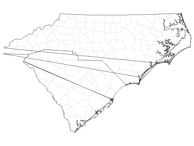
I'm actually having trouble replicating the same map. I ran the below program from the suggested text but the state lines are rendering strangely. Can you please advise on how to fix?
data my_map; set mapsgfk.us_counties (where=(statecode in ('NC' 'SC') and density<=2) drop=resolution);
run;
proc gproject data=my_map out=my_map
latlong eastlong degrees;
id state county;
run;
title1 ls=1.5 "North and South Carolina";
pattern1 v=s c=white;

proc gremove data=my_map out=anno_outline;
by state notsorted;
id county;
run;

data anno_outline; set anno_outline;
by state segment notsorted;
length function $8 color $8;
color='gray33'; style='mempty'; when='a'; xsys='2'; ysys='2';
if first.segment then function='poly';
else function='polycont';
run;

proc gmap map=my_map data=my_map anno=anno_outline;
id state county;
choro segment / levels=1 nolegend coutline=graydd;
run;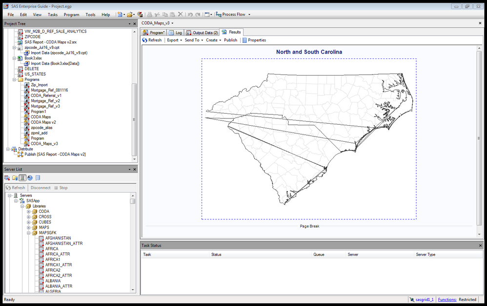
- Mark as New
- Bookmark
- Subscribe
- Mute
- RSS Feed
- Permalink
- Report Inappropriate Content
Could you try running it outside of Enterprise Guide (EG), and see if it works?
Are you using device=activex in EG (which I believe is the default) - perhaps annotation has a bug there.
Is it possible that you have re-sorted or otherwise modified your mapsgfk.us_county dataset?
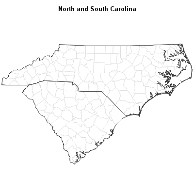
I re-ran your code just now, in SAS 9.4m3, in traditional DMS SAS (rather than EG),
and got the following output:
- Mark as New
- Bookmark
- Subscribe
- Mute
- RSS Feed
- Permalink
- Report Inappropriate Content
I unfortunately only have EG.
I added the below line to the program and am still having the extra lines being drawn on the chart.
How should the mapsgfk.us_county dataset be sorted? I doubt that it has been updated, but can try sorting it as necessary.
goptions reset=global device=activex ypixels=600 xpixels=800; - Mark as New
- Bookmark
- Subscribe
- Mute
- RSS Feed
- Permalink
- Report Inappropriate Content
You want to *not* use goptions device=activex, rather than use it (I would recommend goptions device=png). But I don't think you can just specify a goptions line to do it in EG - I think you have to change it somewhere in the menus (I'm not an EG user so I'm not sure - maybe Chris Hemedinger could help out on that.)
Per the sort order, you can't just sort the dataset by a variable in the dataset. It has to be in the order that it was originally created. Proc Gmap connects the x/y points in the order it encounters them, and then creaks the line between each state/county combination (and sometimes segment).
There are a lot of things that have to happen "just right" for a map to look right.
- Mark as New
- Bookmark
- Subscribe
- Mute
- RSS Feed
- Permalink
- Report Inappropriate Content
OK - I've done some more experimenting, and the stray lines definitely appear to be a device=activex problem...
To aviod the problem, you'll want to figure out how to change your EG session to use png output rather than activex.
In my traditional SAS session I set "goptions device=actximg;" and got the following map (with stray lines):

- Mark as New
- Bookmark
- Subscribe
- Mute
- RSS Feed
- Permalink
- Report Inappropriate Content
Changing to PNG solved the problem. Thank you for your help!
Catch up on SAS Innovate 2026
Dive into keynotes, announcements and breakthroughs on demand.
Explore Now →Learn how use the CAT functions in SAS to join values from multiple variables into a single value.
Find more tutorials on the SAS Users YouTube channel.
SAS Training: Just a Click Away
Ready to level-up your skills? Choose your own adventure.

