- Home
- /
- Programming
- /
- Graphics
- /
- Re: Proc Boxplot for percintiles only
- RSS Feed
- Mark Topic as New
- Mark Topic as Read
- Float this Topic for Current User
- Bookmark
- Subscribe
- Mute
- Printer Friendly Page
- Mark as New
- Bookmark
- Subscribe
- Mute
- RSS Feed
- Permalink
- Report Inappropriate Content
Hi all,
Can you please help with proc boxplot. I have the dataset where there are just calculated percentiles 10, 25, 50, 75, 90:
data WORK.MOTOR;
infile datalines dsd truncover;
input LEVEL:32. MOTOR_TYPE:$14. SUB_TYPE_N:32. P10:32. P25:32. P50:32. P75:32. P90:32.;
label LEVEL="Level" MOTOR_TYPE="Motor Type" SUB_TYPE_N="Motor Type(N)" P10="10th Percentile" P25="25th Percentile" P50="50th Percentile" P75="75th Percentile" P90="90th Percentile";
datalines4;
1,M14,1,24.7,31,33.15,36.3,36.34
2,M14,1,14.3,22.5,28,29.15,32.72
3,M14,1,14.3,22.5,28,29.5,32.72
4,M14,1,15,18,18,26.15,32.78
5,M14,1,25.2,28.5,31,34.3,35.2
6,M14,1,16.2,18,18.3,20,26
1,M15,2,53.8,78,96.5,157,188.14
2,M15,2,58.2,84.8,120.2,159,227.9
3,M15,2,52.6,72.33,91.3,114.8,166.4
4,M15,2,52.6,72.32,91.3,114.8,166.4
5,M15,2,42,47,64.5,92.3,150.5
6,M15,2,52.6,72.33,91.3,114.8,166.4
;;;;
I need to generate boxplots just for percentiles (for each motor_type)
Is it possible with proc boxplot and what is the syntax? Thank you!
Accepted Solutions
- Mark as New
- Bookmark
- Subscribe
- Mute
- RSS Feed
- Permalink
- Report Inappropriate Content
Then use the GROUP= option instead of a BY statement:
title 'Box Plot From Summary Statistics';
%let attrs=thickness=2px;
proc sgplot data=inds;
styleattrs datacontrastcolors=(gray CXE2B977) datalinepatterns=(1 1);
xaxis min=0 label='Parameter';
hbox x / category=level whiskerpct=0 nomean nofill group=motor_type
         lineattrs   =(&attrs)
         medianattrs =(&attrs)
         whiskerattrs=(&attrs);
run;- Mark as New
- Bookmark
- Subscribe
- Mute
- RSS Feed
- Permalink
- Report Inappropriate Content
As far as I know, PROC BOXPLOT (and also PROC SGPLOT) doesn't work on pre-computed percentiles. You have to provide the raw data to PROC BOXPLOT (and PROC SGPLOT).
Paige Miller
- Mark as New
- Bookmark
- Subscribe
- Mute
- RSS Feed
- Permalink
- Report Inappropriate Content
Hi @DmytroYermak,
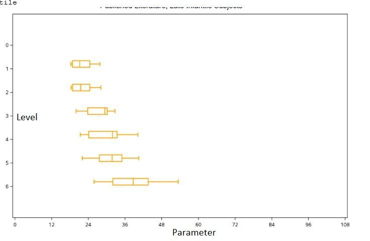
PROC BOXPLOT has an option HISTORY= where you can provide an input dataset containing group summary statistics. However, it must contain a mean value per group (and other statistics not contained in your sample data). Of course, you could set "mean=median," but the mean would still be plotted by default and you would need to modify ODS graphics settings to hide it because for a horizontal box plot you must use ODS graphics. To avoid these complications, I would suggest that you create an ordinary input dataset from your statistics dataset and use PROC SGPLOT, as shown below.
data inds(drop=p:);
set motor;
array p p:;
do over p;
  x=p; output;
end;
run;

title 'Box Plot From Summary Statistics';
%let attrs=thickness=2px color=CXE2B977;
proc sgplot data=inds;
by motor_type;
xaxis min=0 label='Parameter';
hbox x / category=level whiskerpct=0 nomean nofill
         lineattrs   =(&attrs)
         medianattrs =(&attrs)
         whiskerattrs=(&attrs);
run;
Edit: This assumes that you want the whiskers to extend to the 10% and 90% quantile (you don't have minimum and maximum in your data anyway). PROC SGPLOT achieves this (using the whiskerpct=0 or extreme option of the HBOX statement) by treating P10 and P90 as minimum and maximum, respectively. P25, P50 and P75 are the three quartiles of the five data points per category (level) and BY group in dataset INDS.
- Mark as New
- Bookmark
- Subscribe
- Mute
- RSS Feed
- Permalink
- Report Inappropriate Content
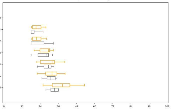
Thank you, Reinhard! Can you please help with option that put both Motor_type on one page? Like this:
- Mark as New
- Bookmark
- Subscribe
- Mute
- RSS Feed
- Permalink
- Report Inappropriate Content
Then use the GROUP= option instead of a BY statement:
title 'Box Plot From Summary Statistics';
%let attrs=thickness=2px;
proc sgplot data=inds;
styleattrs datacontrastcolors=(gray CXE2B977) datalinepatterns=(1 1);
xaxis min=0 label='Parameter';
hbox x / category=level whiskerpct=0 nomean nofill group=motor_type
         lineattrs   =(&attrs)
         medianattrs =(&attrs)
         whiskerattrs=(&attrs);
run;- Mark as New
- Bookmark
- Subscribe
- Mute
- RSS Feed
- Permalink
- Report Inappropriate Content
It is undoubtedly a solution to my case. I just wanted to add that I was able to adapt the code https://blogs.sas.com/content/graphicallyspeaking/2013/03/24/custom-box-plots/#prettyPhoto while trying to sort it out:
proc sgplot data=motor nocycleattrs;
  highlow y=LEVEL high=p90 low=p10 / group=MOTOR_TYPE groupdisplay=cluster
      clusterwidth=0.7;
  highlow y=LEVEL high=p75 low=p25 / group=MOTOR_TYPE type=bar
      groupdisplay=cluster grouporder=ascending clusterwidth=0.7
      barwidth=0.7 name='a';
  highlow y=LEVEL high=p50 low=p50 / group=MOTOR_TYPE type=bar
      groupdisplay=cluster grouporder=ascending clusterwidth=0.7
      barwidth=0.7;
  keylegend 'a';
  xaxis label= "Parameter";
  yaxis label= "Level" reverse;
  run;
There is no color and width solution here.
- Mark as New
- Bookmark
- Subscribe
- Mute
- RSS Feed
- Permalink
- Report Inappropriate Content
If your data is pre-computed, you will need to use a BOXPLOTPARM statement in GTL. The data structure should look something like the following:
|
Day |
PowerOutputs |
Statistic |
|---|---|---|
|
04JUL |
3180.00 |
MIN |
|
04JUL |
3340.00 |
Q1 |
|
04JUL |
3487.40 |
MEAN |
|
04JUL |
3490.00 |
MEDIAN |
|
04JUL |
3610.00 |
Q3 |
|
04JUL |
4050.00 |
MAX |
|
04JUL |
20.00 |
N |
|
05JUL |
3179.00 |
MIN |
|
05JUL |
3333.50 |
Q1 |
|
05JUL |
3471.65 |
MEAN |
|
05JUL |
3419.50 |
MEDIAN |
|
05JUL |
3605.00 |
Q3 |
|
05JUL |
3849.00 |
MAX |
|
05JUL |
20.00 |
N |
and a simple template would look like the following:
proc template;
  define statgraph boxplotparm1;
    begingraph;
      entrytitle "City Mileage for Vehicle Types";
      layout overlay;
       boxplotparm y=value x=x stat=stat /
         datalabel=datalabel spread=true ;
      endlayout;
    endgraph;
  end;
run;

/* Generate the plot. */
proc sgrender data=boxdata template=boxplotparm1;
run;
See https://go.documentation.sas.com/?docsetId=grstatgraph&docsetTarget=p1db7ll5bzyo4nn1pv31g04etput.htm... for more details.
Hope this helps!
Dan
- Mark as New
- Bookmark
- Subscribe
- Mute
- RSS Feed
- Permalink
- Report Inappropriate Content
Catch up on SAS Innovate 2026
Dive into keynotes, announcements and breakthroughs on demand.
Explore Now →Learn how use the CAT functions in SAS to join values from multiple variables into a single value.
Find more tutorials on the SAS Users YouTube channel.
SAS Training: Just a Click Away
Ready to level-up your skills? Choose your own adventure.


