- Home
- /
- Programming
- /
- Graphics
- /
- Re: Problem with using sgplot
- RSS Feed
- Mark Topic as New
- Mark Topic as Read
- Float this Topic for Current User
- Bookmark
- Subscribe
- Mute
- Printer Friendly Page
- Mark as New
- Bookmark
- Subscribe
- Mute
- RSS Feed
- Permalink
- Report Inappropriate Content
Data picture;
input company_amount 	ticker_symbols	company_names;
datalines;
All 	0.2614	0.0706
800	0.264	0.8708
700	0.3303	0.009
600	0.2877	0.0149
500	0.4826	0.0099
400	0.7355	0.0092
300	0.68	0.0045
200	0.6754	0.002
100	0.0444	0.0046
;

proc sgplot data=picture;
     title "P-value Trends";
     SERIES X = company_amount Y = ticker_symbols/datalabel  LEGENDLABEL = "Ticker Symbols" MARKERS LINEATTRS = (THICKNESS = 2)  markerattrs=(symbol=circlefilled);
     SERIES X = company_amount Y = company_names/datalabel LEGENDLABEL = "Company Names" MARKERS LINEATTRS = (THICKNESS = 2  pattern=dashdashdot)  markerattrs=(symbol=squarefilled);
     XAXIS TYPE = DISCRETE;
     xaxis label='Company Amount' reverse;

     yaxis label='P-value';
     REFLINE 0.05 0.01 0.001 / TRANSPARENCY = 0.5;
     RUN;
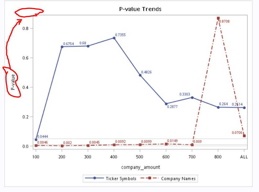
The "all" in the data disappears in my picture. How to solve it?
Moreover, can I set y label horizontal?
Thanks.
Accepted Solutions
- Mark as New
- Bookmark
- Subscribe
- Mute
- RSS Feed
- Permalink
- Report Inappropriate Content
Often special displays for values can be solved with a custom format. Please see:
Data picture;
input company_amount 	ticker_symbols	company_names;
datalines;
999	0.2614	0.0706
800	0.264	0.8708
700	0.3303	0.009
600	0.2877	0.0149
500	0.4826	0.0099
400	0.7355	0.0092
300	0.68	0.0045
200	0.6754	0.002
100	0.0444	0.0046
;
proc format library=work;
value myall
999 = 'All'
;
run;
proc sgplot data=picture;
     title "P-value Trends";
     SERIES X = company_amount Y = ticker_symbols/datalabel  LEGENDLABEL = "Ticker Symbols" MARKERS LINEATTRS = (THICKNESS = 2)  markerattrs=(symbol=circlefilled);
     SERIES X = company_amount Y = company_names/datalabel LEGENDLABEL = "Company Names" MARKERS LINEATTRS = (THICKNESS = 2  pattern=dashdashdot)  markerattrs=(symbol=squarefilled);
     XAXIS TYPE = DISCRETE;
     xaxis label='Company Amount' reverse;

     yaxis label='P-value' labelpos=Top;
     REFLINE 0.05 0.01 0.001 / TRANSPARENCY = 0.5;
     format company_amount myall.;
RUN;
Also notice the use of the labelpos option to move the y-axis label.
- Mark as New
- Bookmark
- Subscribe
- Mute
- RSS Feed
- Permalink
- Report Inappropriate Content
This:
Data picture;
input company_amount 	ticker_symbols	company_names;
datalines;
All 	0.2614	0.0706
800	0.264	0.8708
Is invalid, ALL is not numeric, so you cannot read it in with a numeric read of company amount. Change the input to:
input company_amount $ ticker_symbols company_names;
Then your company amount data will be character and able to hold ALL. Also the graph should then treat them all as character.
- Mark as New
- Bookmark
- Subscribe
- Mute
- RSS Feed
- Permalink
- Report Inappropriate Content
However, " XAXIS reverse;" becomes invalidated. I want to arrange the x array from all to 100.
Moreover, I want to change the label in y array. How to revise it? Thanks.
- Mark as New
- Bookmark
- Subscribe
- Mute
- RSS Feed
- Permalink
- Report Inappropriate Content
For you X-Axis question, simplest method is to read them in as numeric, and put all as 0, so you have the values:
0
100
200
...
800
Then apply a format to the numeric data:
proc format;
  value tmpfmt
    0='ALL';
run;

data have;
  set have;
  format thevalue tmpfmt.;
run;
This will then sort the x-axis data as numeric, so all would be first, but display using the formatted value.
With regards to your y-axis question, I don't know, never seen a graph with axis label at end. If I was trying to do this I would just plot one scatter plot point 0,0.9 and label it with the text you want. However you may find more information at this site:
http://blogs.sas.com/content/graphicallyspeaking/
It is the best reference on graphing.
- Mark as New
- Bookmark
- Subscribe
- Mute
- RSS Feed
- Permalink
- Report Inappropriate Content
Often special displays for values can be solved with a custom format. Please see:
Data picture;
input company_amount 	ticker_symbols	company_names;
datalines;
999	0.2614	0.0706
800	0.264	0.8708
700	0.3303	0.009
600	0.2877	0.0149
500	0.4826	0.0099
400	0.7355	0.0092
300	0.68	0.0045
200	0.6754	0.002
100	0.0444	0.0046
;
proc format library=work;
value myall
999 = 'All'
;
run;
proc sgplot data=picture;
     title "P-value Trends";
     SERIES X = company_amount Y = ticker_symbols/datalabel  LEGENDLABEL = "Ticker Symbols" MARKERS LINEATTRS = (THICKNESS = 2)  markerattrs=(symbol=circlefilled);
     SERIES X = company_amount Y = company_names/datalabel LEGENDLABEL = "Company Names" MARKERS LINEATTRS = (THICKNESS = 2  pattern=dashdashdot)  markerattrs=(symbol=squarefilled);
     XAXIS TYPE = DISCRETE;
     xaxis label='Company Amount' reverse;

     yaxis label='P-value' labelpos=Top;
     REFLINE 0.05 0.01 0.001 / TRANSPARENCY = 0.5;
     format company_amount myall.;
RUN;
Also notice the use of the labelpos option to move the y-axis label.
Catch up on SAS Innovate 2026
Nearly 200 sessions are now available on demand with the SAS Innovate Digital Pass.
Explore Now →Learn how use the CAT functions in SAS to join values from multiple variables into a single value.
Find more tutorials on the SAS Users YouTube channel.
SAS Training: Just a Click Away
Ready to level-up your skills? Choose your own adventure.


