- Home
- /
- Programming
- /
- Graphics
- /
- Population Pyramid Annotated - Proc Gchart - Labels Off
- RSS Feed
- Mark Topic as New
- Mark Topic as Read
- Float this Topic for Current User
- Bookmark
- Subscribe
- Mute
- Printer Friendly Page
- Mark as New
- Bookmark
- Subscribe
- Mute
- RSS Feed
- Permalink
- Report Inappropriate Content
Hey all,
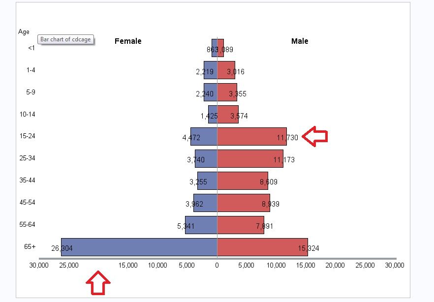
My labels are not placing correctly. I am using a sas example to make a population pyramid style graph with proc gchart.
The counts should either be inside the bar, or outside, not both. Also, 20,000 on the Female side is missing and I'm not sure why. I am attaching a photo and the data set for clarity.
Here is how I have modified the code to fit my data (I have only made small changes for variable names and scale):
/* Set the graphics environment */
goptions reset=all border cback=white htitle=12pt htext=10pt;

 /* Convert the data values for one group to negative values to create the input data set, CONVERT.
	CONVERT contains the same variables as POPPYRAMIDSEXAGESTATE; however, the values of COUNT for
	the female drivers are made negative to force a zero reference line in the bar chart. */
data convert;
   set poppyramidsexagestate;
   if sex='FEMALE' then count=-count;
format count comma15.;
run;

 /* Create a format for the values of COUNT.  The POSVAL. format adds a comma and suppresses the
	sign on the values so that negative values appear as positive values. */
proc format;
   picture posval low-high='000,009';
run;

 /* Create the Annotate data set, ANLABELS.  ANLABELS adds the labels to the bars.  Because data
	values are used to place the labels, XSYS and YSYS use the absolute data coordinate system, 2.
	A value of A for WHEN causes the labels to overlay the chart. */
data anlabels(drop=cdcage sex );
   length text $ 8;
   retain function 'label' when 'a' xsys ysys '2' hsys '3' size 2.5;
   set convert;
   midpoint=cdcage; subgroup=sex;
   text=" " || left(put(count, posval.));

   /* POSITION changes to place label outside of bar if bar is too small. */
   if count ge -1000 and sex='F' then position='<';
   else if sex='F' then position='>';

   /* POSITION changes to place label outside of bar if bar is too small. */
   if count le 1000 and sex='M' then position='>';
   else if sex='M' then position='<';
   output;

 run;

 /* Add a title to the graph */
title1 'Number of blah blah blah by Sex and Age Group, Blah 2014';

 /* Modify the appearance of the axes. In the AXIS2 statement, the VALUE= option suppresses the third
	tick mark so that the range for each group is zero to the maximum value. */
axis1 label=(justify=left 'Age') style=0;
axis2 label=none value=(tick=3 '') minor=none major=none
      width=3 order=(-30000 to 30000 by 5000);

 /* Create the bar chart */
proc gchart data=convert;

   /* The FORMAT statement applies the POSVAL format to the values of count. */
   format count posval.;

   /* The NOTE statement places the labels "Female" and "Male" above the population tree. */

   note font="Albany AMT/bold" move=(25pct,86pct) h=12pt 	'Female'
                               move=(70pct,86pct) 			'Male';

   /* In the HBAR statement, SUBGROUP=  names the variable that determines the groups, and ANNOTATE= includes the annotation defined in the ANLABELS data set. */
   hbar cdcage / sumvar=count discrete nostat subgroup=sex
					maxis=axis1 raxis=axis2 nolegend annotate=anlabels;

run;
quit;
Data set 'convert':

Accepted Solutions
- Mark as New
- Bookmark
- Subscribe
- Mute
- RSS Feed
- Permalink
- Report Inappropriate Content
These assignments never occur:
 /* POSITION changes to place label outside of bar if bar is too small. */
   if count ge -1000 and sex='F' then position='<';
   else if sex='F' then position='>';

   /* POSITION changes to place label outside of bar if bar is too small. */
   if count le 1000 and sex='M' then position='>';
   else if sex='M' then position='<';
   output;
because Sex has values of FEMALE and MALE not F and M.
You may need to adjust your count size for the shift as well. Your range is a bit wider than the example but you are using the same limits. Text size may also play a part in when to shift as a larger font takes up more spaces.
- Mark as New
- Bookmark
- Subscribe
- Mute
- RSS Feed
- Permalink
- Report Inappropriate Content
If you have SAS 9.3, this is very easy with SGPLOT. See link at bottom of article.
I think it can be done with a single HBAR with groups.
http://blogs.sas.com/content/graphicallyspeaking/2012/07/23/butterfly-plots/
- Mark as New
- Bookmark
- Subscribe
- Mute
- RSS Feed
- Permalink
- Report Inappropriate Content
@sanjay_SAS wrote:
If you have SAS 9.3, this is very easy with SGPLOT. See link at bottom of article.
I think it can be done with a single HBAR with groups.
http://blogs.sas.com/content/graphicallyspeaking/2012/07/23/butterfly-plots/
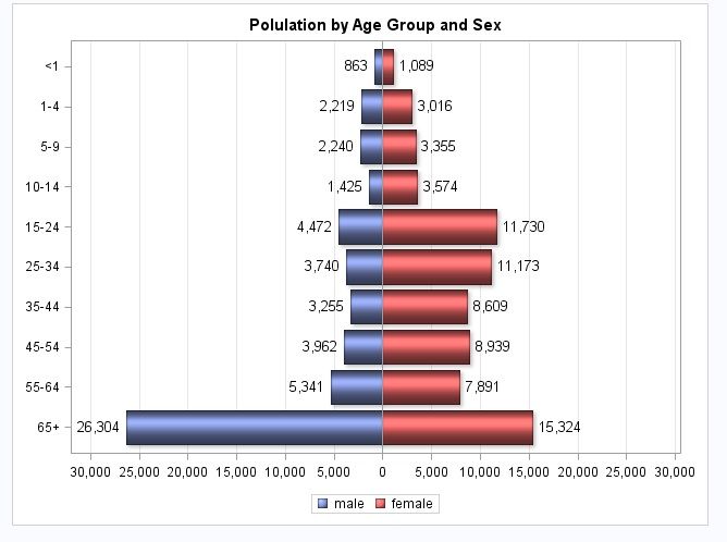
Thank you very much! Yes, that was much easier.
Here is the code I used to fix it:
data convert_fix;
set convert;
if sex = 'FEMALE' then male = count;
if sex = 'MALE' then female = count;
agegroup = cdcage;
   format male female posval. agegroup cdcage. ;
run;

title 'Polulation by Age Group and Sex';
proc sgplot data=convert_fix;
  format male female posval. agegroup cdcage.;
  hbarparm category=agegroup response=male / dataskin=sheen
    datalabel=male datalabelattrs=(size=10);
  hbarparm category=agegroup response=female / dataskin=sheen
    datalabel=female datalabelattrs=(size=10);
  xaxis values=(-30000 to 30000 by 5000) display=(nolabel) grid;
  yaxis display=(nolabel);
run;
- Mark as New
- Bookmark
- Subscribe
- Mute
- RSS Feed
- Permalink
- Report Inappropriate Content
These assignments never occur:
 /* POSITION changes to place label outside of bar if bar is too small. */
   if count ge -1000 and sex='F' then position='<';
   else if sex='F' then position='>';

   /* POSITION changes to place label outside of bar if bar is too small. */
   if count le 1000 and sex='M' then position='>';
   else if sex='M' then position='<';
   output;
because Sex has values of FEMALE and MALE not F and M.
You may need to adjust your count size for the shift as well. Your range is a bit wider than the example but you are using the same limits. Text size may also play a part in when to shift as a larger font takes up more spaces.
- Mark as New
- Bookmark
- Subscribe
- Mute
- RSS Feed
- Permalink
- Report Inappropriate Content
@ballardw wrote:
These assignments never occur:
 /* POSITION changes to place label outside of bar if bar is too small. */
   if count ge -1000 and sex='F' then position='<';
   else if sex='F' then position='>';

   /* POSITION changes to place label outside of bar if bar is too small. */
   if count le 1000 and sex='M' then position='>';
   else if sex='M' then position='<';
   output;
because Sex has values of FEMALE and MALE not F and M.
You may need to adjust your count size for the shift as well. Your range is a bit wider than the example but you are using the same limits. Text size may also play a part in when to shift as a larger font takes up more spaces.
Ahhh yes! you are absolutely right, I'm not sure how I looked over that so many times.
This is the true fix to my problem.
Got it to work by changing the values of SEX and the range values.
Catch up on SAS Innovate 2026
Dive into keynotes, announcements and breakthroughs on demand.
Explore Now →Learn how use the CAT functions in SAS to join values from multiple variables into a single value.
Find more tutorials on the SAS Users YouTube channel.
SAS Training: Just a Click Away
Ready to level-up your skills? Choose your own adventure.


