Turn on suggestions
Auto-suggest helps you quickly narrow down your search results by suggesting possible matches as you type.
Showing results for
- Home
- /
- Programming
- /
- Graphics
- /
- Panel chart with high resolution for a publication
Options
- RSS Feed
- Mark Topic as New
- Mark Topic as Read
- Float this Topic for Current User
- Bookmark
- Subscribe
- Mute
- Printer Friendly Page
- Mark as New
- Bookmark
- Subscribe
- Mute
- RSS Feed
- Permalink
- Report Inappropriate Content
Posted 01-05-2018 06:08 PM
(2438 views)
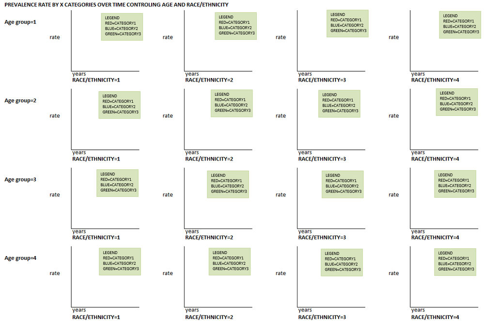
I'd like to create high quality panel chart as shown in image below. Would you please point me out to the most relevant SUGI kinda guideline paper or link for step-by-step demonstrations? Using SAS 9.4.
2 REPLIES 2
- Mark as New
- Bookmark
- Subscribe
- Mute
- RSS Feed
- Permalink
- Report Inappropriate Content
See the SGPANEL documentation.
- Mark as New
- Bookmark
- Subscribe
- Mute
- RSS Feed
- Permalink
- Report Inappropriate Content
Use SGPANEL with LAYOUT=LATTICE.
Note that SGPANEL will put axis labels and values on the edges of the panel, not on each individual graph. Also, the legend will only appear once, not on every graph.
PG
Catch up on SAS Innovate 2026
Nearly 200 sessions are now available on demand with the SAS Innovate Digital Pass.
Explore Now →How to Concatenate Values
Learn how use the CAT functions in SAS to join values from multiple variables into a single value.
Find more tutorials on the SAS Users YouTube channel.
SAS Training: Just a Click Away
Ready to level-up your skills? Choose your own adventure.


