- Home
- /
- Programming
- /
- Graphics
- /
- PROC template Graph
- RSS Feed
- Mark Topic as New
- Mark Topic as Read
- Float this Topic for Current User
- Bookmark
- Subscribe
- Mute
- Printer Friendly Page
- Mark as New
- Bookmark
- Subscribe
- Mute
- RSS Feed
- Permalink
- Report Inappropriate Content
I have attached the data if it would be useful in your helping me achieve this task.
Data Selected;
	Set mylibrary.Mean_Comparison_Proc;
	Period2 = input(Period, 2.);
	Drop Period;
	rename Period2=Period;
run;
Proc Sort Data=Selected;
	by resp_name Treatment Period;
run;
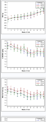
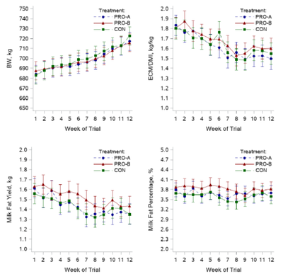
I created the above individual graphs using SGPLOT within a macro, with the below code:
Proc Sql noprint;
	select count(distinct resp_name) into :obs from Selected;
	select distinct resp_name into :resp1-:resp5 from Selected;
Quit;

%Macro TestSee;
	%do i = 1 %to &obs;
		%Let value1=(650 to 750 by 10); %Let value2=(1.0 to 2.0 by 0.1); %Let value3=(1 to 2.0 by 0.1); %Let value4=(2 to 5 by 0.1); %Let value5=(35 to 45 by 1);
		%Let ylabel1=BW, kg; %Let ylabel2=ECM/DMI, kg/kg; %Let ylabel3=Milk Fat Yield, kg; %Let ylabel4=Milk Fat Percentage, %; %Let ylabel5=Milk Yield, kg;
		%Let xlabel=Week of Trial;
		proc format;
		value $treatmentFmt
		"Bov" = "PRO-A"
		"BovC" = "PRO-B"
		"Control" = "CON"
		;
		ods html style=listing; *In SAS 9.4 you need a style like LISTING to see different symbols;
		Proc SGPLOT data = Selected noautolegend;
			format treatment $treatmentFmt.;
			where resp_name="&&resp&i";
			styleattrs datasymbols=(CircleFilled triangleFilled SquareFilled) datalinepatterns=(ShortDash Solid MediumDash) datacontrastcolors=(darkblue darkred darkgreen);
			Series x=Period y=estimate/ group=Treatment grouplc=Treatment groupmc=Treatment markers lineattrs=(thickness=1) name="Treatment";
			Scatter x=Period y=estimate/ group=Treatment name="a" YErrorUpper=Upper YErrorLower=Lower;*groupdisplay=cluster clusterwidth=0.6 datalabel=MSgroup datalabelattrs=(size=9pt color=gray);
			yaxis label="&&ylabel&i" Labelattrs=(Family=Arial Size=11 weight=Bold ) valueattrs=(size=10) values=&&value&i;
			xaxis discreteorder=data label="&xlabel." Labelattrs=(Family=Arial Size=11 weight=Bold ) valueattrs=(size=10) values=(1 to 12 by 1);
			keylegend "Treatment"/ title="Treatment:" location=inside position=topright across=1;
		run;
 	%end;
		Ods html CLOSE;
 %mend;
%TestSee;
What i however need is a grid of all 5 graphs with independent axis, all labelled as i did with the above graph. I did research on Proc template and it seems it could really do the job for me, but i still couldn't figure out how to make this work. I will really appreciate your help guys. Thank you.
Accepted Solutions
- Mark as New
- Bookmark
- Subscribe
- Mute
- RSS Feed
- Permalink
- Report Inappropriate Content
Ah yes, I forgot to put the VIEWMIN and VIEWMAX values in for the y-axis. I've added several macro variables for min/max values to use in the VIEWMIN/VIEWMAX options below. There are more streamlined ways to do this but I'm making it more verbose to read easier to what I'm doing. Look for the VIEWMIN and VIEWMAX options below as this sets what is visible in the axis.
As for the ylabel being spaced a bit. This is because it doesn't exist in the same space as the y-axis tick marks. The wider the tickmarks are the further the y-axis label will be. It won't look as bad when there are actual tick values showing up appropriately, but the only real way to make it closer is to use annotation which is another animal. I can explain how to do that if needed, but try the changes below to see if that helps at all.
Here is some updated code:
%Macro TestSee;
	proc format;
		value $treatmentFmt
		"Bov" = "PRO-A"
		"BovC" = "PRO-B"
		"Control" = "CON"
		;
        run;

     ODS PATH work.templat(update) sasuser.templat(read) sashelp.tmplmst(read);
     PROC TEMPLATE;
        DEFINE STATGRAPH _grid;
        BEGINGRAPH / designheight=10in designwidth=8in;

	%Let value1=start=650 end=750 increment=10; %let min1=650; %let max1=750;
%Let value2=start=1.0 end=2.0 increment=0.1; %let min2=1; %let max2=2;
%Let value3=start=1 end=2.0 increment=0.1; %let min3=1; %let max3=2;
%Let value4=start=2 end=5 increment=0.1; %let min4=2; %let max4=5;
%Let value5=start=35 end=45 increment=1; %let min5=35; %let max5=45;
	%Let ylabel1=BW, kg; %Let ylabel2=ECM/DMI, kg/kg; %Let ylabel3=Milk Fat Yield, kg; %Let ylabel4=Milk Fat Percentage, %; %Let ylabel5=Milk Yield, kg;
	%Let xlabel=Week of Trial;

        DISCRETEATTRMAP name='styles' / ignorecase=true;
             value 'PRO-A' / markerattrs=(symbol=circlefilled color=darkblue) lineattrs=(pattern=shortdash color=darkblue);
             value 'PRO-B' / markerattrs=(symbol=trianglefilled color=darkred) lineattrs=(pattern=solid color=darkred);
             value 'CON' / markerattrs=(symbol=squarefilled color=darkgreen) lineattrs=(pattern=mediumdash color=darkgreen);
        ENDDISCRETEATTRMAP;
        DISCRETEATTRVAR attrvar=_attrvar_ var=treatment attrmap='styles';

        LAYOUT LATTICE / rows=3 columns=2;**Use ORDER=ROWMAJOR or COLUMNMAJOR to determine if the graphs fill top to bottom or left to right;
	%do i = 1 %to &obs;        CELL;          CELLHEADER;                 ENTRY halign=left 'This is where a title goes';          ENDCELLHEADER;
		LAYOUT OVERLAY / xaxisopts=(type=linear label="&xlabel." linearopts=(tickvaluesequence=(start=1 end=12 increment=1) viewmin=1 viewmax=12)
                                            Labelattrs=(Family='Arial' Size=11 weight=Bold ) tickvalueattrs=(size=10))
                                 yaxisopts=(label="&&ylabel&i" Labelattrs=(Family='Arial' Size=11 weight=Bold ) tickvalueattrs=(size=10)
                                            type=linear linearopts=(tickvaluesequence=(&&value&i) viewmin=&&min&i viewmax=&&max&i));
			Seriesplot x=eval(ifn(resp_name="&&resp&i",Period,.)) y=estimate/ group=_attrvar_ display=all lineattrs=(thickness=1) name="Treatment&i";
			Scatterplot x=eval(ifn(resp_name="&&resp&i",Period,.)) y=estimate/ group=_attrvar_ name="a&i" YErrorUpper=Upper YErrorLower=Lower;
			discretelegend "Treatment&i"/ title="Treatment:" location=inside autoalign=(topright) across=1;
		ENDLAYOUT;         ENDCELL;
 	%end;
        ENDLAYOUT;
        ENDGRAPH;
        END;
     RUN;

     Proc SGRENDER data = Selected template=_grid;
	format treatment $treatmentFmt.;
     RUN;
 %mend;
%TestSee;- Mark as New
- Bookmark
- Subscribe
- Mute
- RSS Feed
- Permalink
- Report Inappropriate Content
Please, if there is any clarification you need me to provide in order to assist me with the above problem, i will be glad to provide it. I can do this with SGPANEL, but i do not want to use sgpanel since i won't be having independent axis scales and labels for all graphs. Thank you
@Cynthia_sas, @gcjfernandez, @ChrisNZ , @DanH_sas, @ChrisHemedinger @Rick_SAS , @RickStyll_SAS, @MichelleHomes , @GraphGuy
- Mark as New
- Bookmark
- Subscribe
- Mute
- RSS Feed
- Permalink
- Report Inappropriate Content
When you say a 'grid' - are you wanting all 5 graphs on one page (such as in 1 png file)?
Do you want the grid 1-across, and 5-down?
- Mark as New
- Bookmark
- Subscribe
- Mute
- RSS Feed
- Permalink
- Report Inappropriate Content
Hello @GraphGuy Thanks for the response. Yes, i want all 5 graphs in one page. I want 2 columns and 2 rows, but since its odd number of graphs this will imply one of the columns will have 3 graphs.
- Mark as New
- Bookmark
- Subscribe
- Mute
- RSS Feed
- Permalink
- Report Inappropriate Content
- Mark as New
- Bookmark
- Subscribe
- Mute
- RSS Feed
- Permalink
- Report Inappropriate Content
Hello @Reeza The final destination is PDF. I will appreciate an example of how to execute what you described. Thank you.
- Mark as New
- Bookmark
- Subscribe
- Mute
- RSS Feed
- Permalink
- Report Inappropriate Content
Here you go. You do need to specify the sizes to control the size of the graphs and how they fit on the page. In this case, I've set them all the same, but you can vary them as needed as well with separate ODS GRAPHICS statements.
ods pdf file='/home/fkhurshed/demo.pdf' columns=2 startpage=never;

ods graphics / width = 2.75in height = 3in;

proc sgplot data=sashelp.class;
scatter x=weight y=height;
run;

proc sgplot data=sashelp.class;
scatter x=age y=height;
run;

proc sgplot data=sashelp.cars;
scatter x=mpg_city y=mpg_highway;
run;

proc sgplot data=sashelp.stocks;
where stock = "IBM";
series x=date y=high;
run;

proc sgplot data=sashelp.class;
vbar age;
run;

ods pdf close;
- Mark as New
- Bookmark
- Subscribe
- Mute
- RSS Feed
- Permalink
- Report Inappropriate Content
Thank you so much @Reeza . Your solution was very helpful. Below is the output graph.
Is there a way i can add number to each of these graphs (e.g. A. B. C. D. or 1. 2. 3. 4.)? So i can reference each graph and describe them in the footnote i will be adding.
My second question is not so important, but i noticed that each graph in the grid are separate images in the output pdf, and i cannot copy them all as a single image. Do you have a solution that could help me with this? I can simply take a screenshot, but this will reduce image quality, so your suggested solution will be immensely appreciated. Thank you once again. Much gratitude.
- Mark as New
- Bookmark
- Subscribe
- Mute
- RSS Feed
- Permalink
- Report Inappropriate Content
- Mark as New
- Bookmark
- Subscribe
- Mute
- RSS Feed
- Permalink
- Report Inappropriate Content
- Mark as New
- Bookmark
- Subscribe
- Mute
- RSS Feed
- Permalink
- Report Inappropriate Content
Hello Reeza, please would you mind helping me with a PROC TEMPLATE draft for the code i shared. I'm hoping to have the graphs layout as they were in the last image i shared. Thank you.
- Mark as New
- Bookmark
- Subscribe
- Mute
- RSS Feed
- Permalink
- Report Inappropriate Content
- Mark as New
- Bookmark
- Subscribe
- Mute
- RSS Feed
- Permalink
- Report Inappropriate Content
Use proc TEMPLATE define STATGRAPH statement. Use the LAYOUT GRIDDED structure to layout your graphs in a 2 column layout. You have to define each graph using separate 4 or 5 Layout Overlay blocks.
See example:
- Mark as New
- Bookmark
- Subscribe
- Mute
- RSS Feed
- Permalink
- Report Inappropriate Content
I don't have your data and I don't currently have access to SAS (I can look tomorrow) so I am writing this freeform, but the GTL code would look something like the following. The code makes the template (the ODS PATH statement is to save the template to your WORK directory) and sets up a 3 x 2 lattice. Each cell of the lattice must be filled with an LAYOUT OVERLAY block which is essentially a graph space (new X/Y axis). I changed your loop so that it would add the overlay blocks with the macro loop and updated the graph code to be more in line with GTL (it's slightly different than SGPLOT coding syntax). There's no STYLEATTRS statement in GTL so I made a discrete attribute map block instead to do the same thing based on the data I can see in your graphs. This is basically a style format for the different values in your data. I think this corresponds to the formatted values, but could be wrong. the EVAL functions are working to subset each block similar to your WHERE statements you had. The CELL block is where each cell's title can go. In the end the graph is created with the SGRENDER procedure pointing at your data and at the template that was just made. The actual TEMPLATE code doesn't make anything without the SGRENDER. Again, apologies if there's any errors as I can't test it right now.
%Macro TestSee;
	proc format;
		value $treatmentFmt
		"Bov" = "PRO-A"
		"BovC" = "PRO-B"
		"Control" = "CON"
		;
        run;

     ODS PATH work.templat(update) sasuser.templat(read) sashelp.tmplmst(read);
     PROC TEMPLATE;
        DEFINE STATGRAPH _grid;
        BEGINGRAPH / designheight=10in designwidth=8in;

	%Let value1=start=650 end=750 increment=10;
        %Let value2=start=1.0 end=2.0 increment=0.1;
        %Let value3=start=1 end=2.0 increment=0.1;
        %Let value4=start=2 end=5 increment=0.1;
        %Let value5=start=35 end=45 increment=1;
	%Let ylabel1=BW, kg; %Let ylabel2=ECM/DMI, kg/kg; %Let ylabel3=Milk Fat Yield, kg; %Let ylabel4=Milk Fat Percentage, %; %Let ylabel5=Milk Yield, kg;
	%Let xlabel=Week of Trial;

        DISCRETEATTRMAP name='styles' / ignorecase=true;
             value 'PRO-A' / markerattrs=(symbol=circlefilled color=darkblue) lineattrs=(pattern=shortdash color=darkblue);
             value 'PRO-B' / markerattrs=(symbol=trianglefilled color=darkred) lineattrs=(pattern=solid color=darkred);
             value 'CON' / markerattrs=(symbol=squarefilled color=darkgreen) lineattrs=(pattern=mediumdash color=darkgreen);
        ENDDISCRETEATTRMAP;
        DISCRETEATTRVAR attrvar=_attrvar_ var=treatment attrmap='styles';

        LAYOUT LATTICE / rows=3 columns=2;**Use ORDER=ROWMAJOR or COLUMNMAJOR to determine if the graphs fill top to bottom or left to right;
	%do i = 1 %to &obs;
        CELL;
          CELLHEADER;
                ENTRY halign=left 'This is where a title goes';
          ENDCELLHEADER;
		LAYOUT OVERLAY / xaxisopts=(type=linear label="&xlabel." linearopts=(tickvaluesequence=(start=1 end=12 increment=1))
                                            Labelattrs=(Family='Arial' Size=11 weight=Bold ) tickvalueattrs=(size=10))
                                 yaxisopts=(label="&&ylabel&i" Labelattrs=(Family='Arial' Size=11 weight=Bold ) tickvalueattrs=(size=10)
                                            type=linear linearopts=(tickvaluesequence=(&&value&i)));
			Seriesplot x=eval(ifn(resp_name="&&resp&i",Period,.)) y=estimate/ group=_attrvar_ display=all lineattrs=(thickness=1) name="Treatment&i";
			Scatterplot x=eval(ifn(resp_name="&&resp&i",Period,.)) y=estimate/ group=_attrvar_ name="a&i" YErrorUpper=Upper YErrorLower=Lower;
			discretelegend "Treatment&i"/ title="Treatment:" location=inside autoalign=(topright) across=1;
		ENDLAYOUT;
        ENDCELL;
 	%end;
        ENDLAYOUT;
        ENDGRAPH;
        END;
     RUN;

     Proc SGRENDER data = Selected template=_grid;
	format treatment $treatmentFmt.;
     RUN;
 %mend;
%TestSee;- Mark as New
- Bookmark
- Subscribe
- Mute
- RSS Feed
- Permalink
- Report Inappropriate Content
Hello Jeff,
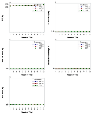
You rock sir. This is exactly what i wanted. Thank you so much. Wish i could give you a million LIKES 👍. There are some flaws i was hoping you could help me address though. The Y-axis range are not working correctly, and the tick values are not displaying correctly. Also, is it possible to position the Y-axis labels a little closer to the axis they are actually depicting. I added the output graph so you could see the result i got. THANK YOU JEFF MEYERS.
Catch up on SAS Innovate 2026
Dive into keynotes, announcements and breakthroughs on demand.
Explore Now →Learn how use the CAT functions in SAS to join values from multiple variables into a single value.
Find more tutorials on the SAS Users YouTube channel.
SAS Training: Just a Click Away
Ready to level-up your skills? Choose your own adventure.


