- Home
- /
- Programming
- /
- Graphics
- /
- PROC SGPLOT
- RSS Feed
- Mark Topic as New
- Mark Topic as Read
- Float this Topic for Current User
- Bookmark
- Subscribe
- Mute
- Printer Friendly Page
- Mark as New
- Bookmark
- Subscribe
- Mute
- RSS Feed
- Permalink
- Report Inappropriate Content
I have this code so far for making a box plot:
TITLE "Diastolic Blood Pressure by Ethnicity/Race Group" BOLD;
PROC SGPLOT DATA = HypAnl.HypPrimanl;
VBOX DBP / GROUP = EthRaceCd
FILLATTRS= (COLOR=LIGHTRED) LINEATTRS= (COLOR=BLACK);
YAXIS LABEL = "Latest DBP Measurement"
LABELATTRS=(Weight=Bold)
VALUES = (10 TO 100 BY 10);
XAXIS LABEL = "Ethnicity/Race Group"
LABELATTRS=(Weight=Bold);
REFLINE 90 / LABEL= "Hypertension Threshold"
LINEATTRS= (COLOR=RED);
INSET "Data Source: HypAnl.HypPrimAnl (As of December 31, 2014)";
RUN;
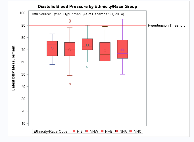
My current box plot looks like this:
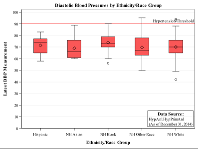
And I want it to look like the one below. Specifically what I want to change is that the groups (Hispanic, NH Asian etc) actually appear on the X-axis with gridlines. Any ideas?
- Mark as New
- Bookmark
- Subscribe
- Mute
- RSS Feed
- Permalink
- Report Inappropriate Content
To get axis labels try using Category=EthRaceCd instead of Group=
To your Yaxis statement add GRID to get gridlines at the tick marks.
Gridattrs would be used to control the appearance of the grid lines.
- Mark as New
- Bookmark
- Subscribe
- Mute
- RSS Feed
- Permalink
- Report Inappropriate Content
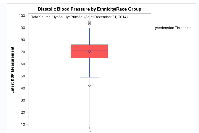
When I change group to category it does show the label like I want it, but it also only produces one box plot, like this:
- Mark as New
- Bookmark
- Subscribe
- Mute
- RSS Feed
- Permalink
- Report Inappropriate Content
Show data in the form of a data step and the actual code you used with category.
I have pages of output with category and get one box for each level of the category variable.
- Mark as New
- Bookmark
- Subscribe
- Mute
- RSS Feed
- Permalink
- Report Inappropriate Content
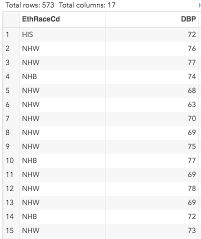
I am using a data file that is formatted like this. These are the two variables that are included in the box plot. The code I provided over is the entire code that I used to produce the box plot.
- Mark as New
- Bookmark
- Subscribe
- Mute
- RSS Feed
- Permalink
- Report Inappropriate Content
Switching to Category worked for me. What exact version of SAS do you have, I'm using 9.4M3
TITLE "Diastolic Blood Pressure by Ethnicity/Race Group" BOLD;

PROC SGPLOT DATA = sashelp.heart;
	VBOX diastolic / category = smoking_status
		FILLATTRS= (COLOR=LIGHTRED) LINEATTRS= (COLOR=BLACK);

	REFLINE 90 / LABEL= "Hypertension Threshold"
		LINEATTRS= (COLOR=RED);

	INSET "Data Source: HypAnl.HypPrimAnl (As of December 31, 2014)";

	YAXIS LABEL = "Latest DBP Measurement"
		LABELATTRS=(Weight=Bold)
		VALUES = (10 TO 100 BY 10);

	XAXIS LABEL = "Smoking Group"
		LABELATTRS=(Weight=Bold);

RUN;- Mark as New
- Bookmark
- Subscribe
- Mute
- RSS Feed
- Permalink
- Report Inappropriate Content
It actually works if I do both Group and Category. The legend at the bottom still shows up though, so will have to fix that somehow.
- Mark as New
- Bookmark
- Subscribe
- Mute
- RSS Feed
- Permalink
- Report Inappropriate Content
Use the NOAUTOLEGEND option in the procedure statement to suppress the legend at the bottom.
If you want the legend somewhere else, you can control that with the KEYLEGEND Statemend.
Learn how use the CAT functions in SAS to join values from multiple variables into a single value.
Find more tutorials on the SAS Users YouTube channel.
SAS Training: Just a Click Away
Ready to level-up your skills? Choose your own adventure.


