- Home
- /
- Programming
- /
- Graphics
- /
- PROC SGPLOT Attrid and Format label Interactions
- RSS Feed
- Mark Topic as New
- Mark Topic as Read
- Float this Topic for Current User
- Bookmark
- Subscribe
- Mute
- Printer Friendly Page
- Mark as New
- Bookmark
- Subscribe
- Mute
- RSS Feed
- Permalink
- Report Inappropriate Content
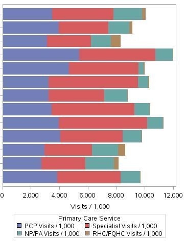
I am trying to use the SGPLOT procedure to create a stacked horizontal bar chart with four categories and apply a color scheme using the attrid statement.
In order to get the four categories in the proper order (rather than alphabetical), each category was assigned a numeric variable (1-4) and a format statement is used to convert the numeric variable back into the category label.
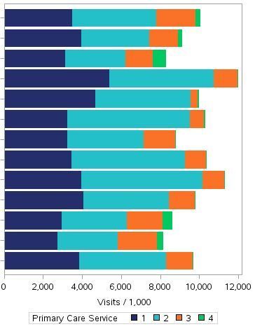
The issue is that I can either get the format to work but the attrid statement won't work to assign the appropriate colors or the attrid statement works to assign the colors and I am left with (1,2,3,4) in my legend.
The first statement produces an output with the appropriate values for label but not the colors specified by the evh type
proc sgplot data=combined5 dattrmap=formatdw.evhstyle;
format value valfmt.;
hbar &sumvar. / response=pcs1 stat=sum
group=value groupdisplay=stack nooutline attrid=evh;
title "Primary Care Services by Type";
run;
The second statement produces a graph with the appropriate colors but leaves (1,2,3,4) in the legend as the values used to order the stacked bars
proc sgplot data=combined5 dattrmap=formatdw.evhstyle;
hbar &sumvar. / response=pcs1 stat=sum
group=value groupdisplay=stack nooutline attrid=evh;
title "Primary Care Services by Type";
run;
Ideally, I'd like the bars stacked in the proper order, with the color scheme applied and the service types labeled in the legend. Thanks in advance for any help.
Accepted Solutions
- Mark as New
- Bookmark
- Subscribe
- Mute
- RSS Feed
- Permalink
- Report Inappropriate Content
Use the formatted group values in your dattrmap dataset, sort your data by your numeric variable, and use grouporder=data in the hbar statement.
- Mark as New
- Bookmark
- Subscribe
- Mute
- RSS Feed
- Permalink
- Report Inappropriate Content
I don't know the answer, and there is not enough code here for me to easily reconstruct what you are doing. However, I can say that one of the standard legend tricks is to make an invisible plot that has the legend you want and overlay it with a visible plot that makes the graph that you want (and don't show the legend for it).
Also, in either the latest release or the second latest, there is a legenditem statement that is very cool and lets you control precisely what is in the legend. If no one posts better ideas, you might try those.
- Mark as New
- Bookmark
- Subscribe
- Mute
- RSS Feed
- Permalink
- Report Inappropriate Content
- Mark as New
- Bookmark
- Subscribe
- Mute
- RSS Feed
- Permalink
- Report Inappropriate Content
Use the formatted group values in your dattrmap dataset, sort your data by your numeric variable, and use grouporder=data in the hbar statement.
Catch up on SAS Innovate 2026
Nearly 200 sessions are now available on demand with the SAS Innovate Digital Pass.
Explore Now →Learn how use the CAT functions in SAS to join values from multiple variables into a single value.
Find more tutorials on the SAS Users YouTube channel.
SAS Training: Just a Click Away
Ready to level-up your skills? Choose your own adventure.


