- Home
- /
- Programming
- /
- Graphics
- /
- PROC SGPANEL
- RSS Feed
- Mark Topic as New
- Mark Topic as Read
- Float this Topic for Current User
- Bookmark
- Subscribe
- Mute
- Printer Friendly Page
- Mark as New
- Bookmark
- Subscribe
- Mute
- RSS Feed
- Permalink
- Report Inappropriate Content
Hello there,
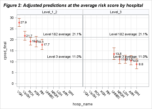
I'm trying to create a graph with SGPLOT that shows rates by hospitals in two seperate panels: Level_1_2 and Level_3. With the dataset I'm currently using, the problem is, I cannot divide the panels the way I want it. The final graph is supposed to have the rates for each hospital within their "level". Currently the graph I produce includes Level_3 hospitals in the Level_1_2 panel and Level_1_2 hospitals in the Level_3 panel. Do you think I set up my dataset not "optimally" or am I missing something in the SGPANEL?
Also, if its a possibility I would like to create two seperate REFLINES for each panel.
Thanks a lot for your help in advance!
Here are my dataset, code, and the graph.
| hosp_name | level | cpred_final | clower_final | cupper_final |
| VGH | Level_1_2 | 27.8587 | 26.0588 | 29.7581 |
| VicGH | Level_1_2 | 21.7479 | 19.824 | 23.8298 |
| RCH | Level_1_2 | 19.2273 | 17.5596 | 21.0323 |
| KGH | Level_1_2 | 19.0601 | 16.8262 | 21.5502 |
| RIH | Level_1_2 | 17.7454 | 15.5962 | 20.1532 |
| UHNBC | Level_3 | 13.5041 | 11.1077 | 16.3623 |
| NRGH | Level_3 | 10.9852 | 9.0805 | 13.2551 |
| LGH | Level_3 | 10.9797 | 9.2928 | 12.9473 |
| ARH | Level_3 | 10.4652 | 8.5618 | 12.757 |
| SPH | Level_3 | 8.8174 | 6.8647 | 11.2857 |
proc sgpanel data=Results noautolegend;
panelby level/columns=2 novarname;
rowaxis values=(0 to 30 by 5) grid;
colaxis grid;
scatter x=hosp_name y=cpred_final / markerattrs=(symbol=circle color=red size=8)
DATALABEL=cpred_final
DATALABELATTRS=(color=black /*weight=bold*/)
DATALABELPOS=right
yerrorlower=clower_final
yerrorupper=cupper_final;
refline 21.13 10.95/label=('Level 1&2 average: 21.1%' 'Level 3 average: 11.0%');
title h=12pt justify=left bold italic 'Figure 2: Adjusted predictions at the average risk score by hospital';
format cpred_final 4.1;
run;
Accepted Solutions
- Mark as New
- Bookmark
- Subscribe
- Mute
- RSS Feed
- Permalink
- Report Inappropriate Content
On the PANELBY statement, add UNISCALE=ROW after "/" and you should get what you want. Basically, you only want the ROW axis to be uniform, but both ROW and COLUMN axes are uniform by default, giving you the combined tick list.
Hope this helps!
Dan
- Mark as New
- Bookmark
- Subscribe
- Mute
- RSS Feed
- Permalink
- Report Inappropriate Content
This is great Dan! Yes, it resolved my problem. Do you think I can create two seperate reflines for each panel?
Cheers,
Recep
- Mark as New
- Bookmark
- Subscribe
- Mute
- RSS Feed
- Permalink
- Report Inappropriate Content
Absolutely! Instead of putting your refline values on the REFLINE statement (which will replicate in every cell), but the values in a column and reference the colume from the REFLINE statement:
| hosp_name | level | cpred_final | clower_final | cupper_final | ref_level | ref_label |
| VGH | Level_1_2 | 27.8587 | 26.0588 | 29.7581 | 21.13 | Level 1&2 average: 21.1% |
| VicGH | Level_1_2 | 21.7479 | 19.824 | 23.8298 | . | |
| RCH | Level_1_2 | 19.2273 | 17.5596 | 21.0323 | . | |
| KGH | Level_1_2 | 19.0601 | 16.8262 | 21.5502 | . | |
| RIH | Level_1_2 | 17.7454 | 15.5962 | 20.1532 | . | |
| UHNBC | Level_3 | 13.5041 | 11.1077 | 16.3623 | 10.95 | Level 3 average: 11.0% |
| NRGH | Level_3 | 10.9852 | 9.0805 | 13.2551 | . | |
| LGH | Level_3 | 10.9797 | 9.2928 | 12.9473 | . | |
| ARH | Level_3 | 10.4652 | 8.5618 | 12.757 | . | |
| SPH | Level_3 | 8.8174 | 6.8647 | 11.2857 | . |
proc sgpanel data=Results noautolegend;
panelby level/columns=2 novarname uniscale=row;
rowaxis values=(0 to 30 by 5) grid;
colaxis grid;
scatter x=hosp_name y=cpred_final / markerattrs=(symbol=circle color=red size=8)
DATALABEL=cpred_final
DATALABELATTRS=(color=black /*weight=bold*/)
DATALABELPOS=right
yerrorlower=clower_final
yerrorupper=cupper_final;
refline ref_level / label=ref_label
title h=12pt justify=left bold italic 'Figure 2: Adjusted predictions at the average risk score by hospital';
format cpred_final 4.1;
run;- Mark as New
- Bookmark
- Subscribe
- Mute
- RSS Feed
- Permalink
- Report Inappropriate Content
Thanks a lot Dan! This also resolve it...
Have a good day...
- Mark as New
- Bookmark
- Subscribe
- Mute
- RSS Feed
- Permalink
- Report Inappropriate Content
The hospital labels are the same because the XAXIS for sgpanel by default is the same for each panel.
You might consider taking that output and using it as the basis for the ODS Graphics Designer to build the custom template that would be needed for SGRender to build what I think you are meaning to do.
Catch up on SAS Innovate 2026
Dive into keynotes, announcements and breakthroughs on demand.
Explore Now →Learn how use the CAT functions in SAS to join values from multiple variables into a single value.
Find more tutorials on the SAS Users YouTube channel.
SAS Training: Just a Click Away
Ready to level-up your skills? Choose your own adventure.


