- Home
- /
- Programming
- /
- Graphics
- /
- Re: PROC FREQ & PROC GCHART are providing different results
- RSS Feed
- Mark Topic as New
- Mark Topic as Read
- Float this Topic for Current User
- Bookmark
- Subscribe
- Mute
- Printer Friendly Page
- Mark as New
- Bookmark
- Subscribe
- Mute
- RSS Feed
- Permalink
- Report Inappropriate Content
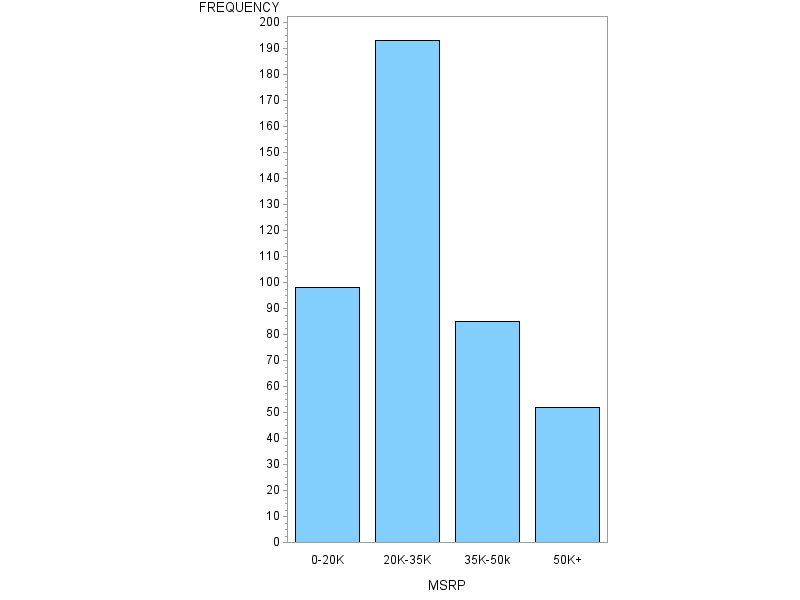
Greetings and Thanks in advance for the help. I feel like I am hung up on an issue that will be simple and obvious if someone can explain it to me. I am attempting to produce a simple bar graph from a data field that has been modified using a PROC format statement. However the bar graph is showing incorrectly (the format level range with the "high" designation is repeated numerous times and the frequencies for all ranges are off. Below is the an example of the code I am using with the example sashelp.cars dataset. along with the incorrect graphing output compared to the correct PROC FREQ output. How do I get my PROC GCHART output to match the PROC FREQ output?
PROC FORMAT;
VALUE Price low-20000 = '0-20K'
20000<-35000 = '20K-35K'
35000<-50000 = '35K-50k'
50000<-high = '50K+';
RUN;
DATA work.cars;
SET sashelp.cars;
FORMAT MSRP Price.;
RUN;
PROC FREQ DATA=work.Cars;
Tables MSRP / NOPERCENT NOCUM;
RUN;
PROC GCHART DATA=work.Cars;
VBAR MSRP;
RUN;
QUIT;
Accepted Solutions
- Mark as New
- Bookmark
- Subscribe
- Mute
- RSS Feed
- Permalink
- Report Inappropriate Content
Looks like GCHART doesn't recognize the format for some reason.
I would probably just switch to SGPLOT - which you should do anyways - and use that instead. You get better graphics and it's easier to work with. You'll find a lot of old courses and tutorials still reference the SAS/GRAPH procedures since the language is almost 50 years old now.
PROC sgplot DATA=work.Cars;

     VBAR MSRP/ stat=freq;

RUN;
@tgrandchamp wrote:
Greetings and Thanks in advance for the help. I feel like I am hung up on an issue that will be simple and obvious if someone can explain it to me. I am attempting to produce a simple bar graph from a data field that has been modified using a PROC format statement. However the bar graph is showing incorrectly (the format level range with the "high" designation is repeated numerous times and the frequencies for all ranges are off. Below is the an example of the code I am using with the example sashelp.cars dataset. along with the incorrect graphing output compared to the correct PROC FREQ output. How do I get my PROC GCHART output to match the PROC FREQ output?
PROC FORMAT;
VALUE Price low-20000 = '0-20K'
20000<-35000 = '20K-35K'
35000<-50000 = '35K-50k'
50000<-high = '50K+';
RUN;
DATA work.cars;
SET sashelp.cars;
FORMAT MSRP Price.;
RUN;
PROC FREQ DATA=work.Cars;
Tables MSRP / NOPERCENT NOCUM;
RUN;
PROC GCHART DATA=work.Cars;
VBAR MSRP;
RUN;
QUIT;
- Mark as New
- Bookmark
- Subscribe
- Mute
- RSS Feed
- Permalink
- Report Inappropriate Content
See if adding DISCRETE as an option to the GCHART vbar makes things look more as expected.
PROC GCHART DATA=work.Cars;
     VBAR MSRP /discrete;
RUN;
QUIT;
GCHART needs to be told explicitly not to treat numeric values as continuous. So without the DISCRETE option the algorithm splits the data into "ranges" based on internal rules about the range of data points. And after that the format is applied to the displayed axis variable. So funny things happen.
- Mark as New
- Bookmark
- Subscribe
- Mute
- RSS Feed
- Permalink
- Report Inappropriate Content
You need to use the 'discrete' option ...
PROC GCHART DATA=work.Cars;
VBAR MSRP / discrete;
RUN;
Learn how use the CAT functions in SAS to join values from multiple variables into a single value.
Find more tutorials on the SAS Users YouTube channel.
SAS Training: Just a Click Away
Ready to level-up your skills? Choose your own adventure.


