BookmarkSubscribeRSS Feed
antor82
Obsidian | Level 7

Hi all

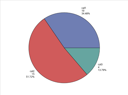
I would like to modify the template of my pie chart by

  • Changing the weight of the labels to bold, limited to the category (not frequency, not percentage)
  • Centering the labels in the column (actually right- or left-sided to appear closer to the chart)
  • Changing the format of the percentage to 1 digit after the comma (actually 2 digits)

This is my example dataset


data mydata;
input group $1-4 value 6-7 ;
datalines;
cat1 10
cat2 15
cat3 4
;
run;

 this is the template


proc template;
	define statgraph pie;
		begingraph;
		layout region;
		piechart category=group response=value /  
			DATALABELcontent=(category response percent) datalabellocation=outside;
		endlayout;
		endgraph;
	end;

proc sgrender data=mydata template=pie;
run;


this is my final result
Picture1.png


Thanks in advance for Your precious support


Sincerely

antor82

SAS INNOVATE 2024

Innovate_SAS_Blue.png

Registration is open! SAS is returning to Vegas for an AI and analytics experience like no other! Whether you're an executive, manager, end user or SAS partner, SAS Innovate is designed for everyone on your team. Register for just $495 by 12/31/2023.

If you are interested in speaking, there is still time to submit a session idea. More details are posted on the website. 

Register now!

How to Concatenate Values

Learn how use the CAT functions in SAS to join values from multiple variables into a single value.

Find more tutorials on the SAS Users YouTube channel.

Get the $99 certification deal.jpg


Back in the Classroom!

Select SAS Training centers are offering in-person courses. View upcoming courses for:

View all other training opportunities.

Discussion stats
  • 0 replies
  • 448 views
  • 0 likes
  • 1 in conversation