- Home
- /
- Programming
- /
- Graphics
- /
- Options in SG panel in Text statement
- RSS Feed
- Mark Topic as New
- Mark Topic as Read
- Float this Topic for Current User
- Bookmark
- Subscribe
- Mute
- Printer Friendly Page
- Mark as New
- Bookmark
- Subscribe
- Mute
- RSS Feed
- Permalink
- Report Inappropriate Content
Hello Team,
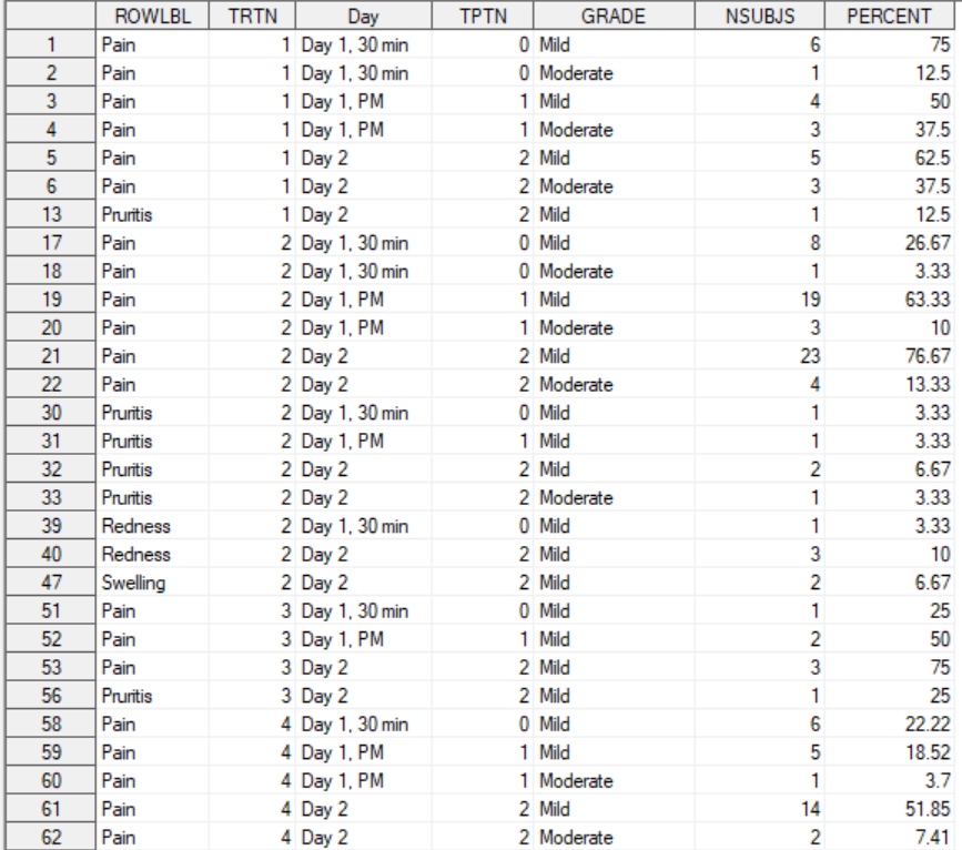
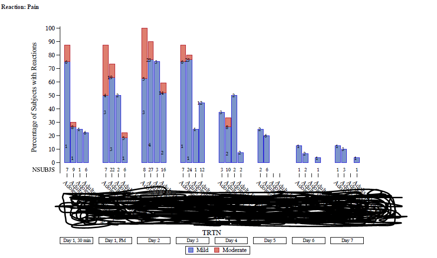
I want to display 'Number of subjects'(nsubjs) in legend level with each grade but iam trying to work on the below code in text statement but none of the option is working. Will be there any solution to display subjects in legend with each grade by removing subjects on top of the bar. For reference i am attaching figure and code. Please provide your insights which would help me.
DATA:
Figure:
proc sgpanel data=final dattrmap=attrmap ;
by rowlbl;
panelby tptn / layout=columnlattice onepanel noborder novarname colheaderpos=bottom headerattrs=(size=7.5) spacing=10;
format tptn tptf.;
vbarparm category=trtn response=percent/ group=grade displaybaseline=auto;
text x=trtn y=percent text=nsubjs / position=left pad=(bottom=25px) contributeoffsets=none ;
format trtn trt2f.;
colaxistable nsubjs ;
rowaxis values=(0 to 100 by 10) label='Percentage of Subjects with Reactions' ;
keylegend /exclude = ("PERCENT") border;
run;
I want the figure to be displayed as below figure image highlighted in yellow:
- Mark as New
- Bookmark
- Subscribe
- Mute
- RSS Feed
- Permalink
- Report Inappropriate Content
I think that perhaps you want an COLAXISTABLE statement. Without data can't make specific code suggestions though.
It might be as simple as replacing your Text statement with
Colaxistable nsubjs;
Instructions here: https://communities.sas.com/t5/SAS-Communities-Library/How-to-create-a-data-step-version-of-your-dat... will show how to turn an existing SAS data set into data step code that can be pasted into a forum code box using the </> icon or attached as text to show exactly what you have and that we can test code against.
- Mark as New
- Bookmark
- Subscribe
- Mute
- RSS Feed
- Permalink
- Report Inappropriate Content
Thanks for quick response. I tried using colaxistable but it didnt worked it still displaying inside the figure not on the legend level(not on the bottom of x-axis).The code and data and new figure by using colaxistable displaying in original question by editing. i cannot post the picture of code, data and figure in the reply
- Mark as New
- Bookmark
- Subscribe
- Mute
- RSS Feed
- Permalink
- Report Inappropriate Content
The XAXISTABLEs and YAXISTABLEs in the SGPLOT procedure can be either inside or outside of the data area; but the equivalent ROWAXISTABLEs and COLAXISTABLEs in the SGPANEL procedure can only be in the inside, since classification panels can have multiple rows and columns. If you absolutely want external axis tables, one approach you could take would be to use SGPLOT with a BY-group, use the UNIFORM option to create uniform axes and groups, and use ODS LAYOUT to lay them out in a panel fashion. If you are interested in that approach and need more information, let me know.
- Mark as New
- Bookmark
- Subscribe
- Mute
- RSS Feed
- Permalink
- Report Inappropriate Content
- Mark as New
- Bookmark
- Subscribe
- Mute
- RSS Feed
- Permalink
- Report Inappropriate Content
Here is a little example comparable to your scenario:
ods _all_ close;
ods html path="." file="sales.html";
ods layout gridded advance=bygroup columns=2;

proc sort data=sashelp.prdsale out=sales; by quarter; run;

ods layout start;
proc sgplot data=sales uniform=all;
by quarter;
vbar product / response=actual group=region;
xaxistable actual / class=region location=outside;
run;
ods layout end;
ods html close;- Mark as New
- Bookmark
- Subscribe
- Mute
- RSS Feed
- Permalink
- Report Inappropriate Content
Hi Danh_sas,
Thank you so much it worked. I need a small update i want to display 'severe' grade as highlighted in yellow in a key legend even though if it is not in data. Is there any way to display by using any options:
or i should a create a dummy dataset to insert 'severe' column into data to represent in graph? please provide your insights
- Mark as New
- Bookmark
- Subscribe
- Mute
- RSS Feed
- Permalink
- Report Inappropriate Content
The best way for you to do that is to use a Discrete Attributes Map, with a SHOW value of ATTRMAP. This option tells the procedure to let the attrmap dictate the content of the grouped legend instead of the group column in the data. If you've never used an attrmap, notice the DATTRMAP option on the procedure statement and the ATTRID on the VBAR statement to bind the plot to the correct attrmap. I also removed the CLASS option from the XAXISTABLE, which was not needed here.
ods _all_ close;
ods html path="." file="sales.html";
ods layout gridded advance=bygroup columns=2;

data attrmap;
retain id "myid" show "attrmap";
length value $ 5 fillstyleelement $ 10;
input value $ fillstyleelement $;
cards;
East  GraphData1
West  GraphData2
North GraphData3
South GraphData4
;
run;

proc sort data=sashelp.prdsale out=sales; by quarter; run;

ods layout start;
proc sgplot data=sales uniform=all dattrmap=attrmap;
by quarter;
vbar product / response=actual group=region attrid=myid;
xaxistable actual / location=outside;
run;

ods layout end;
ods html close;
- Mark as New
- Bookmark
- Subscribe
- Mute
- RSS Feed
- Permalink
- Report Inappropriate Content
Catch up on SAS Innovate 2026
Dive into keynotes, announcements and breakthroughs on demand.
Explore Now →Learn how use the CAT functions in SAS to join values from multiple variables into a single value.
Find more tutorials on the SAS Users YouTube channel.
SAS Training: Just a Click Away
Ready to level-up your skills? Choose your own adventure.


